In today’s digital landscape, having a mobile-friendly website is no longer optional—it’s essential. With users accessing the internet from an ever-growing array of devices, businesses must ensure their online presence is accessible and user-friendly across all platforms. Two primary approaches have emerged to address this challenge: responsive design and adaptive design.
At Designs by Dave O., we understand the importance of selecting the right strategy for your website. In this comprehensive guide, we’ll explore the differences between responsive and adaptive design, helping you make an informed decision for your business’s web presence.
Responsive Design
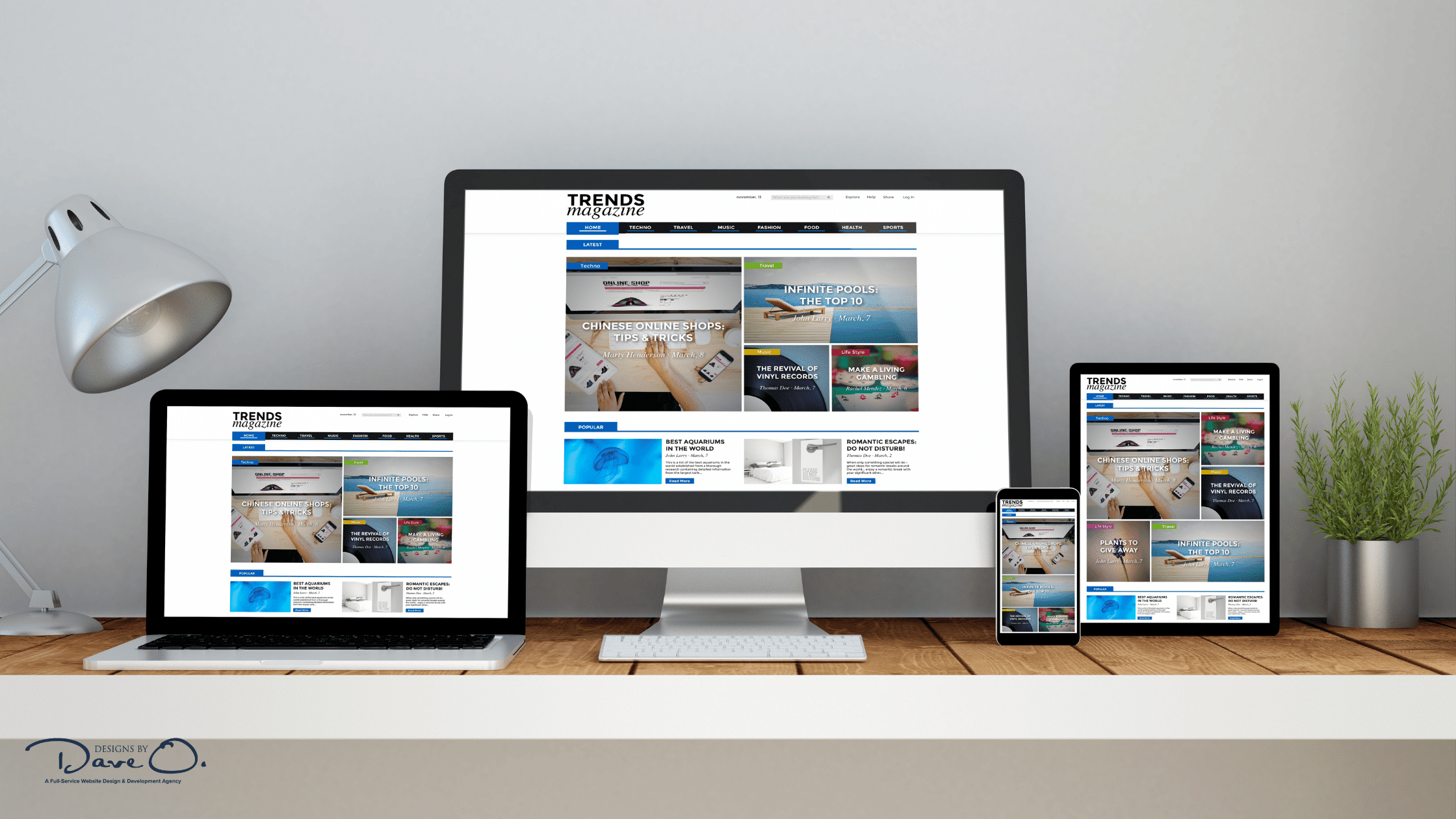
Responsive web design is an approach that allows a website to adjust its layout and content dynamically based on the screen size and orientation of the device being used. This fluid design methodology ensures that your website looks great and functions well on everything from large desktop monitors to small smartphone screens.
How Responsive Design Works:
- Fluid Grids: The layout uses relative units (like percentages) instead of fixed units (like pixels) to allow content to resize and reflow.
- Flexible Images: Images scale within their containing elements to prevent them from displaying outside their containers on smaller screens.
- Media Queries: CSS techniques that apply different styles based on the device’s characteristics, such as width, height, or orientation.
Advantages of Responsive Design:
- Single URL: Maintains one URL for all devices, which is beneficial for SEO and user experience.
- Future-Proof: Adapts to new devices and screen sizes without requiring redesigns.
- Cost-Effective: Generally less expensive to implement and maintain than creating separate mobile sites.
Challenges of Responsive Design:
- Performance: If not optimized properly, responsive sites can be slower on mobile devices due to loading unnecessary assets.
- Design Complexity: Creating a design that works well across all devices can be challenging and may require compromises.
Exploring Adaptive Design
Adaptive web design takes a different approach by creating multiple fixed layout sizes for specific devices. When a user visits an adaptive website, the server detects the device type and delivers the appropriate pre-designed layout.

How Adaptive Design Functions:
- Predefined Layouts: Typically, designers create layouts for common screen sizes (e.g., 320px, 480px, 760px, 960px, 1200px, 1600px).
- Server-Side Components: The server detects the user’s device and sends the appropriate layout.
- Device-Specific Optimizations: Each layout can be tailored to the specific capabilities and limitations of target devices.
Benefits of Adaptive Design:
- Performance: Can be faster on target devices as it loads only the necessary resources.
- Precision: Offers more control over the user experience on specific devices.
- Advertising: Allows for more precise ad placement across different layouts.
Limitations of Adaptive Design:
- Development Time: Requires creating and maintaining multiple layouts, which can be time-consuming and costly.
- Future Compatibility: May require updates to accommodate new devices or screen sizes.

Responsive vs Adaptive: A Detailed Comparison
To help you make an informed decision, let’s compare responsive and adaptive design across several key factors:
1. Development Process and Complexity
Responsive: Requires a single design that flexes to fit all screen sizes. While initially more complex to set up, it’s generally easier to maintain long-term.
Adaptive: Involves creating multiple fixed layouts. This can be more straightforward initially but may require more effort to maintain and update over time.
2. Performance and Loading Speeds
Responsive: Can be slower if not properly optimized, as it may load unnecessary assets for smaller devices.
Adaptive: Often faster on target devices, as it loads only the assets needed for that specific layout.
3. User Experience Across Devices
Responsive: Provides a consistent experience across all devices, with content adjusting fluidly to the screen size.
Adaptive: Offers a tailored experience for specific devices, which can be beneficial for complex websites or applications.

4. SEO Implications
Responsive: Preferred by Google, as it uses a single URL and HTML across all devices.
Adaptive: Can be SEO-friendly if implemented correctly, but may require additional optimization efforts.
5. Maintenance and Long-term Scalability
Responsive: Generally easier to maintain and scale, as changes apply across all devices.
Adaptive: May require more effort to maintain and update, especially when new devices enter the market.
6. Cost Considerations
Responsive: Usually more cost-effective in the long run, with a higher initial investment.
Adaptive: Can be more expensive over time due to the need to create and maintain multiple layouts.
Factors to Consider When Choosing Between Responsive and Adaptive Design
Selecting the right design approach for your website is a crucial decision that can significantly impact your online presence. Both responsive and adaptive designs have their merits, but the best choice depends on various factors unique to your business and audience. Here are the key considerations to help guide your decision:
1. Target Audience and Device Usage Patterns
Understanding your audience’s browsing habits is fundamental to choosing the right design approach. Consider the following:
- Analyze your website analytics to identify the most commonly used devices among your visitors.
- Look into the geographical distribution of your audience and research the prevalent devices in those regions.
- Examine the trends in device usage over time to anticipate future shifts in user behavior.
For instance, if your analytics show that 80% of your traffic comes from mobile devices, a responsive design might be more suitable. However, if you have a significant number of users on both desktop and mobile, with distinct usage patterns, an adaptive approach could be beneficial.

2. Website Complexity and Functionality Requirements
The nature of your website’s features and interactions plays a crucial role in determining the most suitable design approach:
- Evaluate the complexity of your website’s features and how they translate across different screen sizes.
- Identify any functionalities that are critical for specific devices or screen sizes.
- Consider how interactive elements like forms, sliders, or data visualizations need to perform on various devices.
For example, if your website includes complex data tables or intricate user interfaces, an adaptive design might allow you to create optimized versions for different screen sizes. On the other hand, if your site has a relatively simple layout with straightforward functionality, a responsive design could efficiently adapt to various screen sizes without compromising usability.
3. Content Strategy and Prioritization
Your content strategy should align with your chosen design approach:
- Assess how your content needs to be presented across different devices to maintain its impact and readability.
- Determine if certain content should be prioritized differently on mobile versus desktop versions.
- Consider how multimedia elements like images and videos will be displayed across various screen sizes.
If your content strategy requires significantly different layouts or content hierarchies for mobile and desktop users, an adaptive design might be more suitable. However, if your content can be effectively presented in a similar structure across all devices, a responsive design could be more efficient.
4. Budget and Development Resources
Financial considerations and available expertise are crucial factors:
- Evaluate your budget for initial development and ongoing maintenance of the website.
- Assess your team’s expertise in responsive or adaptive design techniques.
- Consider the long-term costs associated with updating and maintaining each design approach.
Responsive design often requires a higher initial investment but can be more cost-effective in the long run due to easier maintenance. Adaptive design might have lower upfront costs but could require more resources for ongoing updates and maintenance of multiple layouts.
5. Future-proofing and Scalability Needs
Think about the future growth and evolution of your website:
- Consider your long-term business goals and how they might impact your website’s design needs.
- Anticipate the potential emergence of new devices and screen sizes in the future.
- Evaluate how easily each design approach can accommodate future changes or additions to your website.
Responsive design is often considered more future-proof as it can adapt to new screen sizes without requiring a complete overhaul. However, adaptive design can offer more control over the user experience as new devices emerge, provided you’re willing to create new layouts as needed.
By carefully considering these factors, you can make an informed decision about whether responsive or adaptive design is the best fit for your website. Remember, there’s no one-size-fits-all solution – the right choice depends on your specific needs, goals, and resources.
At Designs by Dave O., we’re here to help you navigate this decision and implement the best solution for your unique situation.

Best Practices for Implementing Responsive Design Vs Adaptive Design
Regardless of which approach you choose, following these best practices will help ensure a successful implementation:
1. Embrace a Mobile-First Approach
Start by designing for the smallest screen size and progressively enhance the experience for larger screens. This approach ensures that your core content and functionality are optimized for mobile users.
2. Prioritize Performance Optimization
- Compress images and use appropriate file formats.
- Minimize HTTP requests and leverage browser caching.
- Use lazy loading for images and content below the fold.
3. Conduct Thorough Testing and Quality Assurance
Test your website across a wide range of devices and browsers to ensure consistency and functionality.
4. Implement Accessibility Features
Ensure your website is usable by people with disabilities by following WCAG guidelines and using semantic HTML.
5. Continuously Improve and Iterate
Regularly analyze user behavior and feedback to make ongoing improvements to your website’s design and functionality.

The Future of Web Design: Hybrid Approaches and Emerging Technologies
As web technologies continue to evolve, we’re seeing the emergence of hybrid approaches that combine elements of both responsive and adaptive design. These strategies aim to leverage the strengths of each method while mitigating their weaknesses.
Progressive Web Apps (PWAs) are also gaining traction, offering app-like experiences within web browsers. PWAs can adapt to different devices and network conditions, providing fast, engaging experiences across platforms.
Artificial Intelligence and machine learning are beginning to play a role in web design optimization, automatically adjusting layouts and content based on user behavior and preferences. These technologies have the potential to create highly personalized web experiences that adapt in real-time to individual users.
Conclusion
Choosing between responsive and adaptive design is a crucial decision that can significantly impact your website’s success. While responsive design offers flexibility and easier maintenance, adaptive design provides more control over the user experience on specific devices. The right choice depends on your unique business needs, target audience, and resources.
At Designs by Dave O., we understand that every business has unique requirements for its online presence. Our team of expert web developers and designers can help you navigate the decision-making process and implement the best solution for your website. Whether you opt for a responsive design that fluidly adapts to all screens or an adaptive approach tailored to specific devices, we’re here to ensure your website delivers an outstanding user experience that drives results for your business.
Ready to take your website to the next level? Contact Designs by Dave O. today for a consultation on how we can help you choose and implement the perfect design approach for your business’s online success.


