If you woke up to find your OpenClaw assistant unresponsive, or if you got an email from Anthropic that made your stomach drop, you are not alone. Anthropic has officially cut off OAuth access for Claude Max subscribers using third-party tools, and that includes OpenClaw.
Here is what happened, why it matters, and exactly what to do next.
What Changed
Anthropic updated its terms and Claude Code documentation to explicitly prohibit the use of OAuth tokens from Free, Pro, and Max subscriptions in any third-party product. The language is unambiguous: “Using OAuth tokens obtained through Claude Free, Pro, or Max accounts in any other product, tool, or service is not permitted and constitutes a violation of the Consumer Terms of Service.”
This has been rolling out in stages. Enforcement began as early as January 2026, with a formal documentation update in February and a mass email to affected subscribers in late March. As of now, the change is fully in effect. If you were connecting your Claude Max subscription to OpenClaw through OAuth, that connection no longer works.
To be clear, Anthropic is not blocking Claude models from being used in OpenClaw. Opus, Sonnet, and Haiku all still work. What changed is how you authenticate. The “log in with your Claude subscription” path is closed. Going forward, you need your own API key.
Why This Matters
Many OpenClaw users chose the Claude Max plan specifically because it felt like an all-you-can-use pass. At $200 a month, piping that access into a personal AI assistant made economic sense. That math no longer works under the new terms.
Anthropic’s reasoning comes down to economics. Subscription plans were priced for interactive use on claude.ai and Claude Code, not for powering autonomous agents that can burn through tokens at a much higher rate. Third-party agent frameworks like OpenClaw, and even Anthropic’s own Agent SDK, are now explicitly outside the scope of consumer subscriptions.
The developer community has not been quiet about this. Reactions online have ranged from frustrated to genuinely angry, with many pointing out that the rules changed after people had already built workflows around the old arrangement. That frustration is valid. But the policy is final, so the practical move is to adapt.
What to Do Right Now
Anthropic is offering a $200 free API credit to affected users. This is real money and it will keep your OpenClaw assistant running while you get set up with a proper API key. Here is the step-by-step:
Step 1: Claim your free API credit.
Go to claude.ai/settings/usage and look for the option to claim the $200 credit. This is available to Max subscribers affected by the change.
Step 2: Switch your model in OpenClaw.
Open your OpenClaw chat and type `/model`. Click on Anthropic, then select Sonnet instead of Opus. Sonnet is significantly cheaper per token, which means your $200 credit will stretch much further. On Opus, that credit might last a few weeks of heavy use. On Sonnet, you could get months out of it, and for most tasks, the quality difference is marginal.
Step 3: Set up your own Anthropic API key.
While the credit buys you time, it will eventually run out. Go to console.anthropic.com, create an account if you do not already have one, and generate an API key. Add a payment method so your usage continues uninterrupted once the credit is spent. Then configure that key in your OpenClaw settings.
The Bigger Picture
This is not the end of using Claude with OpenClaw. It is a billing change, not a capability change. Your assistant still works. Your skills, your memory, your workflows are all intact. The only difference is where the bill comes from.
For most users running Sonnet, actual API costs will likely land somewhere between $20 and $60 a month depending on usage, well below what you were paying for Max. So while the transition is inconvenient, the economics on the other side might actually be better.
Take the ten minutes to claim the credit, switch to Sonnet, and set up your API key. Your OpenClaw assistant will be back to full speed before lunch.

As a web development agency serving diverse clients, selecting the right WordPress hosting solution is crucial for project success. This comprehensive guide examines various WordPress hosting options, helping you make informed decisions that align with your clients’ needs, budgets, and performance requirements.
WordPress Hosting Fundamentals
WordPress hosting serves as the foundation of your clients’ websites. Think of it as the digital real estate where websites reside. The hosting environment directly impacts website speed, security, and overall performance – factors that significantly influence user experience and search engine rankings.
Types of WordPress Hosting
Different hosting solutions cater to varying business needs and technical requirements:
- Shared Hosting
- Multiple websites share server resources
- Entry-level pricing
- Limited customization options
- Virtual Private Server (VPS)
- Dedicated portion of server resources
- Greater control over server environment
- Moderate technical expertise required
- Dedicated Hosting
- Exclusive server access
- Complete resource control
- Advanced technical knowledge needed
- Managed WordPress
- WordPress-specific optimization
- Automated maintenance
- Expert support included
- Cloud Hosting
- Scalable resources
- High availability
- Pay-as-you-go pricing

Shared Hosting: Entry-Level Solution
Shared hosting represents an accessible starting point for small businesses and personal websites. While cost-effective, understanding its limitations helps set appropriate client expectations.
Key Benefits:
- Affordable monthly costs
- Simple setup process
- Basic technical requirements
- Included email hosting
- Standard cPanel interface
However, shared hosting comes with specific challenges. Resource constraints may lead to slower loading times during peak traffic periods. Security concerns also arise from sharing server space with other websites.

Managed WordPress Hosting: Premium Performance
Managed WordPress hosting stands out for its specialized focus on WordPress websites. This solution includes advanced features that benefit both agencies and clients.
Notable Features:
- WordPress-specific security measures
- Daily automated backups
- Built-in caching systems
- Regular core updates
- Staging environments
Leading providers like WP Engine and Kinsta offer excellent developer tools and workflows. Their platforms include Git integration, transferable installations, and advanced analytics.
VPS and Dedicated Hosting: Advanced Solutions
VPS hosting bridges the gap between shared and dedicated solutions, offering reliable performance for growing websites. Dedicated hosting provides maximum control for high-traffic sites with specific requirements.
VPS Advantages:
- Guaranteed server resources
- Root access for customization
- Better security isolation
- Scalable configurations
Dedicated Server Benefits:
- Complete hardware control
- Custom security implementation
- Maximum resource availability
- Specific compliance requirements

Cloud Hosting: Scalable and Flexible
Cloud hosting introduces dynamic scalability for websites with varying traffic patterns. This modern approach distributes resources across multiple servers, increasing reliability and performance.
Technical Considerations:
- Load balancing capabilities
- Geographic distribution options
- Automatic failover systems
- Resource scaling tools
- Usage-based pricing
Making the Right Choice for Different Client Types
Selecting appropriate hosting depends on various client factors:
Small Business Websites
Small business sites typically need reliable hosting with good support. Managed WordPress hosting often provides the best balance of features and simplicity for these clients.
E-commerce Solutions
Online stores require:
- PCI compliance
- SSL certificates
- Regular backups
- High uptime guarantees
- Scalable resources
Enterprise Clients
Large organizations need:
- Custom security measures
- Advanced monitoring
- Development environments
- Technical support
- Performance guarantees

Best Practices and Recommendations
Performance Considerations
Monitor these key metrics:
- Server response time
- Time to first byte (TTFB)
- Resource usage
- Bandwidth allocation
- Database performance
Security Implementation
Essential security features include:
- Web application firewall
- DDoS protection
- Regular malware scanning
- SSL/TLS encryption
- IP blocking capabilities
Backup Strategy
Implement comprehensive backup systems:
- Daily automated backups
- Manual backup options
- Off-site storage
- Quick restoration tools
- Version control

Making the Final Decision
Consider these factors when selecting hosting for clients:
- Budget Constraints
- Initial costs
- Renewal pricing
- Additional feature expenses
- Technical Requirements
- Resource needs
- Security specifications
- Compliance standards
- Growth Potential
- Scalability options
- Traffic expectations
- Feature expansion
- Support Needs
- Response times
- Technical expertise
- Available channels

Conclusion
Choosing the right WordPress hosting solution requires careful consideration of multiple factors. Understanding your clients’ needs, technical requirements, and growth plans helps determine the most suitable option. Regular evaluation of hosting performance ensures continued alignment with business objectives.
Remember that hosting decisions impact long-term website success. Take time to assess options thoroughly, test performance, and gather feedback from clients. This approach leads to better outcomes and stronger client relationships.
For specific recommendations or detailed hosting comparisons, contact our team at Designs by Dave O. Our experience with various hosting solutions helps guide clients toward choices that support their digital goals.
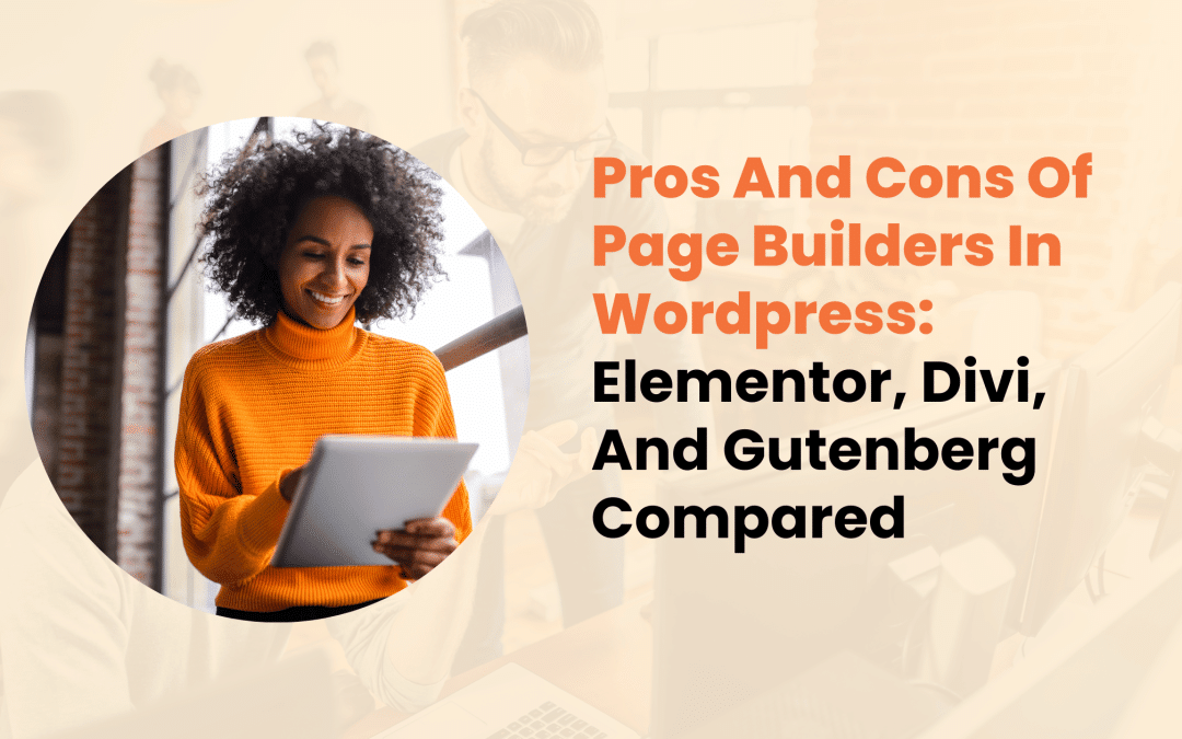
Creating a stunning WordPress website once required deep coding expertise and countless development hours. Today, page builders offer a simpler path, transforming complex development into visual design. But with Elementor, Divi, and Gutenberg leading the market, choosing the right tool can be challenging.
This in-depth comparison examines each builder’s strengths, limitations, and real-world applications. Whether you’re managing client projects or building your first website, we’ll help you make an informed choice that matches your specific needs and technical requirements.
Page Builders: A Foundation for Modern Web Development
Page builders serve as intermediate tools between complex coding and simple drag-and-drop interfaces. They’ve evolved from basic layout tools to sophisticated platforms that can create complex, responsive websites.
While traditional WordPress development relies heavily on coding knowledge, page builders introduce visual editing capabilities that significantly reduce development time and technical barriers.
These tools particularly appeal to:
- Professional developers seeking rapid prototyping options
- Small business owners managing their own websites
- Design agencies handling multiple client projects
- Content creators requiring layout flexibility

Elementor: The Popular Choice
Elementor has established itself as a leading page builder in the WordPress community, serving millions of websites worldwide. Let’s examine what makes it stand out and where it might fall short.
Strengths of Elementor
The free version of Elementor provides remarkable functionality, making it an excellent starting point for many users. Its interface presents a logical arrangement of tools and options, while maintaining professional-grade capabilities.
Key advantages include:
- Extensive widget selection in both free and premium versions
- Real-time visual editing with instant preview
- Responsive design controls for all device sizes
- Theme building capabilities (premium version)
- Active community and regular updates
Potential Drawbacks
Despite its popularity, Elementor isn’t without limitations. Users often report that extensive use of its features can affect website performance. Additionally, the premium version’s pricing structure might not suit all budgets, especially for agencies managing multiple sites.
Areas of concern:
- Additional server resource requirements
- Potential conflicts with certain themes and plugins
- Complex projects may require technical knowledge
- Regular updates sometimes introduce compatibility issues

Divi Builder: The All-in-One Solution
Divi approaches website building from a different angle, offering an integrated theme and builder solution. This comprehensive package presents both opportunities and challenges for users.
Notable Features
Divi’s strength lies in its cohesive ecosystem and extensive design options. The platform provides:
- Comprehensive design control
- Built-in A/B testing capabilities
- Extensive template library
- Global design management
- Responsive editing tools
Considerations and Limitations
While Divi offers a robust solution, users should consider several factors:
The absence of a free version means committing to a paid solution from the start. Additionally, the all-in-one approach might feel restrictive for developers who prefer more flexibility in their tech stack.
Performance considerations include:
- Higher resource consumption compared to standard WordPress
- Potential difficulties when switching themes
- Steeper initial learning curve for beginners

Gutenberg: The Native Solution
As WordPress’s built-in editor, Gutenberg represents the platform’s future direction. This native integration offers unique advantages while still developing its feature set.
Built-in Benefits
Gutenberg’s native status provides several inherent advantages:
- Zero additional plugin requirements
- Minimal impact on site performance
- Guaranteed long-term support
- Regular core updates
- Growing ecosystem of blocks and extensions
Current Limitations
Being relatively newer compared to established page builders, Gutenberg continues to evolve:
- Limited advanced design options
- Fewer pre-built templates available
- More reliance on additional blocks for complex layouts
- Different learning approach compared to traditional builders

Making the Right Choice: Practical Considerations
Selecting the appropriate page builder depends on various factors specific to your project requirements and constraints.
Project Scale and Complexity
For simple websites or blogs, Gutenberg might provide sufficient functionality while maintaining optimal performance. However, complex projects with custom layouts and interactive elements might benefit from Elementor or Divi’s advanced features.
Budget Considerations
Consider these financial aspects:
- Gutenberg: Free, included with WordPress
- Elementor: Free version available, premium starts at $49/year
- Divi: $89/year or $249 lifetime access
Technical Experience
Your technical background should influence your choice:
- Beginners might appreciate Divi’s comprehensive approach
- Developers could prefer Elementor’s flexibility
- Those familiar with WordPress might naturally gravitate toward Gutenberg

Expert Recommendations
Based on extensive testing and real-world applications, here are situation-specific recommendations:
For Small Business Websites:
- Elementor offers an excellent balance of features and ease of use
- The free version often provides sufficient functionality
For Agency Work:
- Divi’s lifetime license provides good value for multiple projects
- Elementor’s developer-friendly features support custom solutions
For Personal Projects:
- Gutenberg offers a lightweight, future-proof solution
- Perfect for content-focused websites

Conclusion
Each page builder brings unique strengths to website development. Elementor excels in flexibility and feature range, Divi provides a comprehensive design ecosystem, and Gutenberg offers native integration with promising future potential.
For professional web development services tailored to your specific needs, consider consulting with our team at Designs by Dave O. We’ll help you choose and implement the most suitable solution for your project, ensuring optimal performance and design excellence.
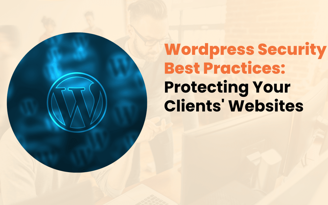
The digital landscape presents constant challenges for website owners and developers. In 2024, security firms reported that WordPress sites faced an average of 2,800 attacks per minute.
As the world’s most popular content management system, WordPress requires robust security measures to protect sensitive data and maintain site integrity.
The Current State of WordPress Security
WordPress powers 43% of all websites on the internet, making it an attractive target for cybercriminals. Recent studies indicate that 70% of WordPress installations are vulnerable to common attacks, yet many site owners remain unaware of these risks.
Understanding these vulnerabilities is the first step toward implementing effective security measures.

Primary Security Challenges in 2024
The most common threats WordPress sites face include:
- Automated brute force attacks
- Malware infections
- SQL injection attempts
- Cross-site scripting (XSS)
- Outdated software vulnerabilities
- Unauthorized access attempts
Essential Security Foundations
Hosting Environment Security
Your WordPress site’s security begins with your hosting environment. Quality hosting providers offer specialized WordPress environments with built-in security features. When selecting a host, consider these critical factors:
- Dedicated WordPress hosting environments
- Regular server-level security updates
- Advanced firewall configurations
- Built-in malware scanning
- Automated backup systems
Access Management and Authentication
Strong authentication systems serve as your first line of defense. Recent data shows that 81% of security breaches occur due to weak or stolen passwords. Implementing robust authentication measures significantly reduces this risk.
Required Password Policies:
- Minimum length: 12 characters
- Complex character combinations
- Regular password updates
- Unique credentials for each user
- Password manager compatibility

Advanced Security Configurations
Security Plugin Implementation
While WordPress core provides basic security features, additional protection through carefully selected security plugins is essential. Research shows that properly configured security plugins can prevent up to 99% of common attacks.
Key security plugin features should include:
- Real-time threat detection and prevention
- Regular malware scanning
- File integrity monitoring
- Security event logging
- IP blocking capabilities
Database Protection Measures
Your WordPress database contains valuable information that requires specific protection measures. Consider implementing these database security practices:
- Modified table prefix
- Limited database user privileges
- Regular backup schedules
- Prepared SQL statements
- SSL/TLS encryption for connections

Regular Maintenance Protocols
Security isn’t a one-time setup – it requires ongoing attention and maintenance. Establish these crucial maintenance routines:
Update Management
Updates play a vital role in security maintenance. Create a structured update schedule that includes:
- Core WordPress files
- Active themes
- Installed plugins
- PHP versions
- Server software
Security Monitoring
Implement comprehensive monitoring systems that track:
- Unusual login attempts
- File modifications
- Database changes
- Traffic patterns
- Security log entries

Client Education and Best Practices
Effective security requires informed clients. Our experience shows that well-trained clients reduce security incidents by up to 60%. Focus on these key areas during client training:
Essential Security Knowledge:
- Password management principles
- Safe content upload procedures
- User role management
- Security incident reporting
- Regular security assessment participation
Creating Security-Aware Teams
Build a culture of security awareness by:
- Providing regular security updates
- Sharing relevant security news
- Conducting periodic security reviews
- Offering ongoing support
- Maintaining open communication channels

Professional Security Services
At Designs by Dave O., we implement comprehensive security measures for all client websites. Our approach combines technical expertise with practical experience:
Standard Security Package
Every client receives:
- Initial security audit
- Custom security configuration
- Regular monitoring
- Incident response planning
- Ongoing support
Real-World Success Story
A recent client came to us after experiencing multiple security breaches. Our team:
- Performed complete security analysis
- Removed existing malware
- Implemented advanced protection
- Created monitoring systems
- Trained staff members
The result? Zero security incidents in the following year and improved site performance.

Long-Term Security Management
Effective security requires continuous attention and updates. Consider these ongoing strategies:
Regular Security Assessments
Maintain strong security through:
- Monthly vulnerability checks
- Quarterly security testing
- Annual policy reviews
- Regular backup verification
- System update compliance
Incident Response Strategy
Prepare for potential security events with:
- Documented response procedures
- Clear team responsibilities
- Communication protocols
- Recovery strategies
- Post-incident analysis

Conclusion
WordPress security requires careful attention to multiple aspects of your website’s infrastructure. By implementing strong security measures, maintaining regular updates, and educating users, you create a robust defense against potential threats.
The team at Designs by Dave O. understands the complexities of WordPress security. We’re ready to help assess your current security measures and implement improvements that protect your digital assets.
Contact us today for a comprehensive security evaluation of your WordPress website. Our security experts will create a custom protection plan that meets your specific needs while ensuring your site remains fast, functional, and secure.
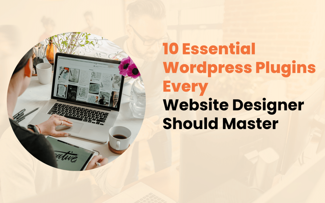
As professional website designers, we understand that WordPress serves as the backbone for millions of websites worldwide. While the platform’s core functionality is robust, plugins play a crucial role in extending its capabilities.
At Designs by Dave O., we’ve spent years testing and implementing various WordPress plugins across hundreds of client projects. Here’s our carefully curated list of must-have plugins that make a real difference in professional web design.
The Impact Of Plugin Selection
Before diving into specific plugins, it’s important to recognize why careful plugin selection matters. Every plugin you add to a WordPress site affects its performance, security, and maintenance requirements.
Professional designers need to balance functionality with site performance, ensuring that each plugin serves a specific purpose without compromising the site’s speed or security.
Key considerations when selecting plugins include:
- Code quality and regular updates
- Impact on page load times
- Compatibility with other plugins
- Security track record
- Support availability

Essential Plugins for Professional Web Design
1. Yoast SEO
Yoast SEO stands out as an indispensable tool for content optimization. This plugin goes beyond basic SEO functionality by offering:
- Real-time content analysis with actionable suggestions
- Advanced XML sitemap capabilities
- Social media preview customization
- Schema markup implementation
- Title and meta description templates
What sets Yoast apart is its ability to guide both designers and clients through SEO best practices. The intuitive interface makes it easier to explain SEO concepts to clients while ensuring their content meets search engine requirements.
2. WP Rocket
Page speed significantly impacts user experience and search rankings. WP Rocket addresses this crucial aspect through:
Advanced caching mechanisms that reduce server load Browser caching optimization Lazy loading for images and videos CDN integration capabilities
Our experience shows that WP Rocket can reduce page load times by 40-60% when properly configured, making it invaluable for professional sites.

3. Elementor Pro
As a page builder, Elementor Pro changes how designers approach WordPress development. Its standout features include:
- Responsive design controls
- Custom CSS integration
- Dynamic content support
- Professional template library
The plugin’s intuitive interface allows for rapid prototyping while maintaining clean code standards – a crucial factor for professional web development.
4. Wordfence Security
Website security cannot be an afterthought. Wordfence provides comprehensive protection through:
Advanced firewall capabilities Real-time threat detection Two-factor authentication Regular security scans
We’ve found Wordfence particularly effective in preventing brute force attacks and identifying vulnerable plugins before they cause issues.

5. WPForms
Contact forms are essential for business websites, and WPForms excels in this area by offering:
Drag-and-drop form builder Multiple form templates Payment gateway integration Survey and poll creation tools
The plugin’s ability to create complex forms while maintaining a user-friendly interface makes it particularly valuable for client projects.
6. BackupBuddy
Data protection is crucial in professional web design. BackupBuddy offers:
Scheduled automatic backups Multiple storage options Easy migration tools Quick restoration capabilities
We’ve relied on BackupBuddy countless times during site updates and migrations, making it an essential part of our toolkit.

7. WooCommerce
For e-commerce functionality, WooCommerce remains the gold standard. Key features include:
- Extensive payment gateway options
- Inventory management
- Shipping calculation tools
- Order tracking capabilities
The plugin’s extensive ecosystem of add-ons allows for customization to meet specific client needs.
8. Monster Insights
Data-driven decisions require proper analytics implementation. Monster Insights provides:
Simple Google Analytics integration E-commerce tracking User behavior analysis Custom reporting options
The ability to present clear analytics data to clients makes this plugin particularly valuable for professional designers.

9. ShortPixel Image Optimizer
Image optimization is crucial for site performance. ShortPixel offers:
Automatic image compression WebP conversion Bulk optimization tools Minimal quality loss
Our tests show that ShortPixel can reduce image sizes by up to 80% while maintaining visual quality.
10. Advanced Custom Fields (ACF)
For custom development work, ACF is indispensable. It provides:
- Flexible content management
- Custom field types
- Template building tools
- Relationship fields
ACF’s ability to create complex content structures while maintaining user-friendly interfaces makes it essential for professional development.

Implementation Best Practices
Successfully implementing these plugins requires attention to detail and proper configuration. Here are key considerations:
- Regular Updates
- Schedule monthly plugin updates
- Test updates on staging sites first
- Maintain backup points before updates
2. Performance Monitoring
- Track site speed before and after plugin installation
- Monitor server resource usage
- Regular performance audits
3. Security Measures
- Regular security scans
- Limited login attempts
- Strong password policies

Conclusion
The right combination of WordPress plugins can significantly improve website functionality while maintaining professional standards. At Designs by Dave O., we’ve refined our plugin selection through years of practical experience, ensuring each tool adds genuine value to our clients’ websites.
Remember that plugin selection should always align with specific project requirements – not every site needs all these plugins. Focus on selecting tools that serve your clients’ goals while maintaining site performance and security.
Need professional guidance on implementing these plugins or creating a custom WordPress solution? Contact our team at Designs by Dave O. for expert assistance in building effective, secure, and high-performing WordPress websites.
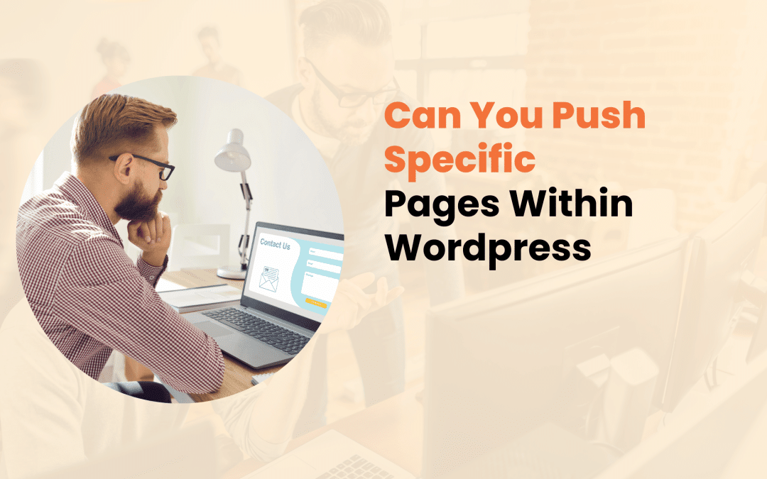
As a website owner or developer using WordPress, you might sometimes need to give certain pages more prominence than others. Whether it’s featuring a new product launch, highlighting a crucial service page, or ensuring your most valuable content reaches your visitors first, understanding how to prioritize specific pages in WordPress is essential for effective content management.
Page Prioritization in WordPress
Page prioritization in WordPress involves various techniques and strategies to make certain pages more visible or accessible to both users and search engines. This process goes beyond simply organizing your content—it’s about creating a strategic hierarchy that serves your business objectives while maintaining a smooth user experience.
Why Prioritize Specific Pages?
Different pages serve different purposes in your WordPress website’s ecosystem. Some common scenarios where page prioritization becomes crucial include:
- Featuring time-sensitive promotional content
- Highlighting key service offerings
- Promoting seasonal products or events
- Directing traffic to conversion-focused landing pages
- Showcasing important announcements or updates

Native WordPress Methods for Page Prioritization
WordPress offers several built-in features that allow you to control how your pages appear and their relative importance within your site structure.
1. Strategic Menu Positioning
Your website’s navigation menu is often the first point of interaction for visitors. WordPress allows you to:
- Arrange menu items in custom orders
- Create multi-level dropdown menus
- Add custom CSS classes for enhanced visibility
- Include featured images in menu items
2. Homepage Display Settings
WordPress provides flexible options for controlling your homepage content:
- Set a static page as your homepage
- Display your latest posts
- Create a custom homepage layout using page builders
- Feature specific content sections above the fold
3. Page Attributes and Ordering
The Page Attributes panel in WordPress enables you to:
- Assign parent-child relationships between pages
- Modify the page order through numerical values
- Apply custom templates for specific pages
- Control the page hierarchy

Technical Solutions for Effective Page Pushing
XML Sitemap Configuration
Your XML sitemap plays a crucial role in how search engines discover and prioritize your pages. Consider these technical aspects:
- Update frequencies
- Priority settings (0.0 to 1.0)
- Last modification dates
- Content categorization
WordPress SEO Plugin Implementation
Popular SEO plugins provide additional control over page prioritization:
Yoast SEO Features:
- Primary category designation
- Content importance indicators
- XML sitemap priority controls
- Breadcrumb navigation settings
Rank Math Capabilities:
- Advanced meta controls
- Schema markup options
- Content analysis tools
- Priority score assignments

Advanced Strategies for Page Prioritization
Internal Linking Architecture
Creating a strategic internal linking structure helps establish page hierarchy and distribute authority effectively:
- Link from high-authority pages to priority content
- Use descriptive anchor text
- Maintain a logical linking pattern
- Create content clusters around priority pages
Content Hierarchy Implementation
Establish a clear content hierarchy through:
- Strategic use of heading tags (H1-H6)
- Content depth and comprehensiveness
- Related content connections
- User engagement signals
Technical Considerations
When implementing page prioritization, pay attention to:
html
- <!– Example of priority page meta tags –>
- <meta name=”robots“ content=”index, follow“>
- <meta name=”priority“ content=”1.0“>
- <link rel=”canonical“ href=”https://example.com/priority-page“>

Best Practices and Common Pitfalls
Recommended Practices
To maintain effective page prioritization:
- Regularly review and update priority pages
- Monitor user engagement metrics
- Ensure mobile responsiveness
- Maintain consistent URL structures
- Keep priority content fresh and relevant
Common Mistakes to Avoid
- Over-prioritizing too many pages
- Neglecting mobile user experience
- Inconsistent internal linking
- Poor content organization
- Ignoring user behavior data

Tools for Effective Page Management
Several tools can help manage your WordPress page priorities:
Essential WordPress Plugins:
- Advanced Custom Fields
- Admin Menu Editor
- Page Builder tools
- Cache management solutions
Analytics and Monitoring:
- Google Analytics
- Google Search Console
- Heat mapping tools
- User behavior tracking

Conclusion
Managing page priorities in WordPress requires a balanced approach combining technical knowledge, strategic thinking, and user experience considerations. By implementing these methods and best practices, you can create a more effective content hierarchy that serves both your business goals and user needs.
Need expert help with your WordPress website? Our team at Designs by Dave O. specializes in creating and managing WordPress websites that perform. Contact us to discuss how we can help you implement these strategies effectively and create a more impactful online presence

Managing multiple online presences has become increasingly common for businesses and content creators alike. Whether you’re running different brands, targeting various niches, or separating your content streams, WordPress offers robust solutions for handling multiple blogs. This comprehensive guide will walk you through everything you need to know about running multiple blogs on WordPress, helping you make informed decisions for your digital presence.
WordPress Multi-Blog Options
WordPress provides two primary approaches to running multiple blogs: WordPress Multisite Network and separate WordPress installations. Each method has its distinct advantages and use cases, making it crucial to understand their differences before making a decision.
WordPress Multisite Network
A WordPress Multisite Network allows you to manage multiple websites from a single WordPress installation. This feature, introduced in WordPress 3.0, enables you to control numerous sites through one administrative dashboard. It’s particularly useful for organizations that want centralized management of their web properties.

Separate WordPress Installations
This traditional approach involves installing WordPress individually for each blog. While it requires more initial setup time, it offers complete independence and isolation between sites, which can be beneficial for security and customization purposes.
Setting Up Multiple Blogs in WordPress
Multisite Network Setup
Setting up a WordPress Multisite Network involves several technical steps:
- Backup your existing WordPress installation
- Enable the Multisite feature in wp-config.php
- Configure network settings
- Update your server configuration
- Set up individual sites within the network
Important Technical Requirements:
- Compatible hosting plan
- Proper server configuration
- Updated WordPress version
- Domain or subdomain availability
Individual Installations Method
For separate WordPress installations, consider these key factors:
- Dedicated hosting resources for each site
- Separate database management
- Independent domain configuration
- Individual SSL certificates
Benefits and Challenges
Key Benefits
- Content Organization
- Separate different topics effectively
- Target specific audiences
- Maintain distinct brand identities
- Management Flexibility
- Risk Management
- Isolated security concerns
- Independent backup systems
- Reduced cross-site vulnerabilities
Common Challenges
Managing multiple WordPress blogs comes with its share of challenges that require careful consideration:
Resource Management
- Server capacity requirements
- Database optimization needs
- Backup storage space
Administrative Overhead
- Regular updates across sites
- Security monitoring
- Content management
- User administration

Best Practices for Multiple WordPress Blogs
Content Management
Developing a systematic approach to content management is crucial when handling multiple blogs:
- Create an editorial calendar for each site
- Establish clear content guidelines
- Implement consistent posting schedules
- Maintain separate content teams if necessary
Security Measures
Protecting multiple WordPress sites requires comprehensive security protocols:
- Regular security audits
- Strong password policies
- Two-factor authentication
- Regular backup schedules
- Updated security plugins
Performance Optimization
To maintain optimal performance across all sites:
- Choose reliable hosting
- Implement caching solutions
- Optimize images and media
- Monitor resource usage
- Regular database maintenance
Technical Considerations
Hosting Requirements
Select hosting that provides:
- Adequate storage space
- Sufficient bandwidth
- Good server response times
- Regular backup services
- Technical support
Resource Management
Effective resource allocation is crucial for smooth operation:
- CPU usage monitoring
- Memory allocation
- Database optimization
- Backup storage planning
Maintenance Schedule
Implement a regular maintenance routine:
- Weekly plugin updates
- Monthly theme reviews
- Quarterly security audits
- Regular content audits
- Performance monitoring

Advanced Tips for Success
Plugin Management
Choose plugins carefully for each site:
- Essential functionality only
- Regular updates
- Compatible versions
- Resource efficiency
Backup Strategy
Implement a comprehensive backup plan:
- Automated daily backups
- Off-site storage
- Regular restoration tests
- Version control
Conclusion
Running multiple blogs on WordPress is entirely feasible with proper planning and management. Whether you choose a Multisite Network or separate installations depends on your specific needs, technical capabilities, and management preferences. The key to success lies in careful planning, consistent maintenance, and following best practices for security and performance.
For businesses looking to expand their online presence through multiple WordPress blogs, professional assistance can make the process smoother and more efficient. Our team at Designs by Dave O. specializes in WordPress development and can help you set up and manage multiple blogs effectively.
Ready to start your multi-blog journey? Contact our expert team to discuss your specific requirements and find the best solution for your business needs.

In today’s digital world, proper image sizing stands as a cornerstone of successful WordPress websites. Whether you’re running a business site, blog, or e-commerce platform, understanding image dimensions isn’t just about aesthetics – it’s about creating an exceptional user experience while maintaining technical excellence.
This guide covers everything you need to know about choosing the right image sizes for your WordPress website.
the Impact of Image Sizes on Website Performance
Website loading speed remains a critical factor in user satisfaction and search engine rankings. Studies show that 47% of users expect websites to load within 2 seconds, and images typically constitute 50-60% of a webpage’s total size.
When you choose appropriate image sizes, you’re not just improving visual appeal – you’re directly influencing your site’s success.
Key consequences of improper image sizing include:
- Increased page load times
- Higher bounce rates
- Reduced search visibility
- Poor mobile user experience
- Excessive storage usage
- Increased hosting costs

Standard WordPress Image Dimensions Explained
WordPress automatically generates multiple versions of each uploaded image, serving different purposes across your site. Understanding these default sizes helps you make informed decisions about your visual content.
Thumbnail Images (150 x 150 pixels)
These compact images serve specific purposes:
- Perfect for user avatars
- Ideal for post previews in grids
- Suitable for sidebar widgets
- Efficient for category thumbnails
Medium Images (300 x 300 pixels)
Medium-sized images offer versatility:
- Blog post preview images
- Sidebar featured content
- Category page headers
- Secondary product images
Large Images (1024 x 1024 pixels)
These full-sized images maintain quality while managing file size:
- Main blog post images
- Portfolio showcases
- Primary product photos
- Featured content displays

Optimal Dimensions for Different Website Elements
Header Images and Hero Sections
Your website’s header creates the first impression. For modern WordPress themes, aim for 1920 x 1080 pixels. This resolution delivers crystal-clear visuals on most desktop screens while maintaining reasonable file sizes.
For hero sections with text overlays, ensure sufficient space around the focal points to accommodate your message.
Featured Blog Images
Blog post featured images require careful consideration. The recommended size of 1200 x 630 pixels ensures:
- Consistent display across social media platforms
- Sharp appearance on high-resolution screens
- Appropriate file size for quick loading
- Suitable dimensions for RSS feeds
E-commerce Product Images
Product photography demands precision. Follow these guidelines:
- Main product images: 800 x 800 pixels (1:1 ratio)
- Gallery thumbnails: 300 x 300 pixels
- Zoom-enabled images: 2000 x 2000 pixels
- Category thumbnails: 300 x 300 pixels

Choosing the Right Image File Formats
JPEG
- Best for photographs and complex images with many colors
- Offers excellent compression while maintaining visual quality
- Ideal for featured images and blog post content
PNG
- Perfect for images requiring transparency
- Best for logos and graphics with text
- Suitable for images with sharp edges and minimal color variation
WebP
- Modern format with superior compression
- Excellent quality-to-size ratio
- Growing browser support
- Ideal for future-proofing your image strategy

Best Practices for Image Implementation
1. Maintain Aspect Ratios
Consistent aspect ratios create visual harmony across your site. Common ratios include:
- 16:9 for header images
- 1:1 for product photos
- 4:3 for standard content images
2. Mobile-First Considerations
With mobile traffic dominating internet usage, prioritize mobile-friendly image sizes:
- Test images across different devices
- Use responsive image techniques
- Consider implementing lazy loading
- Provide appropriate fallback options
3. Image Compression Techniques
Implement these compression strategies:
- Use WordPress plugins for automatic compression
- Compress images before uploading
- Monitor image quality after compression
- Batch process existing image libraries

Troubleshooting Common Image Issues
Resolution Problems
- Blurry images on high-resolution displays
- Pixelation after resizing
- Inconsistent scaling across devices
Storage Limitations
- Exceeded hosting storage quotas
- Slow backup processes
- Increased hosting costs
Performance Issues
- Slow page loading times
- High bandwidth usage
- Poor mobile performance
Practical Solutions:
- Regular image library audits
- Implementing image management plugins
- Using content delivery networks (CDNs)
- Setting up automated compression workflows

Conclusion
Selecting appropriate image sizes for your WordPress website requires balancing quality with performance. By following these guidelines and best practices, you’ll create a visually appealing website that loads quickly and functions smoothly across all devices. Remember that image optimization is an ongoing process – regularly review and adjust your approach based on user feedback and site performance metrics.
Need professional assistance with your WordPress website? Our team at Designs by Dave O. specializes in creating beautiful, high-performing websites. Contact us to learn how we can help improve your site’s visual appeal and technical performance.

In today’s digital landscape, having a strong search engine presence isn’t just about creating great content – it’s also about helping search engines understand your content better. FAQ schema markup is a powerful tool that can improve your website’s visibility in search results and provide better value to your visitors.
This comprehensive guide will walk you through the process of adding FAQ schema to your WordPress website using Elementor, ensuring your content stands out in search results.
FAQ Schema Markup and Its Impact
FAQ schema is a specific type of structured data that tells search engines your content contains questions and answers. When implemented correctly, it can lead to enhanced search results with expandable questions and answers directly in Google’s search results pages (SERPs).
The benefits of implementing FAQ schema include:
- Increased SERP real estate
- Higher click-through rates
- Better visibility for your content
- Improved user experience
- Potential voice search advantages

Prerequisites for Adding FAQ Schema
Before diving into the implementation process, ensure you have:
- A WordPress website with Elementor installed
- Current WordPress version (6.0 or higher recommended)
- Admin access to your website
- Basic understanding of your website’s structure
Pro Tip: Always create a backup of your website before making any significant changes to its structure or code.
Method 1: Using Elementor Pro’s Native FAQ Widget
Elementor Pro includes a built-in FAQ widget that automatically generates the required schema markup. Here’s how to use it:
- Open your page in Elementor Editor
- Search for the “FAQ” widget in the elements panel
- Drag and drop the widget to your desired location
- Add your questions and answers
- Customize the styling to match your website’s design
The native FAQ widget automatically generates valid schema markup, making it the simplest implementation method. However, you’ll need Elementor Pro to access this feature.

Method 2: Installing and Configuring Schema Plugins
If you’re using Elementor’s free version or prefer more control over your schema markup, you can use dedicated schema plugins. Here’s a detailed walkthrough:
Step 1: Choose and Install a Schema Plugin
Popular options include:
- Schema Pro
- Rank Math
- Yoast SEO (Premium)
- Schema & Structured Data for WP
Step 2: Configuration Process
- Install and activate your chosen plugin
- Navigate to the plugin’s settings
- Look for the FAQ schema section
- Enable FAQ schema support
- Configure global settings if available
Step 3: Adding FAQ Schema to Your Content
Once your plugin is configured, you can add FAQ schema to your Elementor pages:
- Create your FAQ content using Elementor’s text editor
- Open your schema plugin’s interface
- Select FAQ as your schema type
- Map your questions and answers
- Save and test your implementation

Best Practices for FAQ Implementation
Creating effective FAQ content requires more than just technical implementation. Here are essential best practices to follow:
Content Guidelines:
- Keep questions clear and concise
- Provide detailed, accurate answers
- Use natural language
- Address real user queries
- Update content regularly
Technical Considerations:
- Limit the number of FAQs per page (8-12 recommended)
- Ensure mobile responsiveness
- Maintain consistent formatting
- Include relevant internal links
- Use proper heading structure

Testing Your FAQ Schema Implementation
After adding FAQ schema, it’s crucial to verify its correct implementation:
Using Google’s Rich Results Test:
- Visit Google’s Rich Results Test tool
- Enter your page URL or paste your code
- Analyze the results
- Fix any reported errors
- Monitor implementation in Search Console
Common Issues and Solutions:
If you encounter issues, check for:
- Invalid markup structure
- Missing required fields
- Duplicate schema
- Formatting errors
- Mobile compatibility issues

Advanced Tips for FAQ Schema Success
To get the most out of your FAQ schema implementation:
- Monitor Performance
- Track click-through rates
- Analyze user engagement
- Review search console data
- Regular Maintenance
- Update answers when needed
- Add new relevant questions
- Remove outdated information
- Check for technical errors
- Content Strategy
- Align FAQs with user intent
- Include relevant keywords naturally
- Structure content logically
- Ensure mobile-friendly formatting

Conclusion
Adding FAQ schema to your WordPress Elementor website is a valuable investment in your site’s SEO and user experience. Whether you choose to use Elementor Pro’s built-in features or opt for a dedicated schema plugin, proper implementation can significantly improve your search visibility and provide better value to your visitors.
Remember that successful FAQ schema implementation is an ongoing process. Regular monitoring, updating, and refinement of your FAQs will ensure continued effectiveness and value for your website visitors.
Need professional help implementing FAQ schema or improving your website’s overall SEO performance? Our team at Designs by Dave O. specializes in technical SEO implementations and WordPress optimizations. Contact us to discuss how we can help improve your website’s search visibility and user experience.

Local WordPress development environments are essential tools for web developers and designers who want to test, build, and modify websites without affecting live servers. However, there may come a time when you need to remove these local installations, whether to free up space, resolve conflicts, or start fresh.
How Can I Uninstall Local WordPress
This comprehensive guide will walk you through the process of properly uninstalling local WordPress installations while maintaining data integrity and preventing common issues.
Local WordPress Installations
Before diving into the uninstallation process, it’s crucial to understand how local WordPress setups work. Local WordPress installations typically consist of three main components:
- Web server software (Apache/Nginx)
- Database server (MySQL/MariaDB)
- PHP installation
These components are usually bundled in development environments such as:
- XAMPP
- MAMP
- Local by Flywheel
- DesktopServer
- Docker containers
Each environment stores WordPress files and databases differently, making it essential to follow environment-specific steps during uninstallation.

Pre-Uninstallation Steps: Protecting Your Work
Before removing your local WordPress installation, take these precautionary measures to safeguard important data:
1. Backup Essential Files
Create copies of:
- WordPress theme files
- Custom plugins
- Uploaded media
- Configuration files
- Database dumps
2. Document Your Setup
Record important details such as:
- Database names and credentials
- Custom configuration settings
- Plugin lists and settings
- Theme modifications
3. Verify Live Site Independence
Ensure your live websites aren’t dependent on local resources by:
- Checking for hardcoded local URLs
- Confirming backup functionality
- Testing all site features

Step-by-Step Uninstallation Process
Phase 1: Stopping Local Servers
Before removing any files, properly shut down all running services:
- Access your local environment’s control panel
- Stop the Apache/Nginx web server
- Stop the MySQL/MariaDB database server
- Close any related applications
Phase 2: Removing WordPress Files
Navigate to your local WordPress installation directory and remove:
- [Root Directory]
- ├── wp-admin/
- ├── wp-content/
- ├── wp-includes/
- └── Individual WordPress files
Important Note: If you’re using version control, make sure to properly remove the repository settings to prevent future conflicts.
Phase 3: Database Cleanup
Access your database management tool (phpMyAdmin or similar) and:
- Identify WordPress-related databases
- Create final backups if needed
- Drop the associated databases
- Remove database users

Phase 4: Environment-Specific Steps
For XAMPP:
- Navigate to the XAMPP installation directory
- Remove the WordPress folder from htdocs
- Clean httpd.conf and php.ini if modified
- Remove virtual hosts if configured
For MAMP:
- Access the MAMP document root
- Delete WordPress installation folder
- Clear MAMP preferences
- Remove custom host configurations
For Local by Flywheel:
- Use the application’s interface to remove the site
- Clean up remaining site files
- Reset site configurations
- Clear application cache

Common Challenges and Solutions
Permission Issues
When dealing with permission errors:
- Check file ownership
- Verify read/write permissions
- Use appropriate system commands
- Consider safe mode operations
Database Connection Problems
If experiencing database-related issues:
- Confirm server status
- Check port configurations
- Verify user privileges
- Clear persistent connections
Residual Files
To handle leftover files:
- Search for hidden directories
- Check system temp folders
- Clear browser caches
- Remove environment variables

Best Practices for Future Local Development
Organized Development Structure
Maintain a clean development environment by:
- Creating separate projects for each client
- Using consistent naming conventions
- Implementing proper file structure
- Managing resources efficiently
Version Control Integration
Incorporate version control by:
- Setting up Git repositories
- Creating meaningful commits
- Managing branches effectively
- Documenting changes properly
Environment Management
Improve your workflow with:
- Regular maintenance schedules
- Resource monitoring
- Performance optimization
- Security Protocols

Professional Recommendations
Based on extensive experience with WordPress development, we recommend:
- Regular Environment Audits
- Review active installations
- Monitor resource usage
- Update development tools
- Clean unnecessary files
- Systematic Approach
- Follow standard procedures
- Document all changes
- Maintain backup protocols
- Test thoroughly
- Future-Proof Setup
- Use scalable solutions
- Implement backup systems
- Plan for growth
- Consider automation

Conclusion
Properly uninstalling local WordPress installations requires attention to detail and a systematic approach. Following this guide ensures a clean removal while protecting valuable development assets. Regular maintenance and proper documentation make future installations and removals more manageable.
Need expert assistance with your WordPress development? At Designs by Dave O., our team specializes in WordPress development, custom solutions, and professional web services. Contact us to discuss your project needs and discover how we can help create and maintain your ideal web presence.

In the intricate world of WordPress development, understanding serialized data is crucial for maintaining a healthy, well-functioning website. Whether you’re a business owner managing your site or a developer working on complex WordPress projects, grasping this concept can save you from potential headaches and database issues.
What Does It Mean Serialized Data On WordPress
Let’s dive deep into what serialized data means in WordPress and why it matters for your website’s success.
Serialized Data Basics
Serialized data is a specific way WordPress stores complex information in its database. Think of it as a method of converting arrays and objects into a long string of text that can be easily saved and retrieved later.
This process is essential because WordPress’s database structure primarily handles simple text strings, but modern websites often need to store more complicated data structures.
Here’s what happens during serialization:
- Complex data structures are converted into a string format
- The string includes markers for data types and lengths
- Special characters are preserved within the data
- The format allows for nested arrays and objects
For example, when you save settings for a plugin, WordPress might store them like this:
a:3:{s:5:”title”;s:10:”My Website”;s:5:”theme”;s:4:”dark”;s:7:”widgets”;a:2:{i:0;s:4:”news”;i:1;s:8:”calendar”;}}

The Role of Serialized Data in WordPress
Serialized data serves several critical functions in WordPress websites. Most notably, it appears in these common scenarios:
Plugin and Theme Settings
WordPress plugins and themes often need to store complex configuration settings. Rather than creating multiple database entries, they use serialization to store all settings in a single field. This approach helps maintain database efficiency and keeps related settings together.
User Metadata
Your website’s user information often contains arrays of preferences, permissions, and custom data. Serialization makes it possible to store all this information efficiently while maintaining the relationships between different data points.
Custom Post Types and Fields
When working with custom post types or advanced custom fields, serialized data becomes particularly important. It allows for storing structured data that goes beyond simple text or numbers.

Common Scenarios Where You’ll Encounter Serialized Data
1. Website Migrations
During website migrations, serialized data requires special attention. A simple search and replace operation can break the carefully structured format, leading to functionality issues. Professional migration tools are designed to handle these cases correctly.
2. Database Management
When performing database operations, you’ll find serialized data in several tables:
- wp_options: Stores site-wide settings
- wp_postmeta: Contains post-related metadata
- wp_usermeta: Holds user-specific information
3. Troubleshooting
Many common WordPress issues stem from corrupted serialized data. Understanding this concept helps in:
- Identifying the root cause of plugin malfunctions
- Resolving theme setting issues
- Fixing database migration problems

Potential Issues with Serialized Data
Working with serialized data presents unique challenges that require careful attention. Here are the most common issues you might encounter:
Database Corruption Risks
Improper handling of serialized data can lead to database corruption. This typically happens when:
- Direct database edits break the serialization format
- Failed plugin updates leave partial data
- Incorrect search and replace operations modify string lengths
Migration Challenges
Moving WordPress sites between domains or servers requires special consideration for serialized data. The process must maintain:
- Correct string lengths
- Proper escape sequences
- Data structure integrity

Best Practices for Managing Serialized Data
To maintain your WordPress website’s health, follow these essential practices:
- Regular Backups Create comprehensive backups before any database modifications. This provides a safety net if something goes wrong during data manipulation.
- Use Specialized Tools When working with serialized data, rely on purpose-built tools such as:
- WP-CLI for command-line operations
- Professional migration plugins
- Database management tools with serialization support
3. Professional Oversight For critical operations involving serialized data, consider working with experienced WordPress developers who understand:
- The implications of data structure changes
- Proper backup and restoration procedures
- Safe update and migration techniques

Maintaining Website Health
Regular maintenance of your WordPress site should include attention to serialized data. Here’s a practical maintenance checklist:
- Monitor Database Size
- Track the growth of tables containing serialized data
- Remove unnecessary stored options
- Clean up post revisions and related metadata
2.Update Carefully
- Test updates in a staging environment
- Backup before major changes
3. Verify data integrity after updates
- Document Custom Implementations
- Keep records of custom serialized data structures
- Document any modifications to standard WordPress behavior
- Maintain backup procedures specific to your setup

Conclusion
Understanding serialized data in WordPress is essential for maintaining a robust and reliable website. While the technical aspects might seem complex, recognizing its importance and following best practices will help prevent common issues and ensure your site’s smooth operation.
Remember that proper handling of serialized data is crucial for:
- Website stability
- Successful migrations
- Efficient data storage
- Problem-free updates
When in doubt about handling serialized data, particularly during critical operations like site migrations or major updates, consulting with WordPress professionals can save time and prevent potential issues that could affect your website’s functionality.
Need expert help with your WordPress website? Our team at Designs by Dave O. specializes in professional WordPress development and maintenance. Contact us to ensure your website’s data is handled with the care and expertise it deserves.
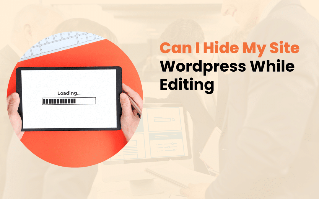
Making changes to your WordPress site while it’s live can be like renovating a store during business hours – it’s messy, potentially confusing for visitors, and might give the wrong impression about your brand. At Designs by Dave O., we frequently guide clients through the process of implementing maintenance mode effectively.
Can I Hide My Site WordPress While Editing?
This comprehensive guide will walk you through everything you need to know about hiding your WordPress site while making updates.
The Need for Maintenance Mode
When you’re updating your WordPress site, visitors might encounter half-finished pages, broken layouts, or error messages. These encounters can damage your site’s reputation and credibility.
Professional web developers always ensure their work remains hidden until it’s ready for public viewing.
Here’s why hiding your site during updates is crucial:
- Professional Image Maintenance: Incomplete changes can make your business appear unprofessional
- User Experience Protection: Visitors won’t encounter broken features or confusing layouts
- Security Enhancement: Reduced vulnerability during database updates or plugin installations
- SEO Protection: Search engines won’t index incomplete or broken pages

Built-in WordPress Maintenance Mode Features
WordPress comes with basic maintenance mode capabilities built into its core functionality. When major updates run, WordPress automatically displays a simple message informing visitors that the site is undergoing maintenance.
Default WordPress Maintenance Message:
Briefly unavailable for scheduled maintenance. Check back in a minute.
While this basic feature serves its purpose for quick updates, it lacks customization options and professional appeal. WordPress 5.6 and newer versions include a basic “Coming Soon” feature, which offers slightly more flexibility but still has limitations.
Limitations of Native Solutions:
- Minimal customization options
- Basic design capabilities
- No advanced features like email collection
- Limited control over access permissions

Professional Solutions for Site Maintenance
Professional maintenance mode solutions offer comprehensive features that help maintain your brand identity while keeping your site hidden. Here are some effective options:
Popular Maintenance Mode Plugins
SeedProd:
- Fully customizable maintenance pages
- Email list building capabilities
- Social media integration
- Access controls for specific users
WP Maintenance Mode:
- Countdown timer functionality
- Mobile-responsive designs
- Simple configuration options
- Free and premium versions available
Coming Soon Page & Maintenance Mode:
- Multiple template options
- SEO settings management
- Google Analytics integration
- Custom CSS capabilities

Custom Development Solutions
For businesses requiring unique functionality, custom maintenance page development offers complete control over:
- Brand alignment
- Functionality
- User experience
- Integration with existing systems
Implementation Guide: Setting Up Maintenance Mode
Follow these steps to implement maintenance mode effectively on your WordPress site:
1. Preparation Phase
- Back up your entire website
- Choose your preferred maintenance mode solution
- Plan your maintenance page content
- Prepare necessary brand assets
2. Installation and Configuration
Begin by installing your chosen maintenance mode solution:
- Navigate to Plugins > Add New in your WordPress dashboard
- Search for your preferred maintenance mode plugin
- Click Install Now, then Activate
- Access the plugin’s settings through your dashboard

3. Design Your Maintenance Page
Create a maintenance page that aligns with your brand:
- Add your logo and brand colors
- Write clear, informative content explaining the situation
- Include estimated completion time when possible
- Provide alternative contact methods
- Consider adding a newsletter signup form
4. Testing and Implementation
Before activating maintenance mode:
- Preview your maintenance page across different devices
- Test access controls for team members
- Verify that search engines receive proper status codes
- Ensure tracking tools continue functioning
Advanced Considerations for Business Websites
Managing Client Access
Create exclusive access points for clients and team members:
- Set up IP-based restrictions
- Create temporary access URLs
- Implement password protection for specific users
SEO Considerations During Maintenance
Proper SEO management during maintenance is crucial:
- Use appropriate HTTP status codes (503 for temporary maintenance)
- Set reasonable retry-after headers
- Maintain robots.txt configurations
- Monitor Google Search Console for issues

Email Collection Strategy
Turn downtime into an opportunity:
- Create compelling signup forms
- Offer notifications when the site returns
- Provide valuable content in exchange for email addresses
Best Practices for Site Maintenance
To ensure successful site maintenance:
- Schedule updates during low-traffic periods
- Communicate maintenance windows in advance
- Keep maintenance periods as brief as possible
- Test all functionality before going live
- Maintain regular backups throughout the process
When to Seek Professional Help
While many WordPress maintenance tasks are manageable independently, complex updates might require professional assistance. Consider working with experts when:
- Implementing major design changes
- Migrating to a new host
- Updating critical business functions
- Managing complex e-commerce systems

Conclusion
Hiding your WordPress site during updates is essential for maintaining professional standards and protecting your brand reputation. Whether you choose a plugin solution or custom development, the key is planning ahead and implementing the right tools for your specific needs.
At Designs by Dave O., we understand the importance of smooth, professional website maintenance. Our team of experts can help you implement these solutions effectively, ensuring your site updates happen seamlessly without disrupting your business operations.
Need assistance with your WordPress site maintenance? Contact our team today to discuss how we can help maintain and improve your online presence while keeping your professional image intact.

In today’s digital landscape, establishing an online store has become crucial for business success. With e-commerce sales projected to reach $6.3 trillion by 2024, choosing the right platform for your online store is more important than ever.
WordPress, powering over 43% of all websites, emerges as a compelling option for e-commerce – but is it the right choice for your business? Let’s explore the capabilities, benefits, and practical considerations of using WordPress for your online store.
WordPress Ecommerce Capabilities
WordPress has evolved far beyond its blogging roots to become a robust e-commerce solution. At the heart of WordPress e-commerce lies WooCommerce, the platform’s most popular e-commerce plugin, currently supporting over 5 million online stores worldwide.
This free, open-source solution manages everything from product listings to checkout processes, making it a go-to choice for businesses of all sizes.

Core Features of WordPress Ecommerce:
- Comprehensive product management systems
- Multiple payment gateway integrations
- Inventory tracking and management
- Order processing and fulfillment tools
- Customer account management
- Marketing and promotional tools
While WooCommerce leads the pack, other notable plugins like Easy Digital Downloads and WP eCommerce offer specialized solutions for specific business needs, such as digital product sales or subscription-based models.
Benefits of Choosing WordPress for Your Online Store
Cost-Effectiveness
Unlike proprietary platforms that charge monthly fees, WordPress and WooCommerce are free to use. Your primary expenses will be hosting, domain registration, and any premium themes or plugins you choose to implement. This cost structure makes it particularly attractive for small businesses and startups.
Customization and Control
WordPress offers unparalleled flexibility in design and functionality. Whether you’re selling physical products, digital downloads, or services, you can tailor your store to match your exact requirements. The platform’s extensive theme and plugin ecosystem allows for endless possibilities in:
- Store design and layout
- Product presentation
- Checkout processes
- Customer communication
- Marketing integrations

SEO and Marketing Advantages
WordPress comes with built-in SEO benefits that can help your store rank better in search results. The platform offers:
- Clean, search-engine-friendly URLs
- Customizable meta descriptions and titles
- Mobile responsiveness
- Fast loading speeds (with proper optimization)
- Easy integration with marketing tools
Essential Features for Success
Payment Processing
WordPress e-commerce solutions support various payment methods, from traditional credit cards to modern digital wallets. Popular payment gateways include:
- PayPal
- Stripe
- Square
- Amazon Pay
- Local payment options
Security Measures
Security is paramount for online stores. WordPress offers robust security features through various plugins and integrations:
- SSL certificate support
- Secure payment processing
- Regular security updates
- Backup solutions
- Fraud prevention tools

Mobile Commerce Support
With mobile commerce accounting for over 70% of e-commerce sales, WordPress themes and plugins are designed to be mobile-responsive, ensuring your store performs flawlessly across all devices.
Practical Considerations and Challenges
While WordPress offers numerous advantages for ecommerce, there are several factors to consider:
Performance Management
A successful online store must maintain fast loading speeds and smooth performance. This requires:
- Quality hosting services
- Regular maintenance
- Performance optimization
- Content delivery networks (CDN)
- Image optimization
Maintenance Requirements
Running a WordPress ecommerce site demands ongoing attention to:
- Regular updates (core, themes, and plugins)
- Security monitoring
- Backup management
- Performance optimization
- Content updates

Getting Started with WordPress E-commerce
1. Choose a Reliable Host
Select a hosting provider that specializes in WordPress and offers:
- Dedicated resources
- Strong security features
- Regular backups
- Technical support
- SSL certificates
2. Install Essential Components
- WordPress core installation
- WooCommerce or your chosen e-commerce plugin
- Security plugins
- Backup solutions
- SEO tools
3. Configure Your Store
Set up crucial elements including:
- Payment gateways
- Shipping options
- Tax calculations
- Product categories
- Customer accounts

4. Design Your Store
Focus on creating an engaging shopping experience through:
- Clean, professional design
- Easy navigation
- Clear product presentations
- Mobile responsiveness
- Fast checkout process
Real-World Success Story
Consider the case of artisanal coffee retailer Bean & Brew, which migrated from a traditional website to WordPress eCommerce. Within six months, they experienced:
- 45% increase in online sales
- 30% reduction in cart abandonment
- 60% increase in mobile purchases
- Significant reduction in maintenance costs

Professional Implementation Considerations
While WordPress ecommerce is accessible to DIY users, professional implementation often proves valuable for:
- Custom feature development
- Advanced security setup
- Performance optimization
- Integration with existing systems
- Training and support
Conclusion
WordPress stands as a capable and flexible ecommerce solution suitable for businesses of various sizes. Its combination of cost-effectiveness, customization options, and robust features makes it a compelling choice for online retail. However, success requires careful planning, ongoing maintenance, and potentially professional support to ensure optimal performance and security.
For businesses considering WordPress e-commerce, the key lies in understanding your specific needs and resources. Whether you choose to implement it yourself or work with professionals, WordPress provides the tools and flexibility to create a successful online store that grows with your business.
Want to explore how WordPress can work for your e-commerce needs? Our team at Designs by Dave O. specializes in creating custom WordPress e-commerce solutions that align with your business goals. Contact us today to discuss your project and discover how we can help bring your online store to life.
In the ever-evolving landscape of web design, creating an engaging and intuitive user experience is paramount. As websites become more complex and feature-rich, designers and developers must find ways to present information and functionality without overwhelming users. This is where modals, popups, and lightboxes come into play.
These powerful UI elements, when used correctly, can significantly improve website usability and user engagement.
In this comprehensive guide, we’ll explore the world of modals, popups, and lightboxes, discussing their definitions, best practices, and how to implement them effectively in your web projects.
Understanding Popups: More Than Just Annoying Interruptions
Popups have come a long way since their early days as intrusive advertising tools. Today, when implemented thoughtfully, popups can be valuable assets in improving user experience and achieving business goals.
What Are Popups?
Popups are UI elements that appear over the main content of a webpage, typically to display information, gather user input, or prompt an action. They can be triggered by various events, such as page load, user interaction, or time-based conditions.
Types of Popups
- Entry Popups: These appear when a user first lands on a page.
- Exit-Intent Popups: Triggered when a user shows signs of leaving the site.
- Timed Popups: Appear after a user has spent a certain amount of time on the page.
- Scroll-Triggered Popups: Activated when a user scrolls to a specific point on the page.
Best Practices for Using Popups
To ensure popups enhance rather than detract from the user experience, consider the following best practices:
- Use popups sparingly and purposefully
- Offer clear value to the user
- Provide an easy way to dismiss the popup
- Ensure mobile-friendliness
- Consider timing and context
- A/B test different designs and copy
Common Use Cases for Popups
Popups can serve various purposes in web design, including:
- Newsletter signups
- Special offers or promotions
- Customer feedback collection
- Important announcements
- Age verification for restricted content

Modals: Focused Interaction Windows
Modals are similar to popups but offer a more immersive and focused user experience. They’re designed to capture the user’s full attention and often require some form of interaction before the user can return to the main content.
Characteristics of Modals
- Overlay the entire page
- Disable interaction with the main content
- Usually require user action to dismiss
- Can contain complex forms or information
When to Use Modals
Modals are particularly useful for:
- Displaying detailed information about a product or service
- Presenting terms and conditions or privacy policies
- Showing confirmation dialogs for important actions
- Collecting user input through forms
- Presenting step-by-step tutorials or onboarding processes
Best Practices for Designing Effective Modals
To create modals that enhance rather than hinder user experience, keep these tips in mind:
- Keep content concise and focused
- Provide clear navigation and dismissal options
- Ensure keyboard accessibility
- Use animation judiciously to guide user attention
- Consider the modal’s size and placement on different devices

Lightboxes: Showcasing Visual Content
Lightboxes are specialized UI elements primarily used for displaying images or videos in a focused, immersive manner. They dim the background content and present the media in a larger format, allowing users to view details without navigating away from the current page.
Key Features of Lightboxes
- Dimmed background to focus attention on the content
- Enlarged view of images or videos
- Navigation controls for browsing through multiple items
- Smooth transitions and animations
Implementing Lightboxes Effectively
To make the most of lightboxes in your web design:
- Ensure fast loading times for a seamless experience
- Provide intuitive navigation controls
- Offer high-resolution images when possible
- Include relevant information alongside the visual content
- Ensure mobile responsiveness for touch-based interactions

Related UI Elements: Expanding the Toolkit
While modals, popups, and lightboxes are powerful tools, there are other related UI elements that can further enhance user experience:
Tooltips
Tooltips are small information boxes that appear when a user hovers over or clicks on an element. They’re perfect for providing brief explanations or additional context without cluttering the main interface.
Popovers
Popovers are similar to tooltips but typically contain more information and may include interactive elements. They’re useful for displaying additional details or options related to a specific element on the page.
Alerts
Alerts are temporary messages that appear to inform users about important events or changes. They can be dismissible or timed and are often used for system notifications or feedback on user actions.
Dialogs
Dialogs are similar to modals but are generally used for shorter, more focused interactions. They’re commonly used for quick confirmations or simple input requests.
Implementing Modals, Popups, and Lightboxes in WordPress
For WordPress users, there are several ways to incorporate these UI elements into your website:
Native WordPress Solutions
WordPress core and many themes offer built-in functionality for creating simple modals or popups. These can be customized using CSS and JavaScript to fit your specific needs.
Popular Plugins
There are numerous plugins available for creating modals, popups, and lightboxes in WordPress. Some popular options include:
- Popup Maker
- OptinMonster
- Elementor Pro
- WP Popup Builder

Custom Development
For more advanced functionality or seamless integration with your theme, custom development might be the best option. This allows for greater control over the design and behavior of your UI elements.
User Experience Considerations
When implementing modals, popups, and lightboxes, it’s crucial to prioritize user experience:
- Balance functionality with user-friendliness: Ensure that these elements add value without being intrusive.
- Address accessibility concerns: Make sure your UI elements are keyboard-navigable and screen reader-friendly.
- Optimize performance: Large or poorly optimized elements can slow down your site, negatively impacting user experience.
- Gather and analyze user feedback: Use analytics and user testing to refine your implementation over time.
Common Mistakes to Avoid
To ensure your modals, popups, and lightboxes enhance rather than detract from user experience, avoid these common pitfalls:
- Overusing popups, leading to user frustration
- Poor timing or targeting of popups
- Lack of clear dismissal options
- Ignoring mobile user experience
- Using modals for content that doesn’t require focused attention
- Implementing lightboxes that are slow to load or difficult to navigate

Future Trends in UI Design
As web technologies continue to evolve, we can expect to see new developments in how modals, popups, and lightboxes are implemented and used:
- Increased use of AI for personalized timing and content
- Integration with voice interfaces and gesture controls
- More sophisticated animations and transitions
- Greater emphasis on accessibility and inclusive design
Conclusion
Modals, popups, and lightboxes are powerful tools in the web designer’s arsenal. When used thoughtfully and implemented skillfully, they can significantly improve user experience, increase engagement, and help achieve business goals. By understanding the unique characteristics and best practices for each of these UI elements, you can create websites that are not only visually appealing but also highly functional and user-friendly.
Remember, the key to success lies in striking the right balance between providing valuable information or functionality and respecting the user’s experience. As you implement these elements in your web projects, always keep your users’ needs and preferences at the forefront of your design decisions.
One tool that has significantly improved the way we structure and manage content in WordPress is the Custom Post Type (CPT). At Designs by Dave O., we’ve seen firsthand how CPTs can transform websites from simple blogs into powerful, dynamic platforms. But what exactly is a Custom Post Type, and why should you care? Let’s dive in.
WordPress Content Structure
Before we explore Custom Post Types, it’s essential to understand the basic content structure of WordPress. By default, WordPress offers a few standard post types:
- Posts: Used for blog entries and time-sensitive content
- Pages: Ideal for static, hierarchical content
- Attachments: For media files like images and documents
While these default post types serve many purposes, they can be limiting for websites with diverse content needs. This is where Custom Post Types come into play.
Custom Post Types: The Game Changer
A Custom Post Type is a content type that you define. It allows you to create and manage different types of content, each with its own set of characteristics and behaviors. Think of it as creating a new category of content that’s distinct from regular posts and pages.
For example, if you’re running a recipe website, instead of trying to fit your recipes into the standard ‘post’ format, you could create a custom ‘Recipe’ post type. This would allow you to:
- Add specific fields for ingredients, cooking time, and nutritional information
- Create a unique layout for displaying recipes
- Organize recipes using custom taxonomies like ‘cuisine type’ or ‘dietary restrictions’
The beauty of CPTs lies in their flexibility. They can be as simple or as complex as you need them to be, adapting to your specific content requirements.
? 81")
When to Use Custom Post Types
Deciding when to implement a Custom Post Type can significantly impact your website’s structure and functionality. Here are some scenarios where CPTs shine:
- Portfolio Websites: Showcase projects, artworks, or case studies with dedicated fields and layouts.
- E-commerce Sites: Create product catalogs with specific attributes and variations.
- Real Estate Listings: Manage properties with details like square footage, number of bedrooms, and amenities.
- Event Management: Organize events with dates, locations, and ticket information.
- Job Boards: List job openings with requirements, responsibilities, and application processes.
The key is to identify content that doesn’t fit neatly into the standard post or page format and would benefit from a custom structure.
Creating Custom Post Types
There are two primary methods for creating Custom Post Types:
1. Manual Creation Through Code
For developers comfortable with PHP, manually registering a CPT offers the most control. Here’s a basic example:? 82")
This code snippet creates a ‘Recipe’ post type with basic settings. You can customize it further by adding more parameters.
2. Using Plugins
For those less comfortable with code, several plugins simplify the process of creating CPTs:
- Custom Post Type UI
- Pods
- Toolset Types
These plugins offer user-friendly interfaces for creating and managing Custom Post Types without writing code.
Customizing and Extending CPTs
Once you’ve created a Custom Post Type, you can enhance it with additional features:
Custom Fields and Meta Boxes
Add extra fields to your CPT to store specific information. For a recipe CPT, you might add fields for:
- Cooking time
- Difficulty level
- Servings
- Ingredients list
Custom Taxonomies
Create custom categories and tags for your CPT. For recipes, you might have taxonomies like:
- Cuisine type (Italian, Mexican, Thai)
- Dietary restrictions (Vegan, Gluten-free, Keto)
- Meal type (Breakfast, Lunch, Dinner)
Custom Templates
Design specific templates for displaying your CPT content. This allows you to create unique layouts that best showcase your custom content.
? 83")
CPTs and SEO: Optimizing for Search Engines
Custom Post Types can have a significant impact on your website’s SEO. Here are some best practices:
- Use SEO-friendly permalinks: Structure your CPT URLs logically (e.g., /recipes/chocolate-cake)
- Implement XML sitemaps: Ensure your CPTs are included in your sitemap for better indexing
- Optimize meta titles and descriptions: Craft unique meta information for each CPT entry
- Use schema markup: Implement structured data to help search engines understand your content better
By following these practices, you can ensure that your Custom Post Types contribute positively to your overall SEO strategy.
Advanced Topics in Custom Post Types
As you become more comfortable with CPTs, you can explore advanced features:
- REST API Integration: Make your CPT data available through the WordPress REST API for headless CMS setups or mobile app integration.
- Page Builder Compatibility: Ensure your CPTs work seamlessly with popular page builders like Elementor or Gutenberg for easy content creation.
- E-commerce Integration: Use CPTs to create complex product catalogs in WooCommerce or other e-commerce platforms.
- Performance Optimization: Implement caching strategies and optimize queries to ensure your CPTs don’t slow down your site.
? 84")
Real-World Success: Custom Post Types in Action
To illustrate the power of Custom Post Types, let’s look at a real-world example:
At Designs by Dave O., we recently worked with a boutique travel agency to revamp their website. By implementing a ‘Destination’ CPT, we were able to create rich, detailed pages for each travel location. The CPT included:
- Custom fields for climate information, best times to visit, and local customs
- A gallery feature to showcase stunning destination photos
- Integration with a booking system for easy trip planning
The result? A 40% increase in user engagement and a 25% boost in booking inquiries. The client was thrilled with how easy it became to manage and update their destination information.
Conclusion: The Future of Content Management
Custom Post Types have redefined the way we approach content management in WordPress. They offer unparalleled flexibility, allowing websites to grow and adapt to changing needs without major overhauls.
As web technologies continue to evolve, we anticipate CPTs playing an even more crucial role in creating dynamic, content-rich websites. From advanced AI-driven content recommendations to seamless integration with emerging technologies, the possibilities are endless.
At Designs by Dave O., we’re committed to staying at the forefront of these developments, ensuring our clients benefit from the latest in web technology. Whether you’re looking to implement Custom Post Types on your existing site or build a new, custom-tailored web solution, we’re here to help.
Ready to take your website to the next level with Custom Post Types? Get in touch with Designs by Dave O. today, and let’s create something extraordinary together.
? 85")

As we navigate through 2024, one design trend has emerged as a frontrunner in creating visually stunning and user-friendly interfaces: Glassmorphism. This article will dive deep into what Glassmorphism is, its impact on modern UI/UX design, and how it can be effectively implemented to create captivating digital experiences.
Glassmorphism
Glassmorphism is a design style that mimics the visual properties of frosted glass, creating a sense of depth and dimensionality in user interfaces. This approach has gained significant traction since its resurgence in 2020, with major tech companies like Apple and Microsoft incorporating it into their design languages.
Key Characteristics of Glassmorphic Design:
- Transparency and Translucency: Elements appear semi-transparent, allowing background colors and shapes to show through.
- Blur Effects: A gaussian blur is applied to the background, creating a frosted glass appearance.
- Layering and Depth: Multiple translucent layers create a sense of hierarchy and space.
- Light Border Accents: Subtle, often white borders help define the edges of glassmorphic elements.
The appeal of Glassmorphism lies in its ability to create visually lightweight interfaces that don’t overwhelm users with information. By utilizing transparency and blur, designers can guide users’ focus to important elements while maintaining a sense of context within the overall design.
The Evolution of Glassmorphism
While Glassmorphism may seem like a new trend, its roots can be traced back to earlier design paradigms. The use of transparency and blur effects was popularized by Apple’s iOS 7 in 2013 and Microsoft’s Windows Vista Aero interface in 2006. However, the current iteration of Glassmorphism takes these concepts further, creating more refined and purposeful designs.
The term “Glassmorphism” was coined in 2020 by Michal Malewicz, a UI designer and design trend forecaster. Since then, it has been adopted by designers worldwide and incorporated into major design systems. In 2024, we’re seeing Glassmorphism evolve beyond simple aesthetic choices to become a fundamental aspect of creating intuitive and immersive digital experiences.

Implementing Glassmorphism in UI Design
Creating effective Glassmorphic designs requires a thoughtful approach and the right tools. Here’s how designers can incorporate this trend into their work:
Tools and Technologies:
- CSS: Utilize properties like backdrop-filter and rgba() to create glass-like effects.
- Design Software: Figma, Adobe XD, and Sketch all offer features to simulate Glassmorphism.
Best Practices for Glassmorphic Design:
- Balance transparency and blur carefully to maintain readability.
- Ensure sufficient contrast between text and background elements.
- Use Glassmorphism sparingly to highlight key interface elements.
- Consider the impact on page load times and optimize accordingly.
Common UI Elements Suited for Glassmorphism:
- Navigation menus
- Modal windows
- Cards and containers
- Form elements
When implementing Glassmorphism, it’s essential to consider the overall user experience. While the aesthetic is appealing, it should never come at the cost of usability or accessibility.

Advantages of Glassmorphism in Modern Web Design
Glassmorphism offers several benefits that make it an attractive option for modern websites:
- Enhanced Visual Hierarchy: The use of translucent layers naturally creates a sense of depth, helping to organize information and guide users through the interface.
- Improved User Engagement: The subtle, elegant aesthetic of Glassmorphism can make interfaces more inviting and enjoyable to interact with.
- Versatility: Glassmorphic elements can be adapted to various design styles, from minimalist to more complex layouts.
- Compatibility with Dark and Light Modes: The translucent nature of Glassmorphism allows it to work seamlessly with both dark and light color schemes, providing flexibility in design.
At Designs by Dave O., we’ve seen firsthand how incorporating Glassmorphism can significantly improve user engagement and overall satisfaction with a website. For instance, we recently redesigned an e-commerce platform using Glassmorphic principles, resulting in a 20% increase in time spent on the site and a 15% boost in conversion rates.
Challenges and Considerations
While Glassmorphism offers many advantages, it’s not without its challenges:
- Accessibility Concerns: Ensuring proper contrast and readability can be tricky with translucent elements. Designers must be vigilant in maintaining WCAG compliance.
- Performance Impacts: The blur effects used in Glassmorphism can be resource-intensive. Optimizing these effects is crucial for maintaining fast load times.
- Overuse: Like any design trend, Glassmorphism can be overused. It’s important to strike a balance and use it purposefully within the overall design.
- Cross-Browser and Cross-Device Compatibility: Ensuring consistent appearance across different browsers and devices requires thorough testing and potential fallback designs.

Glassmorphism in Action: Case Studies
To illustrate the effective use of Glassmorphism, let’s look at two successful implementations:
- Apple’s macOS Big Sur: Apple’s 2020 update to macOS introduced Glassmorphic elements throughout the operating system. The translucent menu bar and dock create a sense of depth while maintaining a clean, modern aesthetic.
- Microsoft’s Fluent Design: Microsoft’s design language incorporates “Acrylic” material, a Glassmorphic effect used in Windows 10 and 11. This creates a cohesive look across the operating system while providing visual cues about the hierarchy of interface elements.
At Designs by Dave O., we recently completed a project for a tech startup that showcased the power of Glassmorphism. By incorporating frosted glass effects in their dashboard design, we were able to create an interface that felt both futuristic and intuitive. The result was a 30% reduction in user onboarding time and overwhelmingly positive feedback from clients.
The Future of Glassmorphism
As we look ahead, Glassmorphism is poised to evolve and integrate with emerging technologies:
- Augmented Reality (AR): Glassmorphic interfaces could provide a natural way to overlay digital information on the real world in AR applications.
- Variable Blur: Advancements in CSS and browser capabilities may allow for more dynamic and responsive Glassmorphic effects.
- AI-Driven Personalization: Machine learning algorithms could adjust the level of transparency and blur based on individual user preferences and environmental factors.

How to Incorporate Glassmorphism in Your Website
If you’re considering adding Glassmorphic elements to your website, here are some steps to get started:
- Assess Your Brand: Determine if Glassmorphism aligns with your brand identity and target audience.
- Start Small: Begin by incorporating Glassmorphic effects in non-critical UI elements to gauge user response.
- Test Thoroughly: Ensure your Glassmorphic elements maintain accessibility and performance across different devices and browsers.
- Iterate Based on Feedback: Collect user feedback and analytics to refine your implementation of Glassmorphism.
At Designs by Dave O., we specialize in helping businesses implement cutting-edge design trends like Glassmorphism in a way that enhances their brand and improves user experience. Our team of expert designers and developers can guide you through the process of incorporating Glassmorphism into your website effectively.
Conclusion
Glassmorphism represents a significant shift in UI design, offering a fresh approach to creating depth and focus in digital interfaces. As we continue through 2024, this trend shows no signs of slowing down. By thoughtfully incorporating Glassmorphic elements, designers can create interfaces that are not only visually appealing but also more intuitive and engaging for users.
If you’re interested in exploring how Glassmorphism can improve your website’s design and user experience, we invite you to reach out to the team at Designs by Dave O. Our expertise in cutting-edge UI/UX design trends, combined with our commitment to creating functional and beautiful websites, makes us the ideal partner for your next web project. Contact us today to discover how we can help you stay ahead in the ever-evolving digital landscape.
As a business owner or website administrator, understanding common WordPress vulnerabilities and how to address them is crucial for maintaining a secure online presence. At Designs by Dave O., we specialize in creating robust, secure WordPress websites. In this comprehensive guide, we’ll explore 15 critical WordPress vulnerabilities and provide expert solutions to help you safeguard your site.
The Importance of WordPress Security
Before diving into specific vulnerabilities, it’s essential to understand why WordPress security matters. In 2022, there were over 4.3 billion WordPress attacks, a staggering 30,000 attacks per minute. The consequences of a security breach can be severe, including:
- Data theft and loss
- Financial damage
- Reputational harm
- Search engine penalties
- Legal liabilities
By addressing these vulnerabilities, you’re not just protecting your website – you’re safeguarding your entire business.
Common WordPress Vulnerabilities and Expert Solutions
1. Outdated Core Software, Themes, and Plugins
One of the most prevalent WordPress security issues stems from outdated components. WordPress regularly releases updates to patch security vulnerabilities, fix bugs, and improve performance. However, many site owners neglect these updates, leaving their sites exposed to known exploits.
Solution: Implement a regular update schedule for WordPress core, themes, and plugins. Consider using a staging environment to test updates before applying them to your live site. Automated update systems can help, but be cautious with plugins and themes, as updates can sometimes cause compatibility issues.

2. Weak Passwords and Poor Authentication Practices
Weak passwords remain a significant vulnerability across all platforms, including WordPress. Brute force attacks, where hackers attempt to guess login credentials, are common and can be surprisingly effective against sites with weak password policies.
Solution: Enforce strong password policies for all users. This includes:
- Requiring a minimum length (at least 12 characters)
- Mandating a mix of uppercase and lowercase letters, numbers, and special characters
- Implementing password expiration policies
Additionally, enable two-factor authentication (2FA) for an extra layer of security. This dramatically reduces the risk of unauthorized access, even if a password is compromised.
3. Vulnerable Plugins and Themes
While the WordPress plugin and theme ecosystems offer great flexibility, they also introduce potential security risks. Poorly coded or outdated extensions can provide entry points for attackers.
Solution: Be selective when choosing plugins and themes. Opt for well-maintained, frequently updated options from reputable developers. Regularly review and remove any unused plugins or themes. Consider using a security plugin that scans for vulnerabilities in your installed extensions.

4. SQL Injection Attacks
SQL injection attacks occur when malicious SQL statements are inserted into application queries to manipulate the database. This can lead to unauthorized data access, modification, or deletion.
Solution: To prevent SQL injection attacks:
- Use prepared statements and parameterized queries
- Validate and sanitize all user inputs
- Limit database user privileges
- Employ a web application firewall (WAF)
Regular security audits can help identify potential SQL injection vulnerabilities in your custom code or plugins.
5. Cross-Site Scripting (XSS)
Cross-Site Scripting (XSS) attacks involve injecting malicious scripts into web pages viewed by other users. These scripts can steal sensitive information or perform actions on behalf of the victim.
Solution: Protect against XSS by:
- Sanitizing and validating all user inputs
- Implementing Content Security Policy (CSP) headers
- Using WordPress functions like esc_html() and esc_url() to escape output
- Keeping all software components up to date

6. Malware Infections
Malware can infiltrate WordPress sites through various means, including vulnerable plugins, themes, or compromised credentials. Once installed, malware can cause numerous issues, from data theft to site defacement.
Solution: Implement a multi-layered approach to malware prevention and removal:
- Use a reputable malware scanning tool
- Regularly backup your site
- Keep all software updated
- Use strong passwords and 2FA
- Implement file integrity monitoring
If your site does become infected, isolate it immediately and seek professional help for thorough malware removal and security hardening.
7. Brute Force Attacks
Brute force attacks involve automated attempts to guess login credentials. These attacks can overwhelm your server and potentially compromise user accounts.
Solution: Protect against brute force attacks by:
- Limiting login attempts
- Using CAPTCHA on login forms
- Implementing IP blocking for repeated failed attempts
- Changing the default WordPress login URL

8. File Inclusion Exploits
File inclusion vulnerabilities allow attackers to include files from the server or external sources, potentially leading to code execution or information disclosure.
Solution: Prevent file inclusion exploits by:
- Validating and sanitizing all file paths
- Using whitelists for allowed file inclusions
- Disabling unnecessary PHP functions like allow_url_include
- Implementing proper file and directory permissions
9. Cross-Site Request Forgery (CSRF)
CSRF attacks trick users into performing unintended actions on a web application where they’re authenticated. This can lead to unauthorized changes or data manipulation.
Solution: Mitigate CSRF risks by:
- Implementing anti-CSRF tokens in forms
- Using the GET method for non-state changing operations
- Validating the origin and referrer headers
- Encouraging users to log out after each session

10. XML-RPC Attacks
XML-RPC, while useful for certain functionalities, can be exploited for brute force attacks or to perform malicious actions on your site.
Solution: If you’re not using XML-RPC, disable it completely. If you need it, consider:
- Limiting access to specific IP addresses
- Using a security plugin to monitor and block suspicious XML-RPC requests
- Implementing two-factor authentication
11. Insecure Hosting Environments
Your hosting environment plays a crucial role in your site’s security. Shared hosting, while economical, can introduce risks if other sites on the same server are compromised.
Solution: Choose a reputable hosting provider that offers:
- Regular security updates
- Malware scanning
- Firewalls
- DDoS protection
- SSL/TLS certificates
Consider upgrading to managed WordPress hosting or a virtual private server (VPS) for enhanced security and performance.

12. Unauthorized Admin Access
If an attacker gains admin access, they can wreak havoc on your site. This often occurs through compromised credentials or exploiting vulnerabilities that escalate user privileges.
Solution: Protect admin access by:
- Using strong, unique passwords for admin accounts
- Implementing two-factor authentication
- Limiting the number of admin users
- Regularly auditing user roles and permissions
- Monitoring admin activities with a security plugin
13. Insecure File Permissions
Incorrect file permissions can allow unauthorized users to read, write, or execute files on your server, potentially leading to severe security breaches.
Solution: Set proper file permissions:
- Use 644 for files and 755 for directories as a general rule
- Set wp-config.php to 600 or 640
- Avoid using 777 permissions
- Regularly audit and correct file permissions
14. Unprotected wp-config.php File
The wp-config.php file contains sensitive information, including database credentials. If accessed by unauthorized parties, it can lead to a complete site compromise.
Solution: Protect your wp-config.php file by:
- Moving it above the root directory, if possible
- Setting strict file permissions (600 or 640)
- Using .htaccess to deny access to the file
- Encrypting sensitive data within the file

15. SEO Spam and Content Injection
SEO spam involves injecting malicious content or links into your site to manipulate search engine rankings or redirect users to harmful sites.
Solution: Prevent SEO spam and content injection by:
- Regularly monitoring your site for unexpected changes
- Using security plugins to detect and remove injected content
- Implementing proper user roles and permissions
- Keeping all software components updated
- Using a web application firewall
How Designs by Dave O. Can Help
At Designs by Dave O., we understand the complexities of WordPress security. Our team of experts specializes in creating and maintaining secure WordPress websites. We offer comprehensive security audits, vulnerability assessments, and ongoing maintenance plans to ensure your site remains protected against evolving threats. From implementing advanced security measures to providing rapid response in case of security incidents, we’re committed to safeguarding your online presence.
Conclusion
WordPress security is an ongoing process that requires vigilance and expertise. By addressing these common vulnerabilities and implementing robust security measures, you can significantly reduce the risk of a successful attack on your WordPress site. Remember, the cost of prevention is always lower than the cost of recovery from a security breach.
FAQs
Q: How often should I update my WordPress site?
A: It’s best to update your WordPress core, themes, and plugins as soon as new versions are available, after testing in a staging environment.
Q: Can security plugins completely protect my WordPress site?
A: While security plugins are valuable tools, they should be part of a comprehensive security strategy that includes proper configurations, regular updates, and good security practices.
Q: What should I do if my WordPress site gets hacked?
A: Immediately isolate the site, change all passwords, remove any malware, update all components, and consider seeking professional help to ensure thorough cleanup and future prevention.
By staying informed about these vulnerabilities and implementing the recommended solutions, you’re taking significant steps towards a more secure WordPress site. If you need expert assistance in securing your WordPress website, don’t hesitate to contact Designs by Dave O. Our team is ready to help you create and maintain a robust, secure online presence.

In today’s digital landscape, website security is paramount for businesses of all sizes. Among the myriad of cyber threats, Distributed Denial of Service (DDoS) attacks stand out as a particularly insidious and potentially devastating form of assault. As a website owner or manager, understanding how to recognize the signs of a DDoS attack is crucial for protecting your online presence and maintaining business continuity.
DDoS Attacks
Before delving into the telltale signs of a DDoS attack, it’s essential to grasp what these attacks entail. A DDoS attack occurs when malicious actors flood a target website or online service with an overwhelming amount of traffic from multiple sources. This deluge of requests overloads the system, rendering it slow or completely unresponsive to legitimate users.
DDoS attacks come in various forms, each targeting different aspects of your web infrastructure:
- Volume-based attacks: These aim to saturate your network bandwidth with a massive amount of traffic.
- Protocol attacks: These exploit vulnerabilities in network protocols to consume server resources.
- Application layer attacks: These target specific applications or services, often mimicking legitimate user behavior.
The motivations behind DDoS attacks vary widely. Some attackers seek financial gain through extortion, while others may aim to damage a company’s reputation or gain a competitive edge. Regardless of the motive, the impact on businesses can be severe, ranging from lost revenue to long-term damage to customer trust.

Key Indicators of a DDoS Attack
Recognizing the signs of a DDoS attack early can make a significant difference in mitigating its impact. Here are the primary indicators to watch for:
Unusual Traffic Patterns
One of the most apparent signs of a DDoS attack is a sudden and unexplained spike in website traffic. However, it’s important to distinguish between legitimate traffic surges (such as those resulting from a successful marketing campaign) and malicious activity.
Look for these specific patterns:
- Traffic spikes that don’t align with your usual peak times or promotional activities
- A high volume of traffic originating from a single IP address or a narrow range of IP addresses
- Traffic from unexpected geographic locations, especially regions where you don’t typically do business
- Uniform traffic patterns that suggest bot activity rather than human behavior
Website Performance Issues
As your servers struggle to handle the influx of malicious requests, you may notice:
- Significantly slower loading times across your website
- Frequent timeout errors when trying to access specific pages or features
- Complete unresponsiveness of your website or certain services
It’s worth noting that while these issues can indicate a DDoS attack, they may also result from legitimate technical problems. Therefore, it’s crucial to correlate these symptoms with other indicators before concluding that you’re under attack.

Increased Number of HTTP Error Codes
During a DDoS attack, your web servers may start generating an unusually high number of error codes. Pay particular attention to:
- 503 Service Unavailable errors: These indicate that the server is unable to handle the request due to temporary overloading or maintenance.
- Other 5xx server errors: These suggest that the server is failing to fulfill valid requests.
An abrupt increase in these error codes, especially when coupled with other symptoms, strongly suggests a DDoS attack in progress.
Network-Level Anomalies
At the network level, a DDoS attack often manifests as:
- Unusual spikes in bandwidth consumption
- High CPU and memory usage on your servers, even during typically low-traffic periods
- Difficulty accessing network equipment or services due to overload
Application-Specific Issues
Some sophisticated DDoS attacks target specific applications or features of your website. Watch for:
- Sudden difficulty in accessing particular areas of your site, such as login pages or shopping carts
- An increase in failed login attempts, which could indicate a credential stuffing attack masquerading as DDoS
Tools and Techniques for DDoS Detection
To effectively identify DDoS attacks, website owners should employ a combination of monitoring tools and analytical techniques. Here are some essential approaches:
- Network monitoring solutions: These tools provide real-time visibility into your network traffic, allowing you to spot anomalies quickly.
- Web application firewalls (WAFs): A well-configured WAF can detect and filter out malicious traffic before it reaches your servers.
- Traffic analytics tools: These help you understand your traffic patterns, making it easier to identify suspicious deviations.
- DDoS-specific detection software: Specialized tools can provide early warnings and detailed analysis of potential DDoS attacks.
- Real-time monitoring and alerts: Set up systems to notify you immediately when certain thresholds are exceeded or unusual patterns are detected.

Differentiating DDoS Attacks from Other Issues
One of the challenges in identifying DDoS attacks is distinguishing them from other types of traffic spikes or technical issues. Here are some key differences to consider:
- Legitimate traffic spikes usually have an identifiable cause (e.g., a popular news article linking to your site) and often follow more natural patterns of user behavior.
- Server problems typically affect all users equally and don’t show the same traffic characteristics as a DDoS attack.
- Application layer attacks can be particularly tricky to identify, as they often mimic legitimate user behavior. In these cases, looking at the broader context and multiple indicators is crucial.
Steps to Take When You Suspect a DDoS Attack
If you believe your website is under a DDoS attack, time is of the essence. Here’s what you should do:
- Contact your hosting provider or Internet Service Provider (ISP) immediately. They may be able to help filter or reroute malicious traffic.
- Implement your predefined mitigation strategies. This might include activating additional security measures or shifting traffic to backup servers.
- Analyze the attack patterns and sources. This information can help you refine your defenses and potentially identify the attackers.
- Adjust your security measures in real-time. As you learn more about the attack, you can fine-tune your response to be more effective.
- Communicate with stakeholders. Keep your employees and customers informed about the situation and any potential service disruptions.

Proactive Measures to Prevent and Mitigate DDoS Attacks
While knowing how to detect a DDoS attack is crucial, taking steps to prevent and mitigate these attacks is equally important. Consider the following strategies:
- Implement a robust security infrastructure that includes firewalls, intrusion detection systems, and load balancers.
- Conduct regular security audits and vulnerability assessments to identify and address potential weaknesses.
- Create and maintain an incident response plan specifically for DDoS attacks.
- Educate your staff about DDoS threats and proper response procedures.
- Consider using cloud-based DDoS protection services, which can absorb and filter large volumes of malicious traffic before it reaches your servers.
How Designs by Dave O. Can Help Protect Your Website
At Designs by Dave O., we understand the critical importance of website security in today’s digital landscape. Our team of experts specializes in creating robust, secure web solutions that can withstand the evolving threats of the online world, including DDoS attacks.
We offer comprehensive DDoS protection services as part of our web development and maintenance packages. Our approach includes:
- Implementing advanced security measures during the website development process
- Setting up reliable monitoring and alert systems to detect potential threats
- Providing ongoing support and rapid response in case of an attack
By partnering with Designs by Dave O., you’re not just getting a website – you’re investing in a secure, resilient online presence that can stand up to the challenges of the modern web.

Conclusion
In an era where digital presence is integral to business success, understanding how to detect and respond to DDoS attacks is crucial. By familiarizing yourself with the signs of an attack, implementing proper monitoring tools, and having a solid response plan in place, you can significantly reduce the risk and impact of these malicious assaults on your website.
Remember, when it comes to DDoS attacks, prevention and early detection are key. Stay vigilant, keep your security measures up to date, and don’t hesitate to seek professional assistance. Your website’s security is too important to leave to chance.
Are you confident in your website’s ability to withstand a DDoS attack? Contact Designs by Dave O. today for a comprehensive security assessment and learn how we can help fortify your online presence against these invisible threats.
In the fast-paced world of digital marketing, businesses are constantly seeking ways to capture their audience’s attention and convert visitors into customers. One powerful tool that has proven to be indispensable in this quest is the landing page.
But what exactly is a landing page, and why has it become such a vital component of successful online marketing strategies? Let’s dive deep into the world of landing pages and uncover their significance in driving digital success.
Landing Pages
At its core, a landing page is a standalone web page designed with a specific purpose: to prompt a visitor to take a desired action. Unlike your website’s homepage or other general pages, a landing page is laser-focused on a single goal, whether it’s encouraging a purchase, capturing lead information, or promoting a particular offer.
Think of a landing page as a digital salesperson, working tirelessly to guide visitors towards a specific conversion. It’s the destination where your potential customers “land” after clicking on an ad, email link, or search result. The key difference between a landing page and a regular website page lies in its singular focus and lack of distractions.
Types of Landing Pages
There are primarily two types of landing pages:
- Lead Generation Landing Pages: These pages aim to collect visitor information through a form, often in exchange for a valuable offer like an ebook, webinar, or free trial.
- Click-Through Landing Pages: These pages provide information to warm up visitors for a conversion, typically leading to another page where the actual transaction occurs.

Key Components of an Effective Landing Page
To achieve its goals, a well-crafted landing page typically includes:
- A compelling headline that grabs attention
- Clear, concise copy that communicates value
- An eye-catching hero image or video
- Trust indicators like testimonials or security badges
- A prominent call-to-action (CTA) button
- Minimal navigation to keep visitors focused
The Importance of Landing Pages
Now that we understand what landing pages are, let’s explore why they’re so crucial for your digital marketing success.
1. Focused Conversion Opportunities
Landing pages excel at directing visitor attention to a specific action. By removing distractions and presenting a clear value proposition, they significantly increase the likelihood of conversion. This focused approach can lead to conversion rates that are 5-10 times higher than regular website pages.
2. Improved Lead Generation and Qualification
For businesses looking to grow their customer base, landing pages are invaluable. They not only help capture leads but also assist in qualifying them. By offering targeted content or promotions, you can attract prospects who are genuinely interested in your offerings, leading to higher-quality leads for your sales team.
3. Enhanced Marketing Campaign Effectiveness
Landing pages play a crucial role in the success of your marketing campaigns. Whether you’re running paid ads, email marketing, or social media campaigns, directing traffic to a dedicated landing page ensures a cohesive message and a higher chance of conversion. This alignment between your marketing message and the landing page content creates a seamless experience for your potential customers.

4. Better Analytics and Insights
One of the often-overlooked benefits of landing pages is the wealth of data they provide. By creating specific pages for different campaigns or offers, you can gather detailed insights into visitor behavior, preferences, and conversion patterns. This data is gold for marketers, enabling them to refine their strategies and improve future campaigns.
5. Increased ROI on Advertising Spend
When you direct paid traffic to a well-optimized landing page instead of a generic website page, you’re more likely to see a higher return on your advertising investment. The focused nature of landing pages means that visitors who click through are more likely to convert, making your ad spend more efficient.
Best Practices for Creating High-Converting Landing Pages
To make the most of your landing pages, consider these best practices:
- Craft a Clear and Compelling Headline
- Write Concise and Persuasive Copy
- Design a Strong Call-to-Action (CTA)
- Utilize Visuals Effectively
- Ensure Mobile Responsiveness
- Implement A/B Testing
Common Landing Page Mistakes to Avoid
While creating effective landing pages, be wary of these common pitfalls:
- Cluttered design with too many distractions
- Misalignment between ad content and landing page message
- Slow loading speed, which can frustrate visitors
- Lack of trust elements like testimonials or security badges
- Overly complicated forms or unclear value propositions

Landing Pages and SEO
While landing pages are often associated with paid campaigns, they can also contribute to your SEO efforts. Here’s how:
- Target specific long-tail keywords relevant to your offer
- Optimize meta titles and descriptions for search engines
- Create high-quality, relevant content that provides value to visitors
- Ensure fast loading times and mobile-friendliness, which are important ranking factors
Remember, the key is to balance SEO optimization with conversion optimization. While you want your page to be discoverable, its primary goal is to convert visitors.
Measuring Landing Page Success
To gauge the effectiveness of your landing pages, monitor these key performance indicators (KPIs):
- Conversion rate
- Bounce rate
- Time on page
- Form completion rate (for lead generation pages)
- Click-through rate (for click-through pages)
Use tools like Google Analytics or dedicated landing page platforms to track these metrics and gain insights into visitor behavior.

The Future of Landing Pages
As digital marketing continues to evolve, so too will landing pages. We’re already seeing trends like:
- Increased personalization based on user data and behavior
- Integration of chatbots for instant engagement
- Use of interactive elements to boost engagement
- Implementation of video backgrounds and animations
The rise of AI and machine learning is also set to impact landing page optimization, potentially automating the process of creating and testing different variations for maximum effectiveness.
Conclusion
In the dynamic world of digital marketing, landing pages stand out as a powerful tool for driving conversions and achieving business goals. Their focused nature, ability to generate and qualify leads, and contribution to marketing campaign success make them an essential component of any comprehensive digital strategy.
By following best practices, avoiding common mistakes, and continuously testing and optimizing, you can create landing pages that not only attract visitors but convert them into valuable customers. As we look to the future, the role of landing pages in digital marketing is only set to grow, making them an invaluable asset for businesses looking to thrive in the online marketplace.
Whether you’re just starting out or looking to refine your existing strategy, investing time and resources into creating effective landing pages is a decision that can significantly impact your digital success. So, take the leap, create that landing page, and watch as it transforms your online presence and drives your business forward.
In today’s digital landscape, selecting the right Content Management System (CMS) for your website is crucial. It can significantly impact your online presence, user experience, and overall business success. As a full-service website development agency, Designs by Dave O. understands the importance of this decision.
In this comprehensive guide, we’ll compare two popular CMS options: Umbraco and WordPress. Our goal is to help you make an informed choice that aligns with your business objectives and technical requirements.
Content Management Systems
Before diving into the comparison, let’s briefly explore what a CMS is and why it matters. A Content Management System is a software application that allows users to create, edit, and manage digital content without extensive technical knowledge. Modern CMS platforms offer a range of features, including:
- Content creation and editing tools
- User management and access control
- SEO optimization capabilities
- Media management
- Template and theme support
- Extension and plugin functionality
The right CMS can streamline your website management process, improve your team’s efficiency, and provide a solid foundation for your online marketing efforts. Now, let’s examine our two contenders: Umbraco and WordPress.

Umbraco: The .NET-based Contender
Umbraco is an open-source CMS built on Microsoft’s .NET framework. Launched in 2000, it has grown into a robust platform favored by many developers and businesses. Here’s what you need to know about Umbraco:
Core Features and Capabilities:
- Flexible content modeling
- Powerful back-office interface
- .NET Core support for cross-platform development
- Built-in caching mechanisms for improved performance
- Extensive API for custom integrations
Ideal Use Cases:
Umbraco shines in scenarios where complex content structures are required, such as large corporate websites, intranets, and multi-site setups. Its .NET foundation makes it an excellent choice for businesses already invested in Microsoft technologies.
Recent Developments:
Umbraco has been making strides in improving its user experience and expanding its feature set. The introduction of Umbraco Uno, a cloud-based version of the CMS, has made it more accessible to smaller businesses and those with limited technical resources.

WordPress: The Popular Powerhouse
WordPress began as a simple blogging platform in 2003 but has since evolved into the world’s most popular CMS. Its ease of use and vast ecosystem have contributed to its widespread adoption. Let’s explore what WordPress offers:
Key Features and Extensibility:
- User-friendly content editor (Gutenberg)
- Extensive theme and plugin marketplace
- RESTful API for headless CMS implementations
- Multi-site capabilities
- Strong community support and resources
WordPress’s Dominance:
According to W3Techs, WordPress powers over 40% of all websites on the internet. This popularity translates to a wealth of resources, tutorials, and third-party integrations available to users.
Recent Innovations:
The introduction of the Gutenberg block editor has transformed the content creation experience in WordPress. Additionally, the platform continues to improve its performance and security with each update, addressing some of its historical weaknesses.

Head-to-Head Comparison
Now that we’ve introduced both platforms, let’s compare them across several crucial factors:
Ease of Use and Learning Curve:
WordPress is renowned for its user-friendly interface, making it accessible to non-technical users. Its intuitive dashboard and WYSIWYG editor allow for quick content creation and management.
Umbraco, while not as immediately intuitive, offers a clean and customizable back-office experience. For content editors, Umbraco can be just as easy to use once set up correctly. However, the initial configuration and development require more technical expertise.
Customization and Flexibility:
Both CMSs offer extensive customization options, but they approach it differently:
- WordPress relies heavily on its theme and plugin ecosystem. With thousands of options available, you can quickly add functionality or change your site’s appearance.
- Umbraco provides more flexibility at the code level. Developers can create highly customized solutions without relying on third-party extensions.
Performance and Scalability:
Umbraco generally has an edge in performance out of the box, thanks to its compiled .NET codebase and built-in caching. It can handle large, complex sites with ease.
WordPress performance can vary depending on the hosting environment and the number of plugins used. However, with proper optimization and caching, WordPress can also deliver excellent performance and scale effectively.
Security Considerations:
Both platforms take security seriously, but their approaches differ:
- Umbraco benefits from the security features inherent in the .NET framework and has a smaller attack surface due to fewer third-party components.
- WordPress, being more popular, is a frequent target for hackers. However, regular updates and security best practices can make WordPress sites very secure.

SEO Capabilities:
WordPress has a slight advantage in SEO due to its extensive plugin ecosystem. Tools like Yoast SEO provide comprehensive optimization features out of the box.
Umbraco requires more manual configuration for SEO but allows for more granular control over your optimization efforts. With the right setup, both platforms can achieve excellent SEO results.
E-commerce Integration:
WordPress, combined with WooCommerce, offers a powerful and flexible e-commerce solution that’s easy to set up and customize.
Umbraco doesn’t have a native e-commerce solution but integrates well with platforms like Vendr or uCommerce. These solutions can provide robust e-commerce capabilities for .NET-based stores.
Multi-language Support:
Both CMSs offer multi-language capabilities:
- WordPress requires plugins like WPML or Polylang to manage multiple languages effectively.
- Umbraco has built-in support for multiple languages, making it easier to create and manage multilingual content without additional extensions.
Community Support and Resources:
WordPress has an unparalleled community, with countless forums, tutorials, and third-party resources available.
Umbraco has a smaller but dedicated community. While resources are less abundant, the quality of support, especially for complex technical issues, is often high.

Cost Considerations
When evaluating Umbraco vs WordPress, it’s essential to consider the total cost of ownership:
Initial Setup Costs:
WordPress typically has lower initial costs due to its ease of setup and abundance of free themes and plugins.
Umbraco may have higher upfront costs due to the need for more specialized development skills.
Ongoing Maintenance and Updates:
Both platforms require regular updates and maintenance. WordPress updates are generally straightforward, while Umbraco updates may require more technical expertise.
Hosting Requirements and Expenses:
WordPress can run on most hosting platforms, including affordable shared hosting options.
Umbraco requires Windows hosting, which can be more expensive. However, cloud options like Azure can provide cost-effective solutions for Umbraco sites.
Plugin/Extension Costs:
WordPress has a mix of free and premium plugins. Costs can add up if multiple premium plugins are required.
Umbraco has fewer third-party extensions, but those available are often of high quality. The cost for Umbraco extensions can be higher, but fewer are typically needed.

Making the Right Choice for Your Business
Choosing between Umbraco and WordPress depends on various factors:
- Technical expertise: If you have .NET developers on staff, Umbraco might be a natural fit.
- Content complexity: For highly structured content, Umbraco’s flexibility can be advantageous.
- Budget: WordPress often has a lower total cost of ownership for smaller projects.
- Scalability needs: Both can scale, but Umbraco may have an edge for very large, complex sites.
- Integration requirements: Consider which platform aligns better with your existing tech stack.
Industry-specific considerations also play a role. For example, e-commerce businesses might lean towards WordPress with WooCommerce, while large corporations with complex content needs might prefer Umbraco’s structure.
Future-proofing your choice is crucial. Both WordPress and Umbraco are actively developed and have strong roadmaps. Consider your long-term business goals and which platform is better positioned to support them.
How Designs by Dave O. Can Help
At Designs by Dave O., we specialize in both Umbraco and WordPress development. Our team of experts can guide you through the decision-making process and create a custom solution tailored to your specific needs. We offer:
- In-depth CMS consultations to determine the best fit for your business
- Custom development and design services for both platforms
- Integration with third-party systems and APIs
- Ongoing support and maintenance to keep your site secure and up-to-date
Whether you choose Umbraco or WordPress, our goal is to ensure your website not only meets but exceeds your expectations.

Conclusion
Both Umbraco and WordPress are powerful CMS platforms with their own strengths and ideal use cases. WordPress offers unparalleled ease of use and a vast ecosystem, making it an excellent choice for many businesses. Umbraco provides superior flexibility and performance for complex, custom web solutions.
The right choice depends on your specific needs, resources, and long-term goals. We encourage you to carefully consider the factors outlined in this article and consult with experts before making your decision.
Ready to take the next step in your web development journey? Contact Designs by Dave O. today for a personalized consultation. Let us help you create an extraordinary web solution that drives your business forward.
In today’s digital landscape, having a mobile-friendly website is no longer optional—it’s essential. With users accessing the internet from an ever-growing array of devices, businesses must ensure their online presence is accessible and user-friendly across all platforms. Two primary approaches have emerged to address this challenge: responsive design and adaptive design.
At Designs by Dave O., we understand the importance of selecting the right strategy for your website. In this comprehensive guide, we’ll explore the differences between responsive and adaptive design, helping you make an informed decision for your business’s web presence.
Responsive Design
Responsive web design is an approach that allows a website to adjust its layout and content dynamically based on the screen size and orientation of the device being used. This fluid design methodology ensures that your website looks great and functions well on everything from large desktop monitors to small smartphone screens.
How Responsive Design Works:
- Fluid Grids: The layout uses relative units (like percentages) instead of fixed units (like pixels) to allow content to resize and reflow.
- Flexible Images: Images scale within their containing elements to prevent them from displaying outside their containers on smaller screens.
- Media Queries: CSS techniques that apply different styles based on the device’s characteristics, such as width, height, or orientation.
Advantages of Responsive Design:
- Single URL: Maintains one URL for all devices, which is beneficial for SEO and user experience.
- Future-Proof: Adapts to new devices and screen sizes without requiring redesigns.
- Cost-Effective: Generally less expensive to implement and maintain than creating separate mobile sites.
Challenges of Responsive Design:
- Performance: If not optimized properly, responsive sites can be slower on mobile devices due to loading unnecessary assets.
- Design Complexity: Creating a design that works well across all devices can be challenging and may require compromises.
Exploring Adaptive Design
Adaptive web design takes a different approach by creating multiple fixed layout sizes for specific devices. When a user visits an adaptive website, the server detects the device type and delivers the appropriate pre-designed layout.

How Adaptive Design Functions:
- Predefined Layouts: Typically, designers create layouts for common screen sizes (e.g., 320px, 480px, 760px, 960px, 1200px, 1600px).
- Server-Side Components: The server detects the user’s device and sends the appropriate layout.
- Device-Specific Optimizations: Each layout can be tailored to the specific capabilities and limitations of target devices.
Benefits of Adaptive Design:
- Performance: Can be faster on target devices as it loads only the necessary resources.
- Precision: Offers more control over the user experience on specific devices.
- Advertising: Allows for more precise ad placement across different layouts.
Limitations of Adaptive Design:
- Development Time: Requires creating and maintaining multiple layouts, which can be time-consuming and costly.
- Future Compatibility: May require updates to accommodate new devices or screen sizes.

Responsive vs Adaptive: A Detailed Comparison
To help you make an informed decision, let’s compare responsive and adaptive design across several key factors:
1. Development Process and Complexity
Responsive: Requires a single design that flexes to fit all screen sizes. While initially more complex to set up, it’s generally easier to maintain long-term.
Adaptive: Involves creating multiple fixed layouts. This can be more straightforward initially but may require more effort to maintain and update over time.
2. Performance and Loading Speeds
Responsive: Can be slower if not properly optimized, as it may load unnecessary assets for smaller devices.
Adaptive: Often faster on target devices, as it loads only the assets needed for that specific layout.
3. User Experience Across Devices
Responsive: Provides a consistent experience across all devices, with content adjusting fluidly to the screen size.
Adaptive: Offers a tailored experience for specific devices, which can be beneficial for complex websites or applications.

4. SEO Implications
Responsive: Preferred by Google, as it uses a single URL and HTML across all devices.
Adaptive: Can be SEO-friendly if implemented correctly, but may require additional optimization efforts.
5. Maintenance and Long-term Scalability
Responsive: Generally easier to maintain and scale, as changes apply across all devices.
Adaptive: May require more effort to maintain and update, especially when new devices enter the market.
6. Cost Considerations
Responsive: Usually more cost-effective in the long run, with a higher initial investment.
Adaptive: Can be more expensive over time due to the need to create and maintain multiple layouts.
Factors to Consider When Choosing Between Responsive and Adaptive Design
Selecting the right design approach for your website is a crucial decision that can significantly impact your online presence. Both responsive and adaptive designs have their merits, but the best choice depends on various factors unique to your business and audience. Here are the key considerations to help guide your decision:
1. Target Audience and Device Usage Patterns
Understanding your audience’s browsing habits is fundamental to choosing the right design approach. Consider the following:
- Analyze your website analytics to identify the most commonly used devices among your visitors.
- Look into the geographical distribution of your audience and research the prevalent devices in those regions.
- Examine the trends in device usage over time to anticipate future shifts in user behavior.
For instance, if your analytics show that 80% of your traffic comes from mobile devices, a responsive design might be more suitable. However, if you have a significant number of users on both desktop and mobile, with distinct usage patterns, an adaptive approach could be beneficial.

2. Website Complexity and Functionality Requirements
The nature of your website’s features and interactions plays a crucial role in determining the most suitable design approach:
- Evaluate the complexity of your website’s features and how they translate across different screen sizes.
- Identify any functionalities that are critical for specific devices or screen sizes.
- Consider how interactive elements like forms, sliders, or data visualizations need to perform on various devices.
For example, if your website includes complex data tables or intricate user interfaces, an adaptive design might allow you to create optimized versions for different screen sizes. On the other hand, if your site has a relatively simple layout with straightforward functionality, a responsive design could efficiently adapt to various screen sizes without compromising usability.
3. Content Strategy and Prioritization
Your content strategy should align with your chosen design approach:
- Assess how your content needs to be presented across different devices to maintain its impact and readability.
- Determine if certain content should be prioritized differently on mobile versus desktop versions.
- Consider how multimedia elements like images and videos will be displayed across various screen sizes.
If your content strategy requires significantly different layouts or content hierarchies for mobile and desktop users, an adaptive design might be more suitable. However, if your content can be effectively presented in a similar structure across all devices, a responsive design could be more efficient.
4. Budget and Development Resources
Financial considerations and available expertise are crucial factors:
- Evaluate your budget for initial development and ongoing maintenance of the website.
- Assess your team’s expertise in responsive or adaptive design techniques.
- Consider the long-term costs associated with updating and maintaining each design approach.
Responsive design often requires a higher initial investment but can be more cost-effective in the long run due to easier maintenance. Adaptive design might have lower upfront costs but could require more resources for ongoing updates and maintenance of multiple layouts.
5. Future-proofing and Scalability Needs
Think about the future growth and evolution of your website:
- Consider your long-term business goals and how they might impact your website’s design needs.
- Anticipate the potential emergence of new devices and screen sizes in the future.
- Evaluate how easily each design approach can accommodate future changes or additions to your website.
Responsive design is often considered more future-proof as it can adapt to new screen sizes without requiring a complete overhaul. However, adaptive design can offer more control over the user experience as new devices emerge, provided you’re willing to create new layouts as needed.
By carefully considering these factors, you can make an informed decision about whether responsive or adaptive design is the best fit for your website. Remember, there’s no one-size-fits-all solution – the right choice depends on your specific needs, goals, and resources.
At Designs by Dave O., we’re here to help you navigate this decision and implement the best solution for your unique situation.

Best Practices for Implementing Responsive Design Vs Adaptive Design
Regardless of which approach you choose, following these best practices will help ensure a successful implementation:
1. Embrace a Mobile-First Approach
Start by designing for the smallest screen size and progressively enhance the experience for larger screens. This approach ensures that your core content and functionality are optimized for mobile users.
2. Prioritize Performance Optimization
- Compress images and use appropriate file formats.
- Minimize HTTP requests and leverage browser caching.
- Use lazy loading for images and content below the fold.
3. Conduct Thorough Testing and Quality Assurance
Test your website across a wide range of devices and browsers to ensure consistency and functionality.
4. Implement Accessibility Features
Ensure your website is usable by people with disabilities by following WCAG guidelines and using semantic HTML.
5. Continuously Improve and Iterate
Regularly analyze user behavior and feedback to make ongoing improvements to your website’s design and functionality.

The Future of Web Design: Hybrid Approaches and Emerging Technologies
As web technologies continue to evolve, we’re seeing the emergence of hybrid approaches that combine elements of both responsive and adaptive design. These strategies aim to leverage the strengths of each method while mitigating their weaknesses.
Progressive Web Apps (PWAs) are also gaining traction, offering app-like experiences within web browsers. PWAs can adapt to different devices and network conditions, providing fast, engaging experiences across platforms.
Artificial Intelligence and machine learning are beginning to play a role in web design optimization, automatically adjusting layouts and content based on user behavior and preferences. These technologies have the potential to create highly personalized web experiences that adapt in real-time to individual users.
Conclusion
Choosing between responsive and adaptive design is a crucial decision that can significantly impact your website’s success. While responsive design offers flexibility and easier maintenance, adaptive design provides more control over the user experience on specific devices. The right choice depends on your unique business needs, target audience, and resources.
At Designs by Dave O., we understand that every business has unique requirements for its online presence. Our team of expert web developers and designers can help you navigate the decision-making process and implement the best solution for your website. Whether you opt for a responsive design that fluidly adapts to all screens or an adaptive approach tailored to specific devices, we’re here to ensure your website delivers an outstanding user experience that drives results for your business.
Ready to take your website to the next level? Contact Designs by Dave O. today for a consultation on how we can help you choose and implement the perfect design approach for your business’s online success.

In today’s digital age, having a well-designed eCommerce website is crucial for business success. As online shopping continues to grow, the importance of creating a user-friendly, visually appealing, and high-performing eCommerce site cannot be overstated.
This comprehensive guide will delve into the top 15 eCommerce web design tips that can significantly improve your online sales. We’ll explore everything from the basics of user experience to advanced strategies that will set your eCommerce site apart from the competition.
Understanding the eCommerce Landscape
Before we dive into our expert tips, it’s essential to understand the current eCommerce landscape. In 2023, global eCommerce sales are projected to reach $6.3 trillion, accounting for 22.3% of total retail sales. This rapid growth highlights the immense opportunity for businesses to thrive in the online marketplace.
However, with great opportunity comes great competition. To stand out in this crowded space, your eCommerce website needs to be more than just functional – it must provide an exceptional user experience that encourages visitors to become customers.

Foundation of Effective eCommerce Design
At the core of any successful eCommerce website are three fundamental principles:
- User-centric approach: Your website should be designed with your target audience in mind, addressing their needs, preferences, and pain points.
- Brand consistency: Maintain a cohesive visual identity and messaging across your site to build trust and recognition.
- Mobile-first design: With mobile commerce on the rise, ensuring your site performs flawlessly on smartphones and tablets is essential.
Now, let’s explore the top 15 eCommerce web design tips that will help you create a website that not only looks great but also converts visitors into loyal customers.
Top 15 eCommerce Web Design Tips
1. Streamline Your Navigation for Intuitive Browsing
A well-organized navigation structure is the backbone of any successful eCommerce site. Users should be able to find what they’re looking for quickly and easily. Consider implementing:
- A clear, logical menu structure
- Dropdown menus for subcategories
- A prominently displayed search bar
- Breadcrumb navigation for easy backtracking
The goal is to minimize the number of clicks required for users to reach their desired product or information.

Streamline Your Navigation for Intuitive Browsing
2. Prioritize Page Load Speed
In the fast-paced world of online shopping, every second counts. A delay of just one second in page load time can result in a 7% reduction in conversions. To improve your site’s speed:
- Compress images without sacrificing quality
- Minimize HTTP requests
- Use browser caching
- Consider a content delivery network (CDN) for faster global access
3. Implement Responsive Design for Cross-Device Compatibility
With users accessing eCommerce sites from various devices, responsive design is no longer optional – it’s essential. A responsive website automatically adjusts its layout and content to provide an optimal viewing experience across all screen sizes. This approach improves user experience and positively impacts your search engine rankings.

Implement Responsive Design for Cross-Device Compatibility
4. Use High-Quality, Zoomable Product Images
Product images are often the deciding factor in online purchases. Invest in high-quality photography that showcases your products from multiple angles. Implement a zoom feature that allows customers to examine products in detail, mimicking the in-store experience as closely as possible.
5. Craft Compelling and Scannable Product Descriptions
While visuals are important, don’t underestimate the power of well-written product descriptions. Create content that is:
- Informative and accurate
- Scannable with bullet points for key features
- Optimized for SEO with relevant keywords
- Engaging and reflective of your brand voice

Craft Compelling and Scannable Product Descriptions
6. Incorporate Social Proof and Customer Reviews
Building trust is crucial in eCommerce. Showcase customer reviews and ratings prominently on your product pages. Consider integrating user-generated content, such as customer photos or videos, to provide authentic social proof and increase confidence in your products.
7. Simplify the Checkout Process
A complicated checkout process is one of the leading causes of cart abandonment. To improve your conversion rates:
- Offer guest checkout options
- Minimize form fields to essential information only
- Provide multiple payment options
- Display security badges to reassure customers
8. Implement Clear Call-to-Action (CTA) Buttons
Your CTAs should stand out and clearly communicate the action you want users to take. Use contrasting colors, persuasive copy, and strategic placement to guide users through the purchasing journey.

Implement Clear Call-to-Action (CTA) Buttons
9. Utilize White Space for Better Visual Hierarchy
Don’t be afraid of white space (also known as negative space). It helps create a clean, uncluttered look that allows important elements to stand out. Proper use of white space improves readability, focuses attention on key areas, and creates a more pleasant browsing experience.
10. Integrate Advanced Search and Filtering Options
For eCommerce sites with large product catalogs, robust search and filtering capabilities are essential. Implement features such as:
- Autocomplete suggestions
- Filters for price, size, color, etc.
- Sort options (e.g., best-selling, newest, price)
- Related product recommendations
11. Implement Wishlist and Save for Later Features
Not all visitors are ready to make a purchase immediately. Offering wishlist or “save for later” functionality allows users to bookmark items they’re interested in, increasing the likelihood of future conversions and providing valuable data on customer preferences.

Implement Wishlist and Save for Later Features
12. Use Color Psychology to Influence Purchasing Decisions
Colors can evoke emotions and influence behavior. Choose a color scheme that aligns with your brand identity and encourages desired actions. For example, using contrasting colors for CTA buttons can make them more noticeable and clickable.
13. Incorporate Video Content for Product Demonstrations
Video content can significantly enhance the shopping experience by providing a more comprehensive view of your products. Consider adding:
- 360-degree product views
- How-to videos or tutorials
- Customer testimonial videos
14. Implement Live Chat for Instant Customer Support
Offering real-time support can help address customer concerns quickly, reducing hesitation and increasing the likelihood of completing a purchase. Live chat functionality can also provide valuable insights into common customer questions and pain points.
15. Design for Accessibility to Reach a Wider Audience
Ensuring your website is accessible to users with disabilities is not only ethically important but can also expand your potential customer base. Follow Web Content Accessibility Guidelines (WCAG) to make your site more inclusive.

Design for Accessibility to Reach a Wider Audience
Advanced eCommerce Design Strategies
To truly stand out in the competitive eCommerce landscape, consider implementing these advanced strategies:
- Personalization and AI-driven Recommendations: Utilize data and artificial intelligence to offer personalized product recommendations and tailored shopping experiences.
- Augmented Reality (AR) for Product Visualization: Allow customers to virtually “try on” or visualize products in their own space using AR technology.
- Microinteractions: Implement subtle animations and feedback to enhance user engagement and make the shopping experience more interactive and enjoyable.
Measuring Success and Continuous Improvement
Implementing these design tips is just the beginning. To ensure ongoing success, it’s crucial to:
- Monitor key performance indicators (KPIs) such as conversion rate, average order value, and bounce rate
- Conduct regular A/B testing to optimize design elements
- Perform periodic website audits to identify areas for improvement
Conclusion
Creating an effective eCommerce website requires a combination of aesthetic appeal, user-centric design, and technical proficiency. By implementing these 15 expert tips, you’ll be well on your way to creating an online store that not only looks great but also drives sales and fosters customer loyalty.
This article will guide you through the first 10 steps to effectively rank your newly launched website. From keyword research to continuous improvement, we’ll provide actionable insights and proven strategies. Let’s dive in and explore how you can set up your new website for success in the competitive online space.
1. Conduct Comprehensive Keyword Research
The foundation of any successful SEO strategy lies in thorough keyword research. This step helps you understand what your target audience is searching for and how to align your content with their needs. Here’s how to approach keyword research effectively:
- Start with seed keywords: List the main topics and themes relevant to your website.
- Utilize keyword research tools: Use tools like Google Keyword Planner, SEMrush, or Ahrefs to expand your list and gather data on search volume and competition.
- Focus on long-tail keywords: Target specific, less competitive phrases to reach niche audiences and rank more easily.
- Analyze competitor keywords: Review the keywords your competitors are ranking for to identify potential opportunities.

2. Optimize On-Page Elements
Once you’ve identified your target keywords, implement them strategically across your website. On-page optimization is essential for helping search engines understand your content and rank it appropriately. Key areas to focus on include:
- Title Tags: Create compelling, keyword-rich titles that accurately describe your page content while keeping them under 60 characters.
- Meta Descriptions: Write concise, engaging descriptions that incorporate your target keywords and entice users to click on your site.
- Header Tags: Use H1, H2, and H3 tags to structure your content logically, incorporating relevant keywords where appropriate.
- URL Structure: Create clean, descriptive URLs that include your target keywords and are easy for both users and search engines to understand.
- Internal Linking: Develop a robust internal linking strategy to help search engines discover and understand the relationship between different pages on your site.
By optimizing these on-page elements, you increase your chances of ranking higher in search results while improving the user experience on your website.
3. Create High-Quality, Engaging Content
Content is the heart of your website, and creating high-quality, engaging material is essential for attracting and retaining visitors. Here’s how to approach content creation for SEO success:
- Focus on value: Produce content that answers questions, solves problems, or provides unique insights for your target audience.
- Incorporate keywords naturally: Use your target keywords throughout your content, but avoid keyword stuffing.
- Maintain freshness: Regularly update your content to keep it relevant and show search engines that your site is active.
- Diversify content types: Include blog posts, videos, infographics, and other formats to cater to different user preferences.

4. Optimize for Mobile and Speed
In today’s mobile-first world, ensuring your website is optimized for smartphones and tablets is essential. Additionally, site speed plays a crucial role in both user experience and search engine rankings. Here’s what you need to do:
- Mobile Optimization: Use responsive design to ensure your site looks great on all devices, test your site’s mobile-friendliness using Google’s Mobile-Friendly Test, and ensure buttons and links are easily clickable on smaller screens.
- Speed Optimization: Compress images, minify CSS, JavaScript, and HTML, use browser caching to improve load times for returning visitors, and consider using a CDN for faster global access.
5. Implement Technical SEO Best Practices
Technical SEO forms the backbone of your website’s performance in search engines. By ensuring your site is easily crawlable and indexable, you lay a strong foundation for ranking success. Focus on these key technical SEO elements:
- XML Sitemap: Create and submit an XML sitemap to help search engines discover and index your pages efficiently.
- Robots.txt: Use this file to guide search engine crawlers on which parts of your site to index or ignore.
- Schema Markup: Implement structured data to help search engines better understand your content and enhance your search listings with rich snippets.
- HTTPS: Ensure your site is secure by implementing SSL encryption, which is a ranking factor for Google.

6. Build Quality Backlinks
Backlinks are one of the most important ranking factors for search engines. However, it’s not just about quantity; the quality and relevance of your backlinks matter significantly. Here are some effective strategies for building quality backlinks:
- Create linkable assets: Develop high-quality content, such as original research, comprehensive guides, or unique insights, that others in your industry will want to link to.
- Guest posting: Contribute valuable content to reputable websites in your niche to earn backlinks and increase your visibility.
- Broken link building: Find broken links on other websites and offer your content as a replacement.
- Engage in industry forums and communities: Participate in relevant online discussions, sharing your expertise and linking to your content where appropriate.
7. Utilize Social Media for SEO
While social media signals aren’t direct ranking factors, a strong social media presence can indirectly benefit your SEO efforts. Here’s how:
- Increase visibility: Share your content across social platforms to expand its reach and potential for earning backlinks.
- Improve engagement: Engage with your audience on social media to drive traffic to your website and increase time on site, which is a positive signal for search engines.
- Build brand authority: Establish yourself as an industry leader by consistently sharing valuable social media content.

8. Optimize for Local SEO (If Applicable)
For businesses with physical locations, local SEO is essential for attracting nearby customers. Key steps for local SEO optimization include:
9. Implement and Monitor Analytics
To improve your website’s performance, you need to understand how it’s currently performing. Implement analytics tools like Google Analytics and Google Search Console to track your progress and identify areas for improvement. Key metrics to monitor include:
- Organic traffic.
- Bounce rate.
- Average time on page.
- Conversion rates.
- Keyword rankings.
Regularly review these metrics and use the insights gained to refine your SEO strategy and improve your website’s performance.

10. Continuously Update and Improve
SEO is an ongoing process. To maintain and improve your rankings, you need to:
- Regularly update your content to keep it fresh and relevant.
- Stay informed about algorithm updates and adjust your strategy accordingly.
- Continuously analyze your performance and make data-driven improvements.
- Expand your content to cover new topics and keywords relevant to your audience.
Conclusion
Ranking a newly launched website requires a multifaceted approach that combines technical expertise with creative content strategies. By following these 10 essential steps, you’ll be well on your way to improving your website’s visibility and attracting more organic traffic.
Remember, SEO is a marathon, not a sprint. It takes time, effort, and patience to see significant results. But with consistent application of these strategies and a commitment to providing value to your audience, you can achieve lasting success in search engine rankings.

In today’s digital marketplace, having a well-designed ecommerce website is crucial for business success. As online shopping continues to grow, companies must adapt their web presence to meet evolving customer expectations and stay ahead of the competition.
At Designs by Dave O., we’ve helped countless businesses create extraordinary ecommerce platforms that drive results. In this comprehensive guide, we’ll explore the top 10 ecommerce website design best practices that can help your online store thrive in 2024 and beyond.
1. The Foundation: Mobile-First Responsive Design
The importance of mobile-friendly design cannot be overstated in today’s ecommerce landscape. With mobile devices accounting for over 60% of online shopping traffic, a mobile-first approach is no longer optional – it’s essential.
A mobile-first responsive design ensures that your website looks and functions seamlessly across all devices, from smartphones to tablets to desktop computers. This approach not only improves user experience but also positively impacts your search engine rankings, as Google prioritizes mobile-friendly websites in its search results.
Key benefits of mobile-first responsive design:
- Improved user experience across all devices
- Higher search engine rankings
- Reduced bounce rates and increased time on site
- Better conversion rates on mobile devices
At Designs by Dave O., we prioritize mobile-first design in all our ecommerce projects, ensuring that your customers have a smooth shopping experience regardless of the device they’re using.

2. Streamlined Navigation and Intuitive User Interface
An easy-to-navigate website is crucial for keeping potential customers engaged and guiding them towards a purchase. A well-structured navigation system helps users find what they’re looking for quickly and effortlessly.
Consider implementing these navigation best practices:
- Clear and concise category structure
- Prominent search bar with autocomplete functionality
- Filters and sorting options for product listings
- Breadcrumb navigation for easy backtracking
An intuitive user interface goes hand-in-hand with streamlined navigation. Ensure that your website’s design is clean, uncluttered, and follows established UI conventions. This familiarity helps users feel comfortable and confident while browsing your store.
3. High-Quality Product Imagery and Videos
In the absence of physical interaction, high-quality visuals are essential for showcasing your products effectively. Invest in professional product photography and videography to give customers a clear and detailed view of what they’re considering purchasing.
Best practices for product imagery:
- Use high-resolution images that allow for zooming
- Provide multiple angles of each product
- Include lifestyle shots to show products in context
- Maintain consistent image styles across your catalog
Videos can take your product presentations to the next level. Consider creating:
- 360-degree product views
- Demonstration videos
- Unboxing experiences
- Customer testimonial videos
Innovative technologies like augmented reality (AR) are also becoming increasingly popular in ecommerce. AR allows customers to visualize products in their own space, which can significantly increase confidence in purchasing decisions, especially for items like furniture or home decor.

4. Compelling and SEO-Optimized Product Descriptions
Well-crafted product descriptions serve two crucial purposes: they inform and persuade potential customers while also helping your products rank in search engine results. Striking the right balance between informative content and SEO best practices is key to creating effective product descriptions.
When writing product descriptions:
- Focus on benefits as well as features
- Use customer-centric language that addresses pain points
- Include relevant keywords naturally throughout the text
- Break up text with bullet points for easy scanning
Remember that each product description is an opportunity to showcase your brand voice and connect with your target audience. At Designs by Dave O., we work closely with our clients to develop product descriptions that not only rank well in search results but also resonate with their ideal customers.
5. Streamlined Checkout Process
A complicated or lengthy checkout process is one of the primary reasons for cart abandonment. To increase conversions, focus on creating a smooth, friction-free path to purchase.
Key elements of a streamlined checkout:
- Offer guest checkout options
- Minimize the number of form fields
- Provide clear progress indicators
- Include multiple payment options (credit cards, PayPal, Apple Pay, etc.)
- Display security badges and SSL certificates prominently
Consider implementing a one-page checkout design, which can significantly reduce abandonment rates by simplifying the process. Additionally, offering features like saved payment information for returning customers can further expedite the checkout experience.

6. Personalization and AI-Driven Recommendations
Personalization has become a cornerstone of successful ecommerce strategies. By tailoring the shopping experience to individual users, you can increase engagement, average order value, and customer loyalty.
Implement personalization through:
- Personalized product recommendations based on browsing history
- Tailored email marketing campaigns
- Dynamic content that adapts to user preferences
- Customized promotions and offers
AI-powered recommendation engines can analyze user behavior and purchase history to suggest relevant products, increasing the likelihood of additional purchases. These systems can also help with cross-selling and upselling by recommending complementary items or upgraded versions of products.
7. Trust Signals and Social Proof
Building trust is crucial in ecommerce, where customers can’t physically interact with products before purchasing. Incorporating various trust signals throughout your website can help alleviate concerns and increase confidence in your brand.
Effective trust-building elements include:
- Customer reviews and ratings
- Security badges and certifications
- User-generated content (photos, videos, testimonials)
- Clear return and refund policies
- Contact information and live chat support
Displaying social proof, such as the number of products sold or customer testimonials, can also significantly impact purchasing decisions. Consider featuring case studies or success stories that showcase how your products have benefited other customers.

8. Performance Optimization
Website speed and performance play a critical role in both user experience and search engine rankings. A slow-loading website can lead to high bounce rates and lost sales.
To improve your site’s performance:
- Optimize images and videos for web
- Minimize HTTP requests
- Use browser caching
- Implement a content delivery network (CDN)
- Regularly monitor and update your site’s performance
At Designs by Dave O., we prioritize performance optimization in all our ecommerce projects, ensuring that your website loads quickly and functions smoothly, even during high-traffic periods.
9. Engaging Content Marketing Integration
Content marketing can be a powerful tool for driving traffic to your ecommerce site and establishing your brand as an authority in your industry. Integrating valuable content into your ecommerce platform can enhance the overall shopping experience and support your SEO efforts.
Consider incorporating:
- Blog posts and articles related to your products
- Buying guides and how-to content
- Video content for product demonstrations
- User-generated content and customer stories
Ensure that your content strategy aligns with your overall ecommerce goals and provides genuine value to your target audience. Well-executed content marketing can help build trust, educate customers, and ultimately drive more sales.

10. Data-Driven Design and Continuous Improvement
The most successful ecommerce websites are those that continuously evolve based on data and user feedback. Implementing analytics tools and conducting regular user testing can provide valuable insights into how customers interact with your site and where improvements can be made.
Key areas to focus on:
- A/B testing of design elements and copy
- Heat mapping and user session recordings
- Conversion funnel analysis
- Customer feedback surveys
Use these insights to make informed decisions about design changes, feature additions, and overall site improvements. Remember that ecommerce website design is an ongoing process, and staying responsive to user needs and market trends is crucial for long-term success.
Conclusion
Implementing these top 10 e-commerce website design best practices can significantly improve your online store’s performance and drive more sales. However, creating a truly exceptional e-commerce experience requires expertise, creativity, and a deep understanding of both design principles and consumer behaviour.
At Designs by Dave O., we specialize in crafting custom e-commerce solutions that not only look great but also deliver tangible results for businesses of all sizes. Our team of experts can help you navigate the complexities of e-commerce design and create a website that stands out in today’s competitive online marketplace.
If you’re looking to take your e-commerce presence to the next level, we’d love to hear from you. Contact Designs by Dave O. today to learn how we can help you create an extraordinary online shopping experience that drives growth and success for your business.

In today’s digital age, your online reputation can make or break your business. At the heart of this reputation lies a crucial metric: your online reputation score.
This comprehensive guide delves into what an online reputation score is, why it matters, and how you can improve it to benefit your business.
Understanding Online Reputation Scores
An online reputation score is a numerical representation of how your business is perceived online. It’s a composite metric that considers various factors, including customer reviews, social media sentiment, search engine results, and more. Think of it as a credit score for your business’s online presence.
How are these scores calculated? While different platforms and tools may use varying methodologies, most consider the following factors:
- Review ratings and volume
- Social media engagement and sentiment
- Search engine rankings
- Website traffic and user behavior
- Online mentions and citations
The scale for these scores can vary, but typically ranges from 0 to 100 or -100 to 100, with higher numbers indicating a better reputation.

What You Need To Know About Your Online Reputation Score
The Impact of Online Reputation Scores on Businesses
Your online reputation score isn’t just a vanity metric—it has real-world implications for your business:
Customer Trust and Decision-Making
A high score can instill confidence in potential customers, making them more likely to choose your business over competitors.
Search Engine Visibility
Many search engines factor in online reputation when determining search rankings. A better score can lead to improved visibility in search results.
Brand Perception
Your score influences how people perceive your brand, affecting everything from customer loyalty to partnerships and investment opportunities.
Financial Performance
Studies have shown a direct correlation between online reputation and revenue. A Harvard Business School study found that a one-star increase in Yelp ratings leads to a 5-9% increase in revenue.

The Impact of Online Reputation Scores on Businesses
Key Components of Online Reputation Management
To understand and improve your online reputation score, focus on several key areas:
Review Management
Reviews are the lifeblood of your online reputation. They provide social proof and significantly influence potential customers. Here’s what you need to do:
- Actively encourage satisfied customers to leave reviews
- Respond promptly and professionally to all reviews, both positive and negative
- Address concerns raised in negative reviews and show how you’re improving
Social Media Presence
Your social media accounts are often the first point of contact for many customers. To maintain a strong presence:
- Regularly post engaging, relevant content
- Interact with your followers and respond to comments and messages
- Use social media to showcase your brand personality and values

Key Components of Online Reputation Management
Search Engine Results
What appears when someone searches for your business name can greatly impact your reputation. To improve your search results:
- Create high-quality, relevant content for your website
- Engage in ethical SEO practices to improve your rankings
- Monitor and manage your Google My Business listing
Customer Service Interactions
Every interaction with a customer can affect your reputation. Excellent customer service is crucial:
- Train your staff in customer service best practices
- Offer multiple channels for customer support (phone, email, chat)
- Follow up with customers after interactions to ensure satisfaction
Content Creation and Thought Leadership
Establishing yourself as an industry expert can significantly boost your reputation:
- Create informative blog posts, whitepapers, or videos
- Participate in industry events or webinars
- Share your expertise through guest posts or interviews

Content Creation and Thought Leadership
Tools and Techniques for Measuring Your Online Reputation Score
Several tools can help you measure and track your online reputation score:
- Brand24: Offers sentiment analysis and reach metrics
- Reputation.com: Provides a comprehensive reputation score based on various factors
- Google Alerts: A free tool to monitor mentions of your brand online
For small businesses or those just starting out, some DIY methods include:
- Regularly searching for your business name on Google
- Monitoring review sites relevant to your industry
- Tracking social media mentions and engagement
Strategies to Improve Your Online Reputation Score
Improving your online reputation score is an ongoing process. Here are some effective strategies:
Proactive Review Solicitation
Don’t wait for customers to leave reviews. Actively ask for them, especially from satisfied customers. You can do this through follow-up emails, in-store signage, or even QR codes that link directly to review sites.
Responding to Feedback
Always respond to reviews, both positive and negative. For positive reviews, express gratitude. For negative reviews, address the issue, apologize if necessary, and explain how you’re working to improve.

Strategies to Improve Your Online Reputation Score
Creating and Sharing High-Quality Content
Regularly publish valuable content that showcases your expertise. This could include blog posts, videos, infographics, or podcasts. Share this content across your social media channels to increase visibility.
Engaging with Your Audience
Don’t just broadcast on social media—engage in conversations. Respond to comments, ask questions, and create polls or contests to encourage interaction.
Optimizing Your Website and Online Listings
Ensure your website is user-friendly and contains accurate, up-to-date information. Keep your business listings on platforms like Google My Business, Yelp, and industry-specific directories current.
Implementing Strong Customer Service Protocols
Train your staff to handle customer interactions professionally and efficiently. Consider implementing a customer service charter that outlines your commitment to customer satisfaction.

Implementing Strong Customer Service Protocols
Common Pitfalls and How to Avoid Them
As you work on improving your online reputation score, be aware of these common mistakes:
- Ignoring Negative Feedback
Negative reviews or comments shouldn’t be ignored or deleted. Address them professionally and use them as opportunities to showcase your commitment to customer satisfaction.
- Fake Reviews
Never post fake positive reviews or pay for reviews. This practice is unethical and can severely damage your reputation if discovered.
- Inconsistent Branding
Ensure your brand message and visual identity are consistent across all platforms. Inconsistency can confuse customers and dilute your brand impact.
- Neglecting Lesser-Known Review Sites
While Google and Yelp are important, don’t forget about industry-specific review sites. Monitor and manage your presence on all relevant platforms.

Common Pitfalls and How to Avoid Them
The Future of Online Reputation Scores
As technology evolves, so will the landscape of online reputation management:
- AI and Machine Learning
These technologies will play an increasingly important role in analyzing vast amounts of online data to provide more accurate and nuanced reputation scores.
- Integration with Other Business Metrics
Expect to see online reputation scores becoming more closely tied to other business performance metrics, providing a more holistic view of a company’s health.
- Emerging Platforms
As new social media platforms and review sites emerge, businesses will need to adapt their reputation management strategies to encompass these new channels.
Conclusion
Your online reputation score is a vital indicator of your business’s health in the digital world. By understanding what contributes to this score and implementing strategies to improve it, you can enhance your business’s visibility, credibility, and ultimately, its bottom line.
Remember, managing your online reputation is not a one-time task but an ongoing process. Stay vigilant, be proactive, and always prioritize providing excellent products or services and customer experiences. Your online reputation score will reflect these efforts, helping your business thrive in the digital age.
In today’s digital landscape, B2B companies face unique challenges in attracting and converting high-quality leads. As traditional marketing methods become less effective, search engine optimization (SEO) has emerged as a powerful tool for driving lead generation in the B2B sector.
This article explores how SEO can significantly impact your B2B lead generation efforts, providing insights and strategies to help your business thrive in the competitive online marketplace.
Understanding B2B Lead Generation
Before delving into the role of SEO, it’s crucial to understand the concept of B2B lead generation. Unlike B2C marketing, which often targets individual consumers, B2B lead generation focuses on attracting other businesses as potential clients. This process involves identifying and cultivating potential customers who have expressed interest in your products or services.
B2B lead generation typically involves a longer sales cycle and requires a more nuanced approach. Decision-makers in B2B transactions often conduct extensive research before committing to a purchase, making it essential to provide valuable, informative content throughout their buyer’s journey.
The Intersection of SEO and B2B Lead Generation
SEO plays a vital role in B2B lead generation by improving your online visibility and attracting qualified traffic to your website. By optimizing your web presence for search engines, you can:
- Increase organic traffic from potential B2B clients
- Improve your brand’s credibility and authority in your industry
- Target specific keywords and phrases relevant to your B2B offerings
- Provide valuable content that addresses the needs of your target audience
SEO supports various stages of the B2B marketing funnel, from awareness to consideration to decision-making. By creating and optimizing content for each stage, you can guide potential leads through their buyer’s journey, ultimately increasing the likelihood of conversion.

How SEO Drives Lead Generation in B2B Businesses
Core SEO Strategies for B2B Lead Generation
To effectively use SEO for B2B lead generation, consider implementing these key strategies:
Keyword Research and Optimization
Identifying and targeting the right keywords is crucial for B2B SEO success. Focus on:
- Industry-specific terms and phrases
- Long-tail keywords that reflect specific B2B pain points or solutions
- Keywords aligned with different stages of the buyer’s journey
For example, a B2B software company might target keywords like “enterprise project management software” or “scalable CRM solutions for startups.”
On-Page SEO Techniques
Optimize your website’s on-page elements to improve search engine rankings and user experience:
- Create compelling title tags and meta descriptions
- Use header tags (H1, H2, H3) to structure your content
- Optimize images with descriptive alt text
- Implement an internal linking strategy to guide users through your site

On-Page SEO Techniques
Content Marketing for B2B SEO
Develop high-quality, authoritative content that addresses the needs and concerns of your B2B audience:
- Craft in-depth blog posts on industry topics
- Create whitepapers and case studies to showcase your expertise
- Develop informative videos and infographics to explain complex concepts
- Offer webinars or podcasts featuring industry experts
Remember to optimize all content for your target keywords while maintaining a natural, engaging tone.
Technical SEO Considerations
Ensure your website’s technical aspects are optimized for search engines and user experience:
- Improve page load speed across all devices
- Implement a mobile-responsive design
- Use HTTPS to secure your website
- Create and submit an XML sitemap to search engines

Technical SEO Considerations
Advanced SEO Tactics for B2B Lead Generation
To stay ahead of the competition, consider implementing these advanced SEO strategies:
Local SEO for B2B Companies
Even B2B businesses can benefit from local SEO:
- Optimize your Google My Business listing
- Encourage satisfied clients to leave reviews
- Create location-specific landing pages for multi-location businesses
Voice Search Optimization
As voice search becomes more prevalent, adapt your content to match conversational queries:
- Include question-based keywords in your content
- Implement FAQ schemas to improve visibility in featured snippets
- Create content that directly answers common industry questions

Voice Search Optimization
Video SEO
Incorporate video content into your B2B SEO strategy:
- Optimize video titles, descriptions, and tags for relevant keywords
- Create engaging thumbnails to improve click-through rates
- Transcribe your videos to make them more accessible to search engines
Measuring SEO Success in B2B Lead Generation
To gauge the effectiveness of your SEO efforts in driving B2B lead generation, track these key performance indicators (KPIs):
- Organic traffic growth
- Keyword rankings for target terms
- Conversion rates from organic search
- Time on site and bounce rate
- Backlink quality and quantity
Use tools like Google Analytics, Google Search Console, and industry-specific SEO software to monitor these metrics and refine your strategy accordingly.
Integrating SEO with Other B2B Marketing Channels
For maximum impact, integrate your SEO efforts with other marketing channels:
- Align your content marketing strategy with SEO goals
- Use insights from paid search campaigns to inform your organic keyword strategy
- Share SEO-optimized content on social media platforms to increase visibility
By creating a cohesive digital marketing strategy, you can amplify the effects of your SEO efforts and drive more B2B leads.

Integrating SEO with Other B2B Marketing Channels
Future Trends in B2B SEO and Lead Generation
As the digital landscape evolves, stay ahead of these emerging trends in B2B SEO:
- Artificial Intelligence and Machine Learning: Search engines are becoming smarter at understanding user intent and delivering relevant results. Adapt your SEO strategy to focus on providing comprehensive, valuable content that truly addresses user needs.
- User Experience Signals: Search engines are placing greater emphasis on user experience metrics. Ensure your website is easy to navigate, loads quickly, and provides a seamless experience across all devices.
- E-A-T (Expertise, Authoritativeness, Trustworthiness): Especially crucial in B2B industries, demonstrating your expertise and building trust through high-quality content and thought leadership will become increasingly important for SEO success.
Conclusion
SEO is a powerful driver of lead generation for B2B businesses. By implementing a comprehensive SEO strategy that includes keyword optimization, content marketing, technical improvements, and advanced tactics, you can significantly increase your online visibility and attract more qualified leads.
As the digital landscape continues to evolve, staying up-to-date with the latest SEO trends and best practices is crucial for maintaining a competitive edge in B2B lead generation. By consistently refining your approach and focusing on providing value to your target audience, you can establish your business as a trusted industry leader and drive sustainable growth through SEO-powered lead generation.

In today’s hyper-connected digital landscape, where consumers are bombarded with countless marketing messages, brand authenticity has emerged as a critical factor in building trust and fostering lasting relationships with customers. For businesses navigating the complexities of the online world, understanding and implementing brand authenticity is no longer optional—it’s essential for survival and growth.
What is Brand Authenticity in the Digital Context?
Brand authenticity refers to the genuine representation of a company’s values, mission, and personality across all touchpoints, especially in the digital realm. It’s about being true to who you are as a business and consistently communicating that identity to your audience.
In the context of web presence, authenticity manifests in various ways:
- Transparent communication about your services and processes
- Consistent visual and tonal identity across all digital platforms
- Genuine storytelling through web design and content
- Alignment of brand values with user experience (UX) and user interface (UI) design
The Significance of Brand Authenticity
Building Trust in a Skeptical Online World
In an era where consumers are increasingly wary of marketing tactics, authentic brands stand out. According to a study by Stackla, 86% of consumers say authenticity is important when deciding which brands to support. This trust translates directly into customer loyalty and advocacy.
Differentiating Your Business in a Saturated Digital Market
With millions of websites competing for attention, authenticity serves as a powerful differentiator. When your brand consistently presents its true self, it becomes memorable and relatable, cutting through the noise of generic online messaging.
Fostering Long-term Customer Relationships
Authentic brands create emotional connections with their audience. These connections lead to stronger, more enduring relationships that can withstand market fluctuations and competitive pressures.

Why Brand Authenticity Matters and How to Achieve It
Impact on Search Engine Rankings and Online Visibility
Search engines like Google are increasingly prioritizing authentic, valuable content. Websites that consistently provide genuine, high-quality information tend to rank higher in search results, improving overall online visibility.
Key Components of Brand Authenticity
- Transparency: Be open about your business practices, pricing, and processes. For web development agencies, this might mean clearly explaining your project timelines and potential challenges.
- Consistency: Ensure your brand message and visual identity are uniform across all digital touchpoints, from your website to social media profiles.
- Genuine Storytelling: Share your brand’s journey, including challenges and successes, through compelling web design and content.
- Value Alignment: Demonstrate how your brand values are reflected in your work and customer interactions.
- Authentic User Experience: Design websites and applications that prioritize genuine user needs over flashy but impractical features.

Key Components of Brand Authenticity
The Role of Web Design in Cultivating Brand Authenticity
Web design plays a crucial role in conveying brand authenticity. Here’s how:
Creating an Authentic Visual Identity
Your website’s design should reflect your brand’s personality. If you’re a cutting-edge tech company, your site might feature sleek, minimalist design. A more traditional firm might opt for classic typography and a formal color scheme.
Incorporating Brand Personality into Website Design
Use design elements that align with your brand’s character. This could include:
- Custom illustrations that reflect your brand’s style
- Micro-interactions that add personality to user interactions
- Color schemes and typography that resonate with your brand values
Balancing Aesthetics with Functionality
An authentic website doesn’t just look good—it works well. Ensure that your site’s design enhances rather than hinders user experience. This means fast load times, intuitive navigation, and responsive design that works across all devices.

Balancing Aesthetics with Functionality
Using Authentic Imagery and Content
Avoid stock photos that feel generic. Instead, use original photography or custom graphics that truly represent your brand and team. Your written content should also reflect your brand’s voice and expertise.
Strategies to Achieve Brand Authenticity Online
Develop a Clear and Genuine Brand Voice
- Create a brand voice guide that outlines your tone, style, and language preferences.
- Ensure this voice is consistently applied across all web content, from homepage copy to blog posts.
Leverage User-Generated Content and Testimonials
- Showcase real customer stories and feedback on your website.
- Implement a system for collecting and displaying authentic reviews.
Implement Transparent Pricing and Process Explanations
- Clearly outline your services and associated costs on your website.
- Provide detailed explanations of your work process to set realistic expectations.
Create Authentic and Valuable Content
- Develop a content strategy that focuses on providing genuine value to your audience.
- Share your expertise through blog posts, whitepapers, and case studies.

Create Authentic and Valuable Content
Use Social Proof and Case Studies
- Display logos of clients you’ve worked with (with permission).
- Create detailed case studies that showcase real results and challenges overcome.
Measuring and Maintaining Brand Authenticity
To ensure your brand remains authentic over time, regular assessment and adaptation are necessary:
Tools and Metrics for Assessing Brand Authenticity Online
- Use sentiment analysis tools to gauge public perception of your brand.
- Monitor social media engagement and comments for authentic interactions.
- Analyze website metrics like time on page and bounce rate to assess content relevance.
Regularly Auditing Your Digital Presence
Conduct quarterly audits of your website and digital channels to ensure consistency in messaging and design. Look for areas where your authenticity might be slipping and address them promptly.

Regularly Auditing Your Digital Presence
Adapting to Changes While Maintaining Core Values
As your business evolves, your brand may need to adapt. However, ensure that any changes align with your core values and are communicated transparently to your audience.
Handling Mistakes and Criticism Authentically
When errors occur or you receive criticism, address it openly and honestly. Use these moments as opportunities to demonstrate your commitment to transparency and improvement.
The Future of Brand Authenticity in the Digital Landscape
As technology continues to advance, brand authenticity will face new challenges and opportunities:
- AI and Personalization: Balancing personalized experiences with authentic brand messaging will be crucial.
- Virtual and Augmented Reality: These technologies will offer new ways to create immersive, authentic brand experiences.
- Blockchain for Transparency: Blockchain technology may provide new methods for verifying and showcasing brand authenticity.

The Future of Brand Authenticity in the Digital Landscape
Conclusion
In the digital age, brand authenticity is not just a buzzword—it’s a fundamental aspect of a successful business strategy. By prioritizing transparency, consistency, and genuine connection in your web presence, you can build trust, differentiate your brand, and foster lasting relationships with your audience.
In today’s digital landscape, Google reviews are crucial in shaping a business’s online reputation. They are social proof, influencing potential customers and impacting local search rankings.
However, many businesses need help finding Google reviews. At Designs by Dave O., we understand the importance of maintaining a solid online presence, including a robust review profile.
In this comprehensive guide, we’ll explore the 14 most common reasons why your Google reviews might be missing and what you can do about it.
Google Reviews
Before diving into the reasons for missing reviews, let’s briefly discuss what Google reviews are and why they matter. Google reviews are customer feedback left on a business’s Google Business Profile. They provide valuable insights for potential customers and contribute significantly to local SEO efforts. A healthy review profile can improve your visibility in local search results and build trust with your audience.
14 Reasons Your Google Reviews Are Disappearing
1. Technical Glitches with Google
Sometimes, the simplest explanation is the correct one. Google’s systems are complex, and occasional glitches can cause reviews to temporarily disappear. These issues are usually resolved within a few days as Google’s team works to fix the problem.
What you can do: Be patient and monitor your profile. If the issue persists for more than a week, consider reaching out to Google Support.
2. Incentivized or Fake Reviews
Google has strict policies against reviews that are not based on genuine experiences. If you’ve offered incentives for reviews or if Google suspects fake reviews, they may remove them.
What you can do: Always encourage honest, organic reviews from your customers without offering rewards or incentives.

14 Reasons Your Google Reviews Are Missing
3. Reviews Containing Links or URLs
Google aims to keep reviews simple and focused on the customer experience. Reviews containing links or URLs are often flagged and removed.
What you can do: Advise your customers to avoid including links in their reviews. Focus on their experience with your business instead.
4. Profanity or Inappropriate Content
To maintain a respectful environment, Google removes reviews containing profanity, hate speech, or other inappropriate content.
What you can do: While you can’t control what customers write, you can respond professionally to negative reviews and report any that violate Google’s policies.
5. Reviews from Current or Former Employees
Google doesn’t allow employees to review their own workplace to prevent biased feedback. These reviews are often removed if detected.
What you can do: Encourage employees to focus on providing great service rather than leaving reviews. Create a separate platform for employee feedback.

Reviews from Current or Former Employees
6. User-Deleted Reviews
Sometimes, customers choose to delete their own reviews. This could be for various reasons, including a change of opinion or resolution of a complaint.
What you can do: Provide excellent customer service and address concerns promptly to reduce the likelihood of customers deleting positive reviews.
7. Reviewer’s Account Deletion
If a Google user deletes their account, all their reviews disappear along with it.
What you can do: Unfortunately, there’s nothing you can do in this case. Focus on continuously gathering new reviews to maintain a healthy profile.
8. Unverified Google Business Profile
An unverified Google Business Profile may have limited functionality, including issues with displaying reviews.
What you can do: Ensure your Google Business Profile is verified. This process legitimizes your business in Google’s eyes and unlocks full functionality.

Unverified Google Business Profile
9. New Business Listing
If you’ve recently created your Google Business Profile, it may take some time for reviews to start appearing.
What you can do: Be patient and focus on providing excellent service. Encourage satisfied customers to leave reviews as you build your online presence.
10. Incorrect Business Information
If your business information (name, address, phone number) doesn’t match what’s on your website or other online listings, Google may suppress your reviews.
What you can do: Ensure your business information is consistent across all online platforms. Regularly audit and update your Google Business Profile.

Incorrect Business Information
11. Inactive Google Business Profile
Google may hide reviews for business profiles that appear inactive. If you haven’t logged into your profile or made updates in several months, this could be the issue.
What you can do: Regularly log into your Google Business Profile. Post updates, respond to reviews, and keep your information current.
12. Duplicate Business Profiles
Having multiple profiles for the same business location can confuse Google and lead to review issues.
What you can do: Identify and remove any duplicate listings. Consolidate your reviews onto a single, verified profile.
13. Recently Merged Business Profiles
If you’ve recently merged two Google Business Profiles, it may take some time for all reviews to appear on the consolidated profile.
What you can do: Be patient and monitor your profile. If reviews don’t appear after a few weeks, contact Google Support for assistance.

Recently Merged Business Profiles
14. Business Not Open to the Public
Businesses that aren’t open to the public or haven’t officially opened yet may have restrictions on reviews.
What you can do: Ensure your Google Business Profile accurately reflects your business status. Only solicit reviews once you’re officially open to the public.
Preventing Missing Google Reviews
While some factors are beyond your control, there are steps you can take to minimize the risk of missing reviews:
- Regularly monitor your Google Business Profile
- Encourage genuine customer feedback without incentives
- Keep your business information up-to-date and consistent across all platforms
- Familiarize yourself with Google’s review policies and avoid violations
- Respond promptly and professionally to all reviews, both positive and negative

Preventing Missing Google Reviews
What to Do If Your Google Reviews Disappear
If you notice that your Google reviews have disappeared, don’t panic. Follow these steps:
- Check your Google Business Profile settings to ensure everything is in order.
- Wait a few days to see if the issue resolves itself (in case of technical glitches).
- If the problem persists, contact Google Support through your Google Business Profile dashboard.
- Be patient and persistent in seeking a resolution.

What to Do If Your Google Reviews Disappear
Conclusion
Google reviews are vital to your online reputation and local SEO efforts. Understanding why reviews might go missing is the first step in addressing and preventing these issues. By following best practices, regularly monitoring your profile, and seeking professional help, you can maintain a healthy review profile that attracts new customers and strengthens your online presence.
Remember, building and maintaining a solid review profile is an ongoing process. Stay vigilant, provide excellent service, and don’t hesitate to seek expert assistance in managing your digital presence.

In today’s digital landscape, creating a robust online presence is crucial for businesses of all sizes. As a website development agency, you’re likely familiar with the ever-evolving world of search engine optimization (SEO). One strategy that has gained significant traction in recent years is the content cluster marketing campaign.
This approach not only improves your SEO performance but also enhances user experience and establishes your brand as an authority in your field.
Content Clusters
Before we dive into the how-to, let’s clarify what content clusters are and why they’re important. A content cluster is a strategic content organization method that groups related content around a central topic or theme. This structure consists of three main components:
- Pillar content: A comprehensive, in-depth page or post that provides a broad overview of the main topic.
- Cluster content: Multiple pieces of content that explore specific aspects of the main topic in greater detail.
- Internal linking structure: A network of links that connect the pillar content to the cluster content and vice versa.
Content clusters differ from traditional content strategies by focusing on creating a holistic, interconnected web of information rather than standalone pieces. This approach aligns closely with how search engines, particularly Google, now understand and rank content based on topics rather than just keywords.
For website development agencies, implementing content clusters is particularly beneficial. It allows you to showcase your expertise across various aspects of web development and digital marketing while creating a user-friendly information architecture that search engines appreciate.

How to Build a Content Cluster Marketing Campaign
The Advantages of Content Cluster Marketing Campaigns
Adopting a content cluster strategy offers numerous benefits for your agency:
- Improved SEO performance: By creating a network of interlinked, topic-focused content, you signal to search engines that your site has depth and authority on specific subjects.
- Enhanced user experience: Visitors can easily navigate between related topics, finding comprehensive information on subjects that interest them.
- Establishment of topical authority: As you build out clusters, you position your agency as an expert in specific areas of web development and digital marketing.
- Increased organic traffic: Well-structured content clusters can lead to higher rankings for multiple pages, driving more organic traffic to your site.
- Better alignment with search intent: By covering topics comprehensively, you’re more likely to match various user intents related to your services.
- Streamlined content creation: With a clear structure in place, your team can more easily identify content gaps and prioritize new content creation.
Building Your Content Cluster Marketing Campaign
Now that we understand the importance of content clusters, let’s walk through the steps to create an effective campaign.
1. Conduct a Comprehensive Content Audit
Start by taking stock of your existing content. This process involves:
- Assessing all your current blog posts, articles, and pages
- Identifying content gaps in your topic coverage
- Evaluating the performance of existing content (traffic, engagement, conversions)
This audit will help you understand what content you already have and what you need to create to build comprehensive clusters.
2. Define Your Core Topics and Pillars
Based on your audit and your agency’s expertise, identify the main topics you want to be known for. These should align with your services and the needs of your target audience. For a web development agency, core topics might include:
- Responsive Web Design
- E-commerce Solutions
- Custom Web Applications
- SEO and Digital Marketing
- User Experience (UX) Design
For each core topic, you’ll create a pillar page that serves as the central hub for that cluster.

Define Your Core Topics and Pillars
3. Create Compelling Pillar Pages
Your pillar page should provide a comprehensive overview of the topic. It should be:
- Lengthy and in-depth (typically 3,000+ words)
- Well-structured with clear headings and subheadings
- Rich in multimedia elements (images, videos, infographics)
- Optimized for both search engines and user experience
For example, a pillar page on “Responsive Web Design” might cover the importance of responsive design, key principles, best practices, and how it impacts SEO and user experience.
4. Develop Cluster Content
With your pillar page in place, it’s time to create supporting cluster content. This content should:
- Address specific subtopics related to your pillar content
- Target long-tail keywords and specific user queries
- Provide in-depth information on niche areas
For the “Responsive Web Design” cluster, you might create articles on:
- Mobile-First Design Principles
- Responsive Images and Performance Optimization
- CSS Grid vs. Flexbox for Responsive Layouts
- Testing and Debugging Responsive Websites
Remember to vary your content formats. While blog posts are common, consider creating:
-
- Infographics explaining complex concepts
- Video tutorials demonstrating techniques
- Case studies showcasing successful projects
- Interactive tools or calculators related to the topic

Develop Cluster Content
5. Implement an Effective Internal Linking Strategy
The strength of your content cluster relies heavily on its internal linking structure. Follow these best practices:
- Link from your pillar page to each piece of cluster content
- Include links from cluster content back to the pillar page
- Cross-link between relevant pieces of cluster content
- Use descriptive, relevant anchor text for all internal links
A well-implemented linking strategy helps both users and search engines navigate your content effectively.
6. Optimize for Technical SEO
While creating great content is crucial, don’t neglect the technical aspects of SEO. Pay attention to:
-
- Site structure and navigation: Ensure your site architecture reflects your content clusters
- Page load speed: Optimize images, minify code, and leverage browser caching
- Mobile responsiveness: Test your content on various devices and screen sizes
- Schema markup: Use appropriate schema to help search engines better understand your content

Optimize for Technical SEO
7. Measure and Refine Your Strategy
To ensure the success of your content cluster campaign, regularly monitor its performance. Key metrics to track include:
- Organic traffic growth to both pillar and cluster pages
- Search engine rankings for target keywords
- User engagement metrics (time on page, bounce rate, pages per session)
- Conversion rates for relevant goals (e.g., contact form submissions, newsletter sign-ups)
Use tools like Google Analytics, Google Search Console, and SEO platforms to gather this data. Based on your findings, continually refine your strategy. This might involve:
-
-
- Updating existing content with new information
- Creating additional cluster content to fill gaps
- Adjusting your internal linking strategy
- Improving underperforming pages

Measure and Refine Your Strategy
Conclusion
Building a content cluster marketing campaign is a powerful way to improve your agency’s online presence, demonstrate your expertise, and drive more qualified traffic to your site. By creating comprehensive pillar content, developing in-depth cluster content, and implementing a strong internal linking strategy, you can create a content ecosystem that benefits both your users and your search engine rankings.
As you embark on your content cluster journey, remember that this is an ongoing process. Continuously assess your content, identify new opportunities, and refine your strategy based on performance data.
With persistence and a commitment to quality, your content clusters will become a valuable asset for your web development agency, helping you attract and engage potential clients more effectively than ever before.

In the world of web design, creating visually appealing and easy-to-navigate websites is crucial for engaging users and conveying information effectively. One of the key elements in achieving this goal is typographic hierarchy.
At Designs by Dave O., we understand the importance of this concept and how it can significantly improve the user experience of your website. In this comprehensive guide, we’ll explore the definition of typographic hierarchy, provide examples, and share best practices for implementing it in your web design projects.
Typographic Hierarchy
Typographic hierarchy refers to the strategic arrangement and styling of text elements on a webpage to create a clear visual order of importance. This organizational approach helps guide the user’s attention through the content, making it easier to scan, understand, and retain information. By effectively implementing typographic hierarchy, designers can create a more intuitive and engaging user experience.
The core principles of typographic hierarchy include:
- Visual distinction between different levels of information
- Consistent application of styles throughout the design
- Logical progression from most important to least important elements
When applied correctly, typographic hierarchy can significantly improve the readability and overall effectiveness of your website’s content. At Designs by Dave O., we prioritize this aspect of design to ensure that our clients’ websites not only look great but also function optimally for their users.

Key Elements of Typographic Hierarchy
To create an effective typographic hierarchy, designers must consider several key elements:
Size and Scale
One of the most straightforward ways to establish hierarchy is through the use of different font sizes. Larger text naturally draws more attention and is typically used for headlines or important information. Smaller text is usually reserved for body copy or less crucial details. By varying the size of text elements, designers can create a clear visual distinction between different levels of information.
Weight and Style
Font weight (such as bold, regular, or light) and style (such as italic or underlined) can be used to emphasize certain elements within the hierarchy. For example, using a bold weight for headings and a regular weight for body text can help differentiate between these two levels of information.
Color and Contrast
Color can be a powerful tool in creating hierarchy. Using different colors or shades for various text elements can help distinguish between levels of importance. Additionally, the contrast between text and background colors plays a crucial role in readability and can be used to highlight key information.
Spacing and Positioning
The space between and around text elements (known as leading, kerning, and tracking) can significantly impact the visual hierarchy. Proper spacing can help group related information together and separate different sections, making the content easier to scan and understand.
Alignment and Grouping
How text is aligned (left, right, center, or justified) and grouped can affect its perceived importance and readability. Consistent alignment can create a sense of order, while intentional misalignment can draw attention to specific elements.
Font Pairing and Selection
Choosing complementary fonts and using them consistently throughout the design can reinforce the hierarchy. For example, using a sans-serif font for headings and a serif font for body text can create a clear distinction between these elements.

Levels of Typographic Hierarchy
A well-structured typographic hierarchy typically consists of several levels:
Primary Level (Headlines)
The primary level includes the main headlines or titles. These are usually the largest and most prominent text elements on the page, designed to grab the user’s attention and provide an immediate understanding of the content’s main topic.
Secondary Level (Subheadings)
Subheadings fall under the primary level and are used to break up content into smaller, more manageable sections. They help users scan the page quickly and find specific information they’re looking for.
Tertiary Level (Body Text)
The tertiary level consists of the main body text, which contains the bulk of the information. This text is typically smaller than the headings and subheadings but should still be easily readable.
Quaternary Level (Captions, Footnotes, etc.)
The quaternary level includes supplementary information such as captions, footnotes, or meta information. These elements are usually the smallest and least prominent on the page but still play an important role in providing context or additional details.

Practical Examples of Typographic Hierarchy in Web Design
To better understand how typographic hierarchy works in practice, let’s examine some common web design scenarios:
E-commerce Product Pages
On an e-commerce product page, the typographic hierarchy might look like this:
- Product name (largest, bold font)
- Price (slightly smaller, still prominent)
- Brief description (medium-sized font)
- Detailed specifications (smaller font)
- Customer reviews (smallest font)
This hierarchy helps users quickly identify the product and its key features while still providing access to more detailed information if needed.
Blog Layouts
For a blog post, the hierarchy could be structured as follows:
- Blog title (largest font, bold)
- Author name and publication date (small font, possibly in a different color)
- Section headings (medium-sized font, bold)
- Body text (comfortable reading size)
- Pull quotes or highlighted text (medium-sized, possibly italicized or in a different color)
- Image captions (small font)
This structure guides readers through the content, allowing them to easily scan the post and decide which sections to focus on.
Landing Pages
On a landing page, where the goal is to convey information quickly and encourage action, the hierarchy might be:
- Main headline (large, bold, attention-grabbing)
- Subheadline or value proposition (medium-sized, possibly in a contrasting color)
- Key benefits or features (bullet points or short paragraphs)
- Call-to-action button (prominent, with contrasting color)
- Supporting text or testimonials (smaller font)
This hierarchy directs the user’s attention to the most important information and guides them towards taking the desired action.

Best Practices for Implementing Typographic Hierarchy
To create an effective typographic hierarchy in your web design projects, consider the following best practices:
- Establish a Clear Visual Order: Ensure that your design has a logical progression from the most important elements to the least important. This helps users understand the content’s structure at a glance.
- Maintain Consistency: Use consistent styles for each level of the hierarchy throughout your website. This creates a sense of cohesion and makes it easier for users to navigate different pages.
- Balance Aesthetics and Functionality: While it’s important to create visually appealing designs, never sacrifice readability for the sake of aesthetics. Ensure that all text is legible and easy to read, regardless of its position in the hierarchy.
- Adapt for Responsive Design: Consider how your typographic hierarchy will translate across different devices and screen sizes. Adjust font sizes, spacing, and layout as needed to maintain clarity on all platforms.
- Consider Accessibility: Ensure that your typographic choices meet accessibility standards, including sufficient color contrast and scalable font sizes for users with visual impairments.
Common Mistakes to Avoid
When implementing typographic hierarchy, be wary of these common pitfalls:
- Overcomplicating the hierarchy: Using too many levels or styles can confuse users. Stick to a clear, simple structure.
- Neglecting mobile users: Ensure that your hierarchy works well on smaller screens, adjusting font sizes and spacing as needed.
- Ignoring brand guidelines: Make sure your typographic choices align with your brand’s overall visual identity.
- Poor contrast ratios: Ensure that there’s sufficient contrast between text and background colors for optimal readability.

The Future of Typographic Hierarchy in Web Design
As web design continues to evolve, so too will the application of typographic hierarchy. Some emerging trends to watch include:
- Variable fonts, which allow for more flexible and responsive typography
- AI-assisted typography, helping designers make more informed decisions about font choices and layouts
- Increased focus on accessibility and inclusive design principles
At Designs by Dave O., we stay ahead of these trends to ensure that our clients’ websites remain at the forefront of web design best practices.
Conclusion
Typographic hierarchy is a crucial aspect of effective web design, playing a significant role in how users interact with and understand your content. By carefully considering the various elements of typography and applying best practices, you can create websites that are not only visually appealing but also highly functional and user-friendly.
If you’re looking to improve your website’s typographic hierarchy and overall design, the team at Designs by Dave O. is here to help. Our expertise in creating intuitive, visually striking web designs can help your business stand out in the digital landscape. Contact us today to learn how we can help you achieve your web design goals.
In today’s digital landscape, having a robust and dynamic website is crucial for business success. At the heart of every great website lies a powerful Content Management System (CMS). At Designs by Dave O., we understand the pivotal role a CMS plays in creating and maintaining a stellar online presence. In this comprehensive guide, we’ll explore the top 10 CMS platforms that are shaping the future of website development in 2024.
CMS and Its Impact on Website Development
A Content Management System is more than just a tool for updating your website. It’s a sophisticated platform that enables businesses to create, manage, and modify content without needing extensive technical knowledge. A well-chosen CMS can significantly enhance your web development project by:
- Simplifying content creation and management
- Improving website performance and user experience
- Enabling seamless collaboration among team members
- Providing robust security features to protect your digital assets
As we delve into the top CMS platforms, it’s important to consider how each aligns with your specific business needs and goals.
Factors to Consider When Choosing a CMS
Before we jump into our top 10 list, let’s briefly discuss the key factors you should consider when selecting a CMS:
- Ease of Use: How intuitive is the platform for non-technical users?
- Customization Capabilities: Can the CMS be tailored to your unique needs?
- Scalability: Will the platform grow with your business?
- Security Features: How well does the CMS protect against cyber threats?
- Integration Options: Can it seamlessly connect with other tools and services?
With these factors in mind, let’s explore the top 10 CMS platforms that are making waves in 2024.

Top 10 CMS Platforms for Website Development
1. WordPress
WordPress remains a dominant force in the CMS world, powering over 40% of all websites. Its popularity stems from its versatility and extensive ecosystem of themes and plugins.
Key Features:
- User-friendly interface
- Vast library of themes and plugins
- Strong community support
- Regular updates and improvements
Best for: Small to medium-sized businesses, bloggers, and e-commerce sites.
Pros:
- Highly customizable
- SEO-friendly
- Extensive documentation and resources
Cons:
- Can be vulnerable to security issues if not properly maintained
- Performance can suffer with too many plugins
2. Drupal
Drupal is known for its robustness and ability to handle complex, content-heavy websites. It’s a favorite among developers for its flexibility and scalability.
Key Features:
- Advanced user permissions and roles
- Excellent for multilingual sites
- Strong security features
Best for: Large organizations, government websites, and educational institutions.
Pros:
- Highly scalable
- Great for handling large amounts of data
- Strong security out of the box
Cons:
- Steep learning curve for beginners
- Can be resource-intensive

3. Joomla
Joomla strikes a balance between the user-friendliness of WordPress and the complexity of Drupal. It offers a good mix of features for both developers and content creators.
Key Features:
- Built-in multilingual support
- Flexible content structure
- Strong access control lists (ACL)
Best for: Medium-sized businesses and community websites.
Pros:
- More flexible than WordPress out of the box
- Good balance of ease-of-use and advanced features
Cons:
- Smaller extension library compared to WordPress
- Can be challenging for complete beginners
4. Shopify
Shopify has become synonymous with e-commerce, offering a comprehensive platform for online stores of all sizes.
Key Features:
- All-in-one e-commerce solution
- Built-in payment processing
- Extensive app store for additional functionality
Best for: Small to large e-commerce businesses.
Pros:
- Easy to set up and use
- Excellent customer support
- Robust security features
Cons:
- Monthly fees can add up
- Limited customization options compared to open-source platforms

5. Wix
Wix has gained popularity for its intuitive drag-and-drop interface, making it easy for anyone to create a professional-looking website.
Key Features:
- Visual drag-and-drop editor
- Wide range of templates
- Built-in SEO tools
Best for: Small businesses and personal websites.
Pros:
- No coding knowledge required
- AI-powered design assistance
- Free plan available
Cons:
- Limited advanced customization options
- Can be difficult to switch to another platform later
6. Squarespace
Known for its sleek, modern templates, Squarespace is a favorite among creatives and small businesses looking for visually appealing websites.
Key Features:
- Beautiful, responsive templates
- Built-in e-commerce capabilities
- Integrated marketing tools
Best for: Creative professionals, portfolios, and small businesses.
Pros:
- Stunning design options
- All-in-one platform with hosting included
- 24/7 customer support
Cons:
- Limited third-party integrations
- Less flexibility compared to open-source options

7. Magento
Magento is a powerful e-commerce platform that caters to large-scale online stores with complex needs.
Key Features:
- Advanced inventory management
- Multi-store functionality
- Extensive customization options
Best for: Large e-commerce businesses with high-volume sales.
Pros:
- Highly scalable
- Robust feature set for complex e-commerce needs
- Large community of developers
Cons:
- Can be expensive to implement and maintain
- Requires technical expertise to fully utilize
8. HubSpot CMS
HubSpot CMS integrates content management with powerful marketing tools, making it an excellent choice for businesses focused on inbound marketing.
Key Features:
- Built-in CRM and marketing tools
- Smart content and personalization
- SEO recommendations
Best for: Businesses with a strong focus on inbound marketing and lead generation.
Pros:
- Seamless integration with HubSpot’s marketing suite
- User-friendly interface
- Strong security features
Cons:
- Can be expensive for small businesses
- Limited design flexibility compared to some other CMS options

9. TYPO3
TYPO3 is an enterprise-level CMS that excels in managing large, complex websites with multiple languages and content types.
Key Features:
- Advanced multilingual capabilities
- Flexible content elements
- Strong focus on security
Best for: Large enterprises and multi-national corporations.
Pros:
- Highly scalable and flexible
- Excellent for managing complex content structures
- Strong security features
Cons:
- Steep learning curve
- Requires technical expertise to set up and maintain
10. Ghost
Ghost is a modern, open-source CMS designed specifically for professional publishing. It offers a clean, minimalist approach to content management.
Key Features:
- Built-in SEO tools
- Native newsletter functionality
- Headless CMS capabilities
Best for: Professional bloggers, online publications, and membership sites.
Pros:
- Fast and lightweight
- Modern, intuitive interface
- Built with modern web technologies
Cons:
- Limited plugin ecosystem compared to WordPress
- May require more technical knowledge to customize

Comparing CMS Platforms: Open Source vs. Proprietary
When choosing a CMS, one of the key decisions is whether to opt for an open-source or proprietary solution. Each has its own set of advantages and considerations:
- Open Source CMS:
- Typically free to use and modify
- Large communities for support and development
- Greater flexibility and customization options
- Proprietary CMS:
- Often includes dedicated support
- Regular updates and security patches
- Can offer more streamlined, out-of-the-box solutions
The choice between open source and proprietary CMS often depends on your specific needs, budget, and in-house technical capabilities.
Emerging Trends in CMS Technology
As we look to the future of CMS platforms, several exciting trends are emerging:
- Headless CMS Architecture: Separating content management from presentation for greater flexibility across different platforms and devices.
- AI-Powered Content Management: Utilizing artificial intelligence to improve content creation, personalization, and user experience.
- Progressive Web Apps (PWAs): Integrating PWA technology for faster, more app-like experiences on mobile devices.
- Improved Accessibility Features: Greater focus on creating inclusive websites that cater to users with diverse needs and abilities.

Conclusion
Choosing the right CMS is a critical decision that can significantly impact your website’s success and your overall online presence. While each platform we’ve discussed has its strengths, the best choice for your business depends on your specific needs, goals, and resources.
As you navigate the complex world of CMS platforms, remember that expert guidance can make all the difference. At Designs by Dave O., we’re committed to helping you make informed decisions and implementing solutions that drive your business forward in the digital realm.

In today’s digital landscape, choosing the right Laravel development agency can make or break your web application project. This comprehensive guide will walk you through the essential factors to consider, ensuring you make an informed decision that aligns with your project goals and business objectives.
1. Understanding Your Project Requirements
Before embarking on your search for a Laravel development agency, it’s crucial to have a clear understanding of your project requirements. This foundational step will guide your entire selection process and help you communicate effectively with potential partners.
Key considerations:
- Define Your Project Goals and Scope: What are your objectives and the extent of your project?
- Identify Specific Laravel Features Needed: What Laravel functionalities are essential for your application?
- Determine Your Project Timeline and Budget Constraints: What is your timeframe and budget for the project?
By clearly outlining these aspects, you’ll be better equipped to evaluate agencies based on their ability to meet your unique needs.

2. Technical Expertise and Skill Set
The cornerstone of any successful Laravel project is the technical proficiency of the development team. When assessing a Laravel agency, pay close attention to their expertise in the following areas:
- Laravel Framework Proficiency: Look for agencies with a deep understanding of Laravel’s core concepts, including:
- MVC architecture
- Eloquent ORM
- Artisan command-line interface
- Blade templating engine
- PHP Mastery: Since Laravel is built on PHP, ensure the agency has strong PHP skills, including:
- Object-oriented programming principles
- PHP 7+ features and best practices
- Composer package management
- Associated Technologies: A well-rounded Laravel agency should also be proficient in:
- Front-end technologies (HTML5, CSS3, JavaScript)
- Database management (MySQL, PostgreSQL)
- RESTful API development
- Version control systems (Git)
Don’t hesitate to ask for code samples or technical assessments to validate their expertise.
3. Portfolio and Past Project Evaluation
An agency’s portfolio is a window into their capabilities and experience. When reviewing their past work:
- Examine projects similar to yours in scope and complexity.
- Look for industry-specific experience that aligns with your sector.
- Assess the diversity of their projects to gauge versatility.
Request detailed case studies that outline the challenges faced and solutions implemented. This will give you insight into their problem-solving abilities and creative approach to development.

4. Development Process and Project Management
The success of your Laravel project hinges not only on technical skills but also on effective project management. A reputable agency should have a well-defined development process that ensures timely delivery and quality results.
Key aspects to consider:
- Agile Methodology: Look for agencies that employ Agile practices, allowing for flexibility and iterative development.
- Communication Tools: Ensure they use modern collaboration platforms (e.g., Slack, Trello, Jira) for seamless communication.
- Quality Assurance: Inquire about their testing procedures, including unit testing, integration testing, and user acceptance testing.
- Code Management: Verify their use of version control systems and code review practices.
A transparent development process will keep you informed and involved throughout the project lifecycle.
5. Security and Scalability Proficiency
In an era of increasing cyber threats and rapidly growing user bases, security and scalability are paramount. Your chosen Laravel agency should demonstrate:
- Implementation of Laravel security best practices.
- Experience with performance optimization techniques.
- Ability to design and build scalable application architectures.
Ask about their approach to handling sensitive data, implementing authentication systems, and preparing applications for high traffic loads.

6. Team Composition and Expertise
The strength of a Laravel development agency lies in its team. When evaluating potential partners:
- Inquire about the size and structure of their development team.
- Assess the availability of dedicated Laravel developers.
- Look for full-stack capabilities to handle all aspects of your project.
A well-rounded team should include not only developers but also UI/UX designers, QA specialists, and project managers to ensure a comprehensive approach to your project.
7. Post-Development Support and Maintenance
Your relationship with the Laravel agency shouldn’t end at project launch. Ongoing support and maintenance are crucial for the long-term success of your application. Consider:
- The range of support services offered.
- Availability of maintenance packages.
- Response times for critical issues.
- Upgrade and update policies.
Ensure that the agency provides clear terms for post-development support to avoid future complications.

8. Cost Structure and Transparency
While cost shouldn’t be the sole deciding factor, it’s an important consideration. A reputable Laravel agency should offer:
- Clear pricing models (e.g., fixed price, time and materials).
- Transparent breakdown of costs.
- Flexible payment terms aligned with project milestones.
Be wary of unusually low quotes, as they may indicate cut corners or hidden costs down the line.
9. Legal and Contractual Considerations
Protecting your interests is crucial when entering into a development partnership. Pay attention to:
- Intellectual Property Rights: Ensure that you retain ownership of the final product.
- Non-Disclosure Agreements: Protect your sensitive business information.
- Service Level Agreements (SLAs): Define clear expectations for project delivery and support.
Don’t hesitate to involve legal counsel in reviewing contracts to safeguard your business interests.

10. Cultural Fit and Communication
Often overlooked, cultural fit can significantly impact project success. Consider:
- Time zone compatibility for effective collaboration.
- Language proficiency to avoid miscommunication.
- Alignment with your company values and work ethics.
A good cultural fit will foster a positive working relationship and smoother project execution.
Conclusion
Selecting the right Laravel development agency is a critical decision that can significantly impact your project’s success. By thoroughly evaluating these ten factors, you’ll be well-equipped to make an informed choice that aligns with your business goals and technical requirements.
Remember, the ideal partner is not just technically proficient but also understands your vision and can translate it into a powerful Laravel application. Take the time to assess each potential agency carefully, and don’t hesitate to ask detailed questions throughout the selection process.
By choosing a Laravel development agency that excels in these areas, you’re setting the foundation for a successful project that will drive your business forward in the digital age. Whether you’re building a complex web application or upgrading an existing system, the right Laravel partner will be instrumental in bringing your vision to life.

In the bustling metropolis of New York, where businesses vie for attention in a sea of digital competition, having a strong online presence is no longer optional—it’s a necessity. A well-crafted website serves as the digital storefront for your brand, often making the first impression on potential customers. This is where the expertise of a professional web design company becomes invaluable.
Designs by Dave O., a full-service website development agency, understands the unique challenges and opportunities that the New York market presents. With a focus on creating extraordinary web solutions for businesses of all sizes, they offer a comprehensive suite of services ranging from responsive website design to custom web applications and e-commerce platforms.
However, choosing the right web design partner in a city brimming with creative talent can be daunting. This article aims to guide you through the essential factors to consider when selecting a web design company in New York, ensuring that your digital presence aligns perfectly with your business goals and stands out in the competitive landscape.
Understanding Your Business Needs
Before embarking on your search for the ideal web design company, it’s crucial to have a clear understanding of your own business needs. This self-reflection will not only help you communicate your vision more effectively but also enable you to evaluate potential partners more accurately. Consider the following points:
- Define Your Website Goals: Are you looking to increase online sales, generate leads, or simply establish a professional online presence?
- Identify Your Target Audience: Who are your ideal customers, and what are their online behaviors and preferences?
- Determine Essential Features: Do you need e-commerce functionality, a content management system, or integration with specific tools?
- Set Your Budget and Timeline: Be realistic about your financial resources and when you need the website to launch.
By clarifying these aspects, you’ll be better equipped to find a web design company that aligns with your specific requirements.

Evaluating Experience and Expertise
When it comes to web design in New York, experience matters. The city’s competitive market demands not just creativity but also a deep understanding of user behavior and industry trends. Here’s how to assess a company’s expertise:
- Portfolio Analysis: A reputable web design company should have a diverse portfolio showcasing their range of skills and industries served. Look for projects similar to what you envision for your own website.
- Client Testimonials: Real feedback from past clients can provide invaluable insights into a company’s work ethic, communication style, and ability to deliver results.
- Industry-Specific Experience: While versatility is important, having experience in your particular industry can be a significant advantage. It means the company already understands the unique challenges and best practices relevant to your business.
- Range of Services: Top web design companies in New York often offer a comprehensive suite of services. This might include:
- UI/UX design
- Responsive and mobile-first design
- E-commerce solutions
- Custom web application development
- Digital marketing and SEO services

Technical Proficiency and Innovation
In the ever-evolving world of web design, staying current with the latest technologies and trends is crucial. A forward-thinking web design company should demonstrate:
- Mastery of Responsive Design: With mobile internet usage surpassing desktop, your website must perform flawlessly across all devices.
- SEO Best Practices: The best web design companies integrate SEO principles into their design process, ensuring your site is not just visually appealing but also discoverable.
- Advanced Feature Integration: From AI-powered chatbots to custom web applications, your chosen company should be capable of implementing cutting-edge features that set your site apart.
- Performance Optimization: Fast loading times and smooth performance are critical for user experience and search engine rankings.

Communication and Project Management
The success of your web design project often hinges on clear communication and efficient project management. When evaluating potential partners, pay attention to:
- Responsiveness: How quickly do they reply to your inquiries?
- Project Management Approach: Do they use modern tools and methodologies to keep projects on track?
- Transparency: Are they clear about timelines, milestones, and pricing?
- Collaboration: Do they value your input and explain their processes clearly?
A company that excels in these areas, like Designs by Dave O., will ensure a smooth development process and a final product that truly reflects your vision.

Post-Launch Support and Maintenance
Your relationship with a web design company shouldn’t end at launch. Ongoing support and maintenance are crucial for the long-term success of your website. Look for a partner that offers:
- Regular Updates and Security Patches: Keeping your website secure and up-to-date is essential in today’s digital landscape.
- Training and Resources: Will they provide guidance on how to manage and update your website content?
- Scalability Options: As your business grows, can the website easily adapt and expand to meet new demands?
- Analytics and Performance Monitoring: The best companies offer insights into your website’s performance, helping you make data-driven decisions.

Local Expertise and Understanding
Choosing a web design company based in New York offers unique advantages. Local firms often have:
- In-depth knowledge of the New York business ecosystem
- Understanding of local consumer behaviors and preferences
- Ability to incorporate New York-specific elements that resonate with your audience
- Valuable networking connections within the local business community
This local insight can be invaluable in creating a website that truly connects with your New York audience.
Conclusion
Choosing the right web design company in New York is a critical decision that can significantly impact your business’s online success. By carefully considering factors such as experience, technical proficiency, communication, and local expertise, you can find a partner that not only meets your immediate needs but also supports your long-term digital growth.
Remember, your website is often the first point of contact between your business and potential customers. Investing in a professional, well-designed site is an investment in your brand’s future. Whether you’re a startup looking to make your mark or an established business aiming to refresh your online presence, the right web design partner can help you achieve your goals and thrive in the competitive New York market.
In the digital age, a website’s success hinges on more than just aesthetics. User Experience (UX) design plays a crucial role in determining how visitors interact with and perceive your online presence. At Designs by Dave O., we understand that mastering UX design principles is essential for creating websites that not only look great but also function seamlessly.
This article delves into the seven most important laws of UX design, offering insights into how these principles can shape your web development strategy and improve user satisfaction. By understanding and applying these laws, you’ll be better equipped to create digital experiences that resonate with your audience and drive business growth.
The Foundation of UX Design
Before we explore the specific laws, it’s important to understand what UX design encompasses. UX design focuses on creating products that provide meaningful and relevant experiences to users. This involves the entire process of acquiring and integrating the product, including aspects of branding, design, usability, and function.
Good UX design is invisible – it allows users to accomplish their goals without frustration or confusion. Poor UX design, on the other hand, can lead to user dissatisfaction, decreased engagement, and ultimately, lost business opportunities.
Now, let’s dive into the seven most important laws of UX design that can help you create more effective and user-friendly websites.

1. Fitts’s Law: The Art of Efficient Interaction
Fitts’s Law is a cornerstone of UX design, focusing on the relationship between the size of a target, its distance from the user, and the time required to reach it. This law has significant implications for the design of interactive elements on your website.
Key aspects of Fitts’s Law:
- Larger targets are easier to select quickly
- Targets closer to the user’s current cursor position are faster to reach
- The edges and corners of the screen are considered to have “infinite” size, making them ideal for important functions
Applying Fitts’s Law in web design:
- Make important buttons and call-to-action elements larger and more prominent
- Position frequently used controls near each other to reduce mouse travel time
- Consider using the edges of the screen for critical functions, like navigation menus or search bars
By implementing Fitts’s Law, you can create interfaces that feel more responsive and intuitive to your users, ultimately improving their overall experience on your site.

2. Hick’s Law: Simplifying User Decisions
Hick’s Law states that the time it takes to make a decision increases with the number and complexity of choices available. In the context of web design, this law emphasizes the importance of simplicity and clarity in user interfaces.
Implementing Hick’s Law effectively:
- Organize content and options into logical categories
- Use progressive disclosure to reveal information gradually
- Prioritize the most important options and make them easily accessible
Consider an e-commerce website as an example. Instead of overwhelming users with countless product options on the homepage, you could categorize products and use filters to help users narrow down their choices.
This approach reduces cognitive load and makes the decision-making process more manageable for your visitors.
3. Jakob’s Law: The Power of Familiarity
Jakob’s Law, named after usability expert Jakob Nielsen, posits that users spend most of their time on other websites. As a result, they develop expectations about how websites should function based on their past experiences.
To apply Jakob’s Law effectively:
- Adhere to common design patterns and conventions
- Use familiar icons and symbols for standard functions
- Maintain consistency in navigation and layout across your website
While innovation is important, it shouldn’t come at the cost of usability. By incorporating familiar design elements, you can create a sense of comfort and ease for your users, allowing them to navigate your site more efficiently.

4. Law of Proximity: Grouping Related Elements
The Law of Proximity is a principle of Gestalt psychology that states that objects or elements that are close to each other appear to form groups. In web design, this law helps create visual relationships between related items, making it easier for users to understand and navigate your content.
Applying the Law of Proximity:
- Group related menu items together in navigation
- Use white space effectively to separate distinct sections of content
- Align related form fields to indicate their connection
By thoughtfully arranging elements on your web pages, you can guide users’ attention and help them understand the structure and hierarchy of your content more intuitively.
5. Law of Similarity: Creating Visual Relationships
The Law of Similarity states that elements that share similar visual characteristics are perceived as related. This principle is particularly useful in creating cohesive and easily navigable interfaces.
Implementing the Law of Similarity:
- Use consistent colors for related actions or categories
- Apply similar styles to elements with similar functions
- Utilize consistent typography for headings, subheadings, and body text
By establishing visual relationships between elements, you can help users quickly identify and understand different components of your website, improving overall usability and user satisfaction.

6. Miller’s Law: Managing Information Overload
Miller’s Law, also known as the “Magical Number Seven, Plus or Minus Two,” suggests that the average person can only keep 7 (± 2) items in their working memory at once. This principle has significant implications for how we present information in web design.
Strategies for applying Miller’s Law:
- Break content into manageable chunks
- Use hierarchical structures to organize information
- Implement progressive disclosure techniques
For example, instead of presenting a long list of features or benefits, consider grouping them into 5-9 main categories. This approach makes the information more digestible and helps users retain key points more effectively.
7. Von Restorff Effect: Highlighting Key Elements
The Von Restorff Effect, also known as the isolation effect, states that an item that stands out from its peers is more likely to be remembered. In web design, this principle can be used to draw attention to important elements or calls-to-action.
Applying the Von Restorff Effect:
- Use contrasting colors for important buttons or links
- Implement unique shapes or sizes for key elements
- Utilize animation or movement to draw attention (sparingly)
While it’s important to make key elements stand out, be cautious not to overuse this technique. Too many “standout” elements can create visual clutter and diminish the effect.

Integrating UX Laws in Your Web Design Process
Understanding these seven laws of UX design is just the first step. The real challenge lies in effectively integrating them into your web design process. Here’s a brief guide to help you get started:
- Research and planning: Begin by understanding your users’ needs and behaviors. Conduct user research and create personas to inform your design decisions.
- Wireframing and prototyping: Apply UX laws during the early stages of design. Create low-fidelity wireframes to test layout and functionality.
- Visual design: Implement the laws of similarity and proximity in your visual design. Ensure that your color scheme, typography, and overall aesthetic support the UX principles.
- Testing and iteration: Regularly test your designs with real users. Use tools like heatmaps and user recordings to identify areas for improvement.
- Continuous improvement: UX design is an ongoing process. Regularly review and update your website based on user feedback and changing trends.
Conclusion: Crafting Exceptional Digital Experiences
The seven laws of UX design we’ve explored – Fitts’s Law, Hick’s Law, Jakob’s Law, the Law of Proximity, the Law of Similarity, Miller’s Law, and the Von Restorff Effect – provide a solid foundation for creating user-centered websites. By understanding and applying these principles, you can significantly improve the usability and effectiveness of your digital presence.
At Designs by Dave O., we’re committed to creating websites that not only look great but also provide exceptional user experiences. By integrating these UX laws into our design process, we ensure that every website we create is intuitive, efficient, and enjoyable to use.
Remember, great UX design is about more than just following rules – it’s about understanding your users and creating digital experiences that truly resonate with them. By keeping these principles in mind and continually seeking to improve, you can create websites that stand out in today’s competitive digital landscape.
Are you ready to take your website’s user experience to the next level? Contact Designs by Dave O. today, and let’s create a digital presence that truly connects with your audience.

In today’s digital landscape, creating visually appealing and user-friendly websites is crucial for success.
This is where the synergy between User Experience (UX) and Web Design comes into play.
While these two disciplines may seem distinct at first glance, they are deeply interconnected and essential for developing successful websites that engage, retain, and convert visitors.
UX and Web Design
Before we explore how UX and web design work together, it’s important to understand what each discipline entails and how they differ.
What is UX?
User Experience (UX) refers to a person’s overall experience when interacting with a product, system, or service. In the context of websites, UX focuses on how users perceive and interact with a site. The primary goal of UX design is to create products that provide meaningful and relevant experiences to users. This involves acquiring and integrating the product, including branding, design, usability, and function.
Key components of UX include:
- Usability
- Accessibility
- Performance
- Design/Aesthetics
- Utility
- Ergonomics

What is Web Design?
Web design, on the other hand, is the process of creating a website’s visual elements and layout. It encompasses aesthetic and functional elements that make up a website’s appearance.
The main objective of web design is to create visually appealing and functional websites that effectively communicate a brand’s message and facilitate easy navigation for users.
Key elements of web design include:
- Layout
- Colour scheme
- Typography
- Imagery
- Responsive design
- Navigation
Key Differences and Similarities
While UX and web design have distinct focuses, they share the goal of creating effective websites.
UX is more concerned with the overall feel of the experience, while web design focuses on the look and layout.
However, both disciplines consider user needs and preferences, aiming to create aesthetically pleasing and functional interfaces.

The Symbiotic Relationship Between UX and Web Design
UX and web design are not separate entities but two sides of the same coin. They work in tandem to create websites that are not only visually stunning but also intuitive and user-friendly.
How UX Informs Web Design Decisions
UX research and principles guide many web design decisions. For instance, UX research helps determine how content should be structured and organized on a website, influencing the overall layout and navigation design.
Insights into how colours affect user behaviour and emotions inform the colour scheme choices in web design.
Readability and accessibility considerations from UX research guide typography choices, while studies on user behaviour patterns inform the strategic placement of call-to-action buttons and other interactive elements.
How Web Design Enhances User Experience
Conversely, web design plays a crucial role in shaping the user experience. A well-designed website creates a positive first impression, setting the tone for the user’s entire experience.
Thoughtful use of colours, imagery, and typography in web design can evoke specific emotions and create a connection with users.
Clear and aesthetically pleasing navigation design helps users find information quickly and easily, while cohesive web design elements reinforce brand identity, contributing to a more unified and memorable user experience.

Key Areas Where UX and Web Design Intersect
Several critical areas showcase the integration of UX and web design:
- Information Architecture: This involves organizing and structuring content in a logical and easy way for users to navigate. UX research on user behaviour and preferences meets web design’s layout and navigation implementation here.
- Visual Hierarchy: This guides users’ attention to the most important elements on a page. UX principles determine what should be emphasized, while web design techniques bring this hierarchy to life.
- Responsive Design: With the increasing use of mobile devices, responsive design has become crucial. UX considerations about how users interact with sites on different devices inform design decisions about layout adaptability.
- Page Load Speed: This is a critical factor in user experience and is heavily influenced by web design decisions. UX research shows that users quickly abandon slow-loading sites, making this a key collaboration area.
- Accessibility: Creating accessible websites for all users, including those with disabilities, is a UX and web design concern. This involves colour contrast, keyboard navigation, and screen reader compatibility.
Best Practices for Integrating UX and Web Design
To effectively combine UX and web design, consider the following best practices:
- Adopt a User-Centered Design Approach: Always keep the end-user in mind throughout the design process. Conducted user research, created personas, and mapped user journeys to inform UX and web design decisions.
- Implement Iterative Design and Testing: Use an agile approach, creating prototypes and conducting user testing regularly. This allows for continuous improvement based on real user feedback.
- Foster Collaboration: Encourage close collaboration between UX designers and web designers. Regular meetings and shared tools can ensure both teams are aligned on project goals and user needs.
- Utilize Data and Analytics: Use web analytics, heatmaps, and user session recordings to gain insights into user behaviour. This data can inform both UX improvements and web design refinements.
- Stay Updated with Industry Trends: UX and web design fields evolve rapidly. Stay informed about the latest trends, technologies, and best practices to create cutting-edge digital experiences.
Tools and Techniques for UX-Web Design Integration
Several tools can facilitate the integration of UX and web design. These include wireframing and prototyping tools like Sketch, Figma, Adobe XD, and InVision.
User testing methods such as A/B testing, usability testing, card sorting, and eye-tracking studies are also valuable.
Tools like Google Analytics, Hotjar, Crazy Egg, and FullStory can provide crucial insights into analytics and heatmaps.
The Future of UX and Web Design
As technology advances, UX and web design integration is likely to deepen. Some emerging trends to watch include AI-driven design, where machine learning algorithms may soon be able to generate design options based on UX data and best practices. Voice user interfaces are becoming more prevalent, making designing for voice interactions increasingly important.
We may also see more augmented reality (AR) elements integrated into web experiences, requiring new UX and web design approaches. Additionally, advanced data analytics and AI could enable highly personalized web experiences tailored to individual user preferences and behaviours.
Conclusion
Integrating UX and web design is not just a trend but a fundamental approach to creating effective digital experiences. By understanding how these disciplines work together and implementing best practices, businesses can create websites that look great and provide meaningful, enjoyable experiences for their users.
As the digital landscape continues to evolve, the symbiotic relationship between UX and web design will only grow stronger, driving innovation and shaping the future of the web.
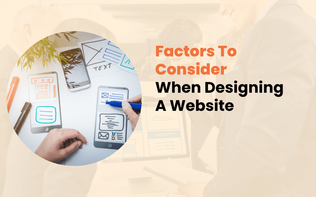
In today’s digital landscape, a well-designed website is crucial for any business or individual aiming to establish a strong online presence.
Your website often serves as the first point of contact between you and potential customers, making it essential to create a positive and lasting impression.
However, designing an effective website involves much more than just aesthetics. This article explores ten critical factors you should consider when designing a website to ensure it looks great, performs well, and meets your business objectives.
1. User Experience (UX) and User Interface (UI)
At the heart of any successful website lies an exceptional user experience. Your website should be intuitive, easy to navigate, and enjoyable.
When focusing on UX and UI, consider creating a clear and logical menu structure that guides visitors through your site. Use descriptive labels for navigation items and implement a search function for larger sites to help users quickly find what they’re looking for.
Responsive design is another crucial aspect of UX/UI. Use flexible layouts and images to ensure your website adapts seamlessly to different screen sizes. Implement touch-friendly elements for mobile users to improve their experience on smaller devices.
Consistency in design elements is key to creating a cohesive user experience. Maintain a uniform color scheme throughout the site, use consistent typography and button styles, and keep layout structures similar across different pages. This consistency helps users feel comfortable and familiar as they navigate your site.
Remember, a great UX/UI design can significantly reduce bounce rates and increase conversions, ultimately contributing to your website’s success.

2. Website Speed and Performance
In our fast-paced digital world, users expect websites to load quickly. Slow-loading sites can lead to high bounce rates and poor user engagement. Moreover, page speed is a ranking factor for search engines, making it crucial for SEO.
To improve your website’s speed and performance, consider the following:
- Optimize image sizes and formats
- Minify CSS, JavaScript, and HTML
- Use browser caching effectively
- Implement a Content Delivery Network (CDN) to distribute your content globally
Research shows that 47% of users expect a web page to load in 2 seconds or less, and 40% will abandon a website that takes more than 3 seconds to load. A 1-second delay in page response can result in a 7% reduction in conversions. These statistics highlight the importance of regularly testing your website’s speed using tools like Google PageSpeed Insights or GTmetrix and making necessary improvements to ensure optimal performance.

3. Mobile Responsiveness
With mobile devices accounting for over 50% of global web traffic, mobile responsiveness is no longer optional – it’s essential. Google’s mobile-first indexing means that the mobile version of your website is considered the primary version for ranking purposes.
When designing for mobile devices, adopt a mobile-first approach. This means designing for smaller screens first and then scaling up for larger displays. Use responsive images that adjust to screen sizes and implement touch-friendly navigation and buttons.
Also, optimize forms for mobile input to provide a smooth user experience on smartphones and tablets.
Mobile-friendly websites tend to rank higher in mobile search results. They also provide a better user experience, which can lead to longer visit durations and lower bounce rates. A well-designed mobile experience can increase conversions and help you reach a wider audience.

4. Content Strategy
Content is the backbone of your website. It draws visitors in, keeps them engaged, and ultimately converts them into customers. A well-planned content strategy is crucial for both user engagement and SEO.
When creating content for your website, focus on:
- Quality and relevance
- Produce original, valuable content that addresses your audience’s needs
- Use a mix of content types (text, images, videos, infographics)
- Keep your content up-to-date and accurate
- Content structure and hierarchy
- Use clear headings and subheadings (H1, H2, H3, etc.)
- Break up text with bullet points and short paragraphs
- Include a table of contents for longer articles
- SEO-friendly practices
- Conduct keyword research and use relevant keywords naturally
- Optimize meta titles and descriptions
- Use internal linking to connect related content
- Include alt text for images
Remember, your content should appeal to search engines and provide genuine value to your readers. Strive to create informative, engaging, and shareable content that establishes your expertise in your field.

5. Visual Design and Branding
The visual aspect of your website plays a crucial role in capturing and retaining user attention. It should reflect your brand identity and create a memorable experience for visitors. When designing your website, pay attention to your color scheme and typography. Choose colors that align with your brand and evoke the right emotions. Select fonts that are easily readable and complement your overall design.
High-quality, relevant images and videos can enhance your website’s visual appeal. However, to maintain good performance, optimize these media files for quick loading. Consider using custom graphics or illustrations to make your site stand out from competitors.
Brand consistency is key to creating a strong online presence. Prominently display your logo and use consistent brand messaging and tone of voice throughout your site. Ensure your website design aligns with your other marketing materials to create a cohesive brand experience across all channels.

6. Accessibility
Designing an accessible website ensures all users, including those with disabilities, can access and interact with your content. It’s a legal requirement in many jurisdictions and expands your potential audience.
Key accessibility considerations include:
- Providing alternative text for images
- Ensuring sufficient color contrast
- Making your website keyboard-navigable
- Using descriptive link text
- Providing captions and transcripts for multimedia content
Follow the Web Content Accessibility Guidelines (WCAG) 2.1, aiming for AA-level compliance. Implementing accessibility features benefits all users and can improve your website’s overall usability and SEO performance.
7. Search Engine Optimization (SEO)
While creating a website for users is paramount, optimizing it for search engines is equally important to ensure it reaches your target audience. Focus on on-page and technical SEO elements to improve your website’s visibility in search results.
On-page SEO involves optimizing individual web pages to rank higher and earn more relevant traffic. This includes optimizing title tags and meta descriptions, using header tags effectively, creating SEO-friendly URLs, and optimizing images with alt text and descriptive file names.
Technical SEO refers to optimizing the infrastructure of your website. Implement a logical site structure, create and submit an XML sitemap, use schema markup to help search engines understand your content, and ensure your website is mobile-friendly and fast-loading.
For local businesses, remember local SEO. Claim and optimize your Google My Business listing, ensure NAP (Name, Address, Phone) consistency across the web, and encourage and respond to customer reviews.
Remember, SEO is an ongoing process. Regularly review and update your SEO strategy to maintain and improve your search engine rankings.

8. Security and Privacy
In an era of increasing cyber threats and data breaches, ensuring your website’s security and protecting user privacy is crucial. Install an SSL certificate to encrypt data transmission and implement HTTPS across your website. Redirect all HTTP traffic to HTTPS to ensure secure connections.
Implement strong data protection measures:
- Use strong, unique passwords for all accounts
- Enable two-factor authentication where possible
- Keep your content management system and plugins up-to-date
- Perform regular backups of your website
Compliance with privacy regulations is also essential. Familiarize yourself with relevant privacy laws such as GDPR or CCPA. Create and display a clear privacy policy on your website. Implement necessary consent mechanisms for data collection and provide users with control over their data.
A secure website protects your business and users and builds trust and credibility, which can lead to increased customer loyalty and conversions.
9. Scalability and Future-Proofing
As your business grows, your website should be able to grow with it. Designing with scalability in mind can save you time and resources in the long run. Start by choosing the Content Management System (CMS) that can handle your current and future needs. When deciding, consider factors like ease of use, customization options, and community support.
When planning for future growth, design a flexible information architecture that can accommodate new pages and sections as your content expands. Use modular design principles for easy updates and additions. Also, plan for increased traffic and data storage needs as your audience grows.
When designing your website, consider your future integration needs. Choose platforms and tools that offer robust APIs, allowing you to integrate new features and functionalities as your business evolves. This might include e-commerce capabilities, marketing automation tools, or customer relationship management systems.
By planning for the future, you can create a website that evolves with your business and maintains its effectiveness over time.

Conclusion
Designing a website involves much more than creating an attractive layout. By considering these ten essential factors – user experience, performance, mobile responsiveness, content strategy, visual design, accessibility, SEO, security, and scalability –you can create a website that not only looks great but also performs well, ranks high in search engines, and effectively serves your business goals.
In today’s digital landscape, your website often serves as the first point of contact between your business and potential customers. A well-designed website can attract and retain visitors, ultimately converting them into loyal customers.
However, the journey to creating an effective website has potential pitfalls that can undermine your online presence and business goals.
This article explores ten critical mistakes to avoid when designing a website, providing valuable insights and practical tips to ensure your website stands out for all the right reasons.
1. Cluttered and Overwhelming Design
One of the most common mistakes in website design is creating a cluttered and overwhelming user interface. A crowded website can quickly lead to information overload, causing visitors to feel confused and frustrated. When a website bombards users with too much information, it becomes difficult for them to focus on what’s truly important. This cognitive overload can result in increased bounce rates, reduced time spent on the site, and lower conversion rates.
To avoid this pitfall, consider the following strategies:
- Embrace white space: Allow elements to breathe by incorporating ample white space (or negative space) in your design.
- Prioritize content: Focus on the most crucial information and remove unnecessary elements.
- Use a clear visual hierarchy: Guide users’ attention to the most important elements through size, color, and placement.
Implementing these techniques can create a clean, focused design that helps users navigate your site easily and find the information they need quickly.

2. Poor Navigation Structure
A website’s navigation is its roadmap, guiding visitors to the information they seek. Poor navigation can frustrate users and quickly prevent them from abandoning your site. Common navigation mistakes include:
- Overly complex menus.
- Inconsistent navigation across pages.
- Lack of search functionality.
- Hidden or hard-to-find important pages.
To create user-friendly navigation:
- Keep your main navigation simple and intuitive
- Use descriptive labels for menu items
- Implement a “hamburger” menu for mobile devices
- Include a search bar for larger sites
- Use breadcrumbs to show users their location within the site structure
By focusing on these elements, you can ensure that visitors can easily find what they’re looking for, improving their overall experience on your site.

3.Slow Loading Times
In our fast-paced digital world, users need more patience for slow-loading websites. A delay of just a few seconds can significantly impact your site’s performance and user satisfaction. Slow loading times can lead to higher bounce rates, lower search engine rankings, and reduced conversion rates. According to a study by Google, as page load time increases from 1 to 3 seconds, the probability of a bounce increases by 32%.
To improve your website’s speed, consider implementing these strategies:
- Optimize images and videos
- Minimize HTTP requests
- Enable browser caching
- Use a content delivery network (CDN)
- Compress files and leverage browser caching
Focusing on these areas can significantly reduce your website’s loading time, improving both user experience and search engine performance.

4. Non-Responsive Design
With mobile devices accounting for over 50% of global web traffic, having a non-responsive website is no longer an option. A non-responsive design can lead to poor user experience for mobile visitors, lower search engine rankings (as Google uses mobile-first indexing), and missed opportunities for mobile conversions.
To implement responsive design effectively:
- Use flexible grid layouts
- Implement responsive images and media
- Prioritize content for mobile views
- Test your design across various devices and screen sizes
By ensuring your website is responsive, you can provide a seamless experience for users across all devices, improving engagement and conversion rates.

5. Inconsistent Branding and Visual Elements
Your website should be an extension of your brand identity. Inconsistent branding can confuse visitors and diminish trust in your business. Common branding mistakes include inconsistent color schemes, multiple font styles, mismatched tone of voice in content, and inconsistent logo usage.
To maintain a cohesive brand identity on your website:
- Develop and adhere to brand guidelines
- Use a consistent color palette across all pages
- Limit your font choices to 2-3 complementary typefaces
- Ensure all visual elements align with your brand personality
Maintaining consistency in your branding can create a more professional and trustworthy image for your business online.

6. Ignoring SEO Best Practices
Even the most beautifully designed website is only useful if it can be found in search engine results. Common SEO mistakes in web design include:
- Non-optimized page titles and meta descriptions.
- URL structure needs to be improved.
- Lack of alt text for images.
- Slow loading times (as mentioned earlier).
To make your website more SEO-friendly:
- Use descriptive, keyword-rich page titles
- Create a logical URL structure
- Optimize images with relevant alt text
- Implement schema markup for rich snippets in search results
- Ensure your site is mobile-friendly and loads quickly
By incorporating these SEO best practices into your web design, you can improve your site’s visibility in search results and attract more organic traffic.
7. Poor Content Hierarchy and Readability
Well-organized, scannable content keeps visitors engaged and guides them through your site. Content organization and presentation mistakes include long, unbroken paragraphs, lack of headings and subheadings, poor contrast between text and background, and small font sizes.
To improve content hierarchy and readability:
- Use clear headings and subheadings (H1, H2, H3, etc.)
- Break up text with bullet points and numbered lists
- Ensure sufficient contrast between text and background
- Use a legible font size (minimum 16px for body text)
- Incorporate relevant images and infographics to break up text
By structuring your content effectively, you can make it easier for visitors to find and digest the information they need, increasing engagement and time spent on your site.

8. Neglecting Accessibility
Designing for accessibility ensures that everyone, including people with disabilities, can use your website. Common accessibility oversights include:
- Low color contrast.
- Lack of keyboard navigation.
- Missing alt text for images.
- Non-descriptive link text.
To make your website more accessible:
- Follow WCAG (Web Content Accessibility Guidelines) standards
- Use sufficient color contrast for text and backgrounds
- Ensure all functionality is available via keyboard navigation
- Provide descriptive alt text for images
- Use descriptive link text instead of generic phrases like “click here.”
By prioritizing accessibility in your web design, you can ensure that your site is usable by the widest possible audience, potentially increasing your reach and improving your site’s overall user experience.
9. Overusing Stock Photos and Generic Content
While stock photos can be a quick solution, overusing them can make your site feel impersonal and need more authenticity. This can lead to a lack of uniqueness, the potential for the same images to appear on competitors’ sites, and missed opportunities to showcase your brand’s personality.
To use visual content more effectively:
- Invest in professional photography of your products, team, or workplace
- Create custom graphics and illustrations that align with your brand
- Use user-generated content (with permission) to add authenticity
- If using stock photos, choose ones that feel natural and align with your brand aesthetic
Focusing on original and relevant visual content can create a more engaging and memorable website that truly represents your brand.

10. Neglecting Call-to-Action (CTA) Optimization
Effective CTAs are crucial for guiding users toward desired actions, whether purchasing, signing up for a newsletter, or contacting your business. Common CTA design mistakes include:
- Unclear or vague CTA text.
- Poor placement on the page.
- Lack of contrast with surrounding elements.
- Too many competing CTAs on a single page.
To create effective CTAs:
- Use clear, action-oriented text (e.g., “Start Your Free Trial” instead of “Submit”)
- Make CTAs stand out with contrasting colors
- Place primary CTAs above the fold
- Use white space to draw attention to CTAs
- A/B test different CTA designs and placements to optimize performance
By carefully crafting and placing your CTAs, you can effectively guide users through your site and increase conversions.
Conclusion
Designing an effective website requires careful consideration of numerous factors, from user experience and visual design to technical performance and accessibility. By avoiding these ten critical mistakes, you’ll be well on your way to creating a website that looks great, performs well in search engines, and converts visitors into customers.

In today’s digital landscape, your website serves as your business’s virtual storefront. It’s often the first impression potential customers have of your brand, and its design can significantly influence their decision to engage with your company or look elsewhere.
Whether you’re a small business owner, a budding entrepreneur, or an experienced web designer, understanding the fundamental principles of effective website design is crucial for creating a compelling online presence.
This comprehensive guide will explore the essential do’s and don’ts of website design, providing you with a roadmap to create a site that looks appealing, performs well in search engines, and converts visitors into customers.
Following these guidelines will enable you to craft a website that stands out in the crowded digital marketplace.
The Do’s of Website Design
1.Prioritize User Experience (UX)
User experience should be at the heart of your website design strategy. A positive UX can dramatically improve your site’s performance, increasing engagement and driving conversions. Consider these key elements:
- Intuitive Navigation: Ensure your site’s structure is logical and easy to understand. Visitors should be able to find what they’re looking for within three clicks.
- Mobile Responsiveness: With over half of global web traffic coming from mobile devices, your site must function flawlessly on smartphones and tablets.
- Fast Loading Times: In our fast-paced world, every second counts. Aim for a loading time of 3 seconds or less to prevent user frustration and abandonment.
To improve your site’s loading speed, consider compressing images, minifying CSS and JavaScript files, and utilizing browser caching. Tools like Google’s PageSpeed Insights can help you identify areas for improvement and provide specific recommendations.

2. Implement a Clear and Consistent Visual Hierarchy
A well-structured visual hierarchy effortlessly guides users through your content, enhancing both aesthetics and functionality. This involves thoughtful use of design elements to create a logical flow of information on your pages.
Start by using whitespace effectively. Don’t be afraid of space – properly using whitespace (also known as negative space) can dramatically improve readability and focus attention on key elements. It gives your content room to breathe and prevents overwhelming your visitors with too much information at once.
Next, consider your layout structure. Arrange your content so that the eye naturally moves from one section to the next. A grid system can maintain consistency across pages and create a sense of order and professionalism.
Lastly, pay attention to your color scheme and typography. Please choose a color palette and font styles that reflect your brand identity and use them consistently throughout your site. This consistency helps build brand recognition and trust. Limit your color palette to 2-3 primary and 2-3 secondary colors to avoid a chaotic appearance.

3. Optimize for Search Engines (SEO)
While creating a visually appealing site is important, ensuring your site is discoverable through search engines is equally crucial. SEO is a complex field, but there are some fundamental practices you can implement:
- Use proper heading structure (H1, H2, H3) to organize your content logically
- Include descriptive alt text for all images
- Craft compelling meta descriptions and title tags for each page
- Create high-quality, relevant content that addresses your audience’s needs
- Ensure your site has a logical URL structure
Remember, SEO is an ongoing process. Update your content regularly, monitor your site’s performance in search results, and adjust your strategy as needed.

4. Include Clear Calls-to-Action (CTAs)
Every page on your website should have a clear purpose. Your CTAs guide users toward the actions you want them to take, whether making a purchase, signing up for a newsletter, or contacting your team.
When designing CTAs, consider the following:
- Use action-oriented language that communicates what will happen when the user clicks
- Make your CTAs visually distinct and easy to find on the page
- Ensure that each CTA leads to a relevant landing page or the next step in the user journey
- Test different colors, sizes, and placements to find what works best for your audience
5. Ensure Accessibility for All Users
Designing for accessibility isn’t just good practice; it’s a legal requirement in many cases. An accessible website ensures all users, including those with disabilities, can navigate and understand your content.
Key accessibility considerations include:
- Using sufficient color contrast for text and background
- Providing text alternatives for non-text content
- Ensuring your site can be navigated using a keyboard alone
- Use descriptive link text instead of generic phrases like “click here.”
By prioritizing accessibility, you comply with legal standards, demonstrate your commitment to inclusivity, and expand your potential audience.

The Don’ts of Website Design
1. Avoid Cluttered Layouts
A cluttered website can overwhelm visitors and drive them away. In your quest to provide comprehensive information, it’s easy to cram too much onto a single page. However, this approach must often be revised, leading to confusion and frustration.
Instead, focus on presenting only the most crucial information on each page. Use progressive disclosure techniques to reveal additional details as needed. This approach allows users to digest information at their own pace and reduces cognitive load.
Be cautious with pop-ups and advertisements as well. While they can be effective for lead generation, overusing them can frustrate users and negatively impact UX. If you must use pop-ups, ensure they’re timed appropriately and easy to dismiss.
2. Don’t Ignore Mobile Users
In 2024, having a mobile-friendly website isn’t just an option; it’s necessary. With most web traffic from mobile devices, ignoring this audience segment can severely limit your site’s effectiveness.
Responsive design is the industry standard for creating mobile-friendly websites. This approach ensures your site looks and functions well on all screen sizes by automatically adjusting layout, text size, and interactive elements.
When designing for mobile, pay special attention to:
- Touch targets (buttons, links) – ensure they’re large enough and spaced appropriately for easy tapping
- Font sizes – make sure text is readable without zooming
- Navigation – consider using a hamburger menu or other mobile-friendly navigation patterns
- Content prioritization – decide what’s most important for mobile users and make it easily accessible

3. Steer Clear of Outdated Design Elements
Web design trends evolve rapidly, and what looked cutting-edge a few years ago might now appear dated. Staying current with design trends helps your site look fresh and professional. Here are some outdated practices to avoid:
- Flash Content: Flash is obsolete and unsupported by most modern browsers. Replace any Flash elements with HTML5 or JavaScript alternatives.
- Excessive Use of Stock Photos: While stock photos have their place, overusing them can make your site feel generic and inauthentic. Opt for original photography or high-quality custom illustrations when possible.
- Auto-playing Media: Videos or audio that play automatically can be jarring and may cause visitors to leave your site quickly. Always give users control over media playback.
4. Avoid Poor Navigation Structures
Navigation is the backbone of your website. Poor navigation can lead to frustrated users and lost opportunities. To create effective navigation:
- Keep your main menu simple and intuitive
- Use clear, descriptive labels for menu items
- Include a search feature for content-rich sites
- Ensure your site structure is logical and easy to understand
- Regularly check for and fix broken links
Remember, if users need help finding what they’re looking for quickly, they will likely leave your site and look elsewhere.

5. Don’t Neglect Website Speed and Performance
In an age of high-speed internet, users need more patience for slow-loading websites. A delay of just a few seconds can significantly increase bounce rates and decrease conversions.
To improve your site’s speed and performance:
- Optimize images and videos for web use
- Minimize HTTP requests by combining files where possible
- Use browser caching to store commonly used files on visitors’ devices
- Consider using a Content Delivery Network (CDN) for faster global access
- Regularly test your site’s speed and make improvements as needed

Conclusion
Creating an effective website requires a delicate balance of aesthetics and functionality. By following the do’s and avoiding the do n’ts outlined in this guide, you’ll be well on your way to designing a website that not only looks great but also performs well in search engines and provides value to your visitors.
In today’s digital landscape, your website serves as the face of your business online. It’s often the first point of contact between you and potential customers. As such, keeping your website fresh, modern, and user-friendly is crucial. However, one question often arises when considering a website redesign: Does changing website design affect SEO?
The short answer is yes, but the impact can be positive or negative, depending on how you approach the redesign process.
In this article, we’ll explore the relationship between website design and SEO, examine the potential impacts of redesign, and provide best practices to ensure your new design improves rather than hinders your search engine rankings.
Relationship Between Website Design and SEO
Before we delve into the specifics, it’s important to understand how search engines interpret website design and why it matters for SEO.
Search engines like Google use complex algorithms to crawl, index, and rank websites. These algorithms consider hundreds of factors, many of which are directly or indirectly related to website design.
Key design elements that influence SEO include:
- Site structure and navigation
- Page load speed
- Mobile responsiveness
- User experience signals (e.g., bounce rate, time on site)
- Content organization and hierarchy
When considering these elements, balancing aesthetics and search engine friendliness is crucial. A visually stunning website that search engines struggle to crawl or understand won’t perform well in search results, no matter how appealing it may be to human eyes.

Positive Effects of Website Redesign on SEO
When executed thoughtfully, a website redesign can significantly improve your SEO efforts. Here are some potential positive impacts:
Improved User Experience
User experience (UX) is a critical factor in SEO. A well-designed website that’s easy to navigate and provides valuable content can reduce bounce rates, increase time on site, and improve engagement metrics. These factors signal to search engines that your site provides value to users, potentially improving your rankings.
Enhanced Mobile Responsiveness
With mobile-first indexing, Google predominantly uses your site’s mobile version for ranking and indexing. A redesign that improves mobile responsiveness can lead to better mobile rankings, improved user experience on mobile devices, and faster network load times.
Faster Loading Speeds
Site speed is a confirmed ranking factor for both desktop and mobile searches. A redesign that improves your site’s performance can lead to better search rankings, reduced bounce rates, and increased conversions.

Better Information Architecture and Navigation
Redesigning your site allows you to improve your site structure and navigation. This can make it easier for search engines to crawl and understand your content, improve internal linking (which distributes link equity more effectively), and enhance user experience, potentially increasing engagement metrics.
Potential Negative Impacts of Website Redesign on SEO
While a redesign can bring many benefits, it has risks. Here are some potential negative impacts to be aware of:
- Loss of existing SEO value
- Changes in URL structure leading to 404 errors
- Removal or alteration of important content
- Temporary drop in rankings during the transition period
These issues can arise if the redesign process is not managed properly. For example, changing URLs without proper redirection can lead to lost backlinks, while removing content that was previously ranking well can hurt search performance.

Best Practices for SEO-Friendly Website Redesign
To maximize the positive impacts and minimize the risks, follow these best practices:
Conduct a Thorough SEO Audit Before Redesign
Before you start the redesign process, it’s crucial to understand your current SEO performance. This involves identifying top-performing pages and keywords, documenting your current site structure and URL patterns, and analyzing your backlink profile.
Preserve Important On-Page SEO Elements
As you redesign, maintain successful title tags, meta descriptions, and header structures. Keep valuable content, updating and improving where necessary, but be cautious about making drastic changes to pages already performing well in search results.
Implement Proper 301 Redirects
If your redesign involves changing URLs, it’s essential to implement proper 301 redirects. Create a comprehensive redirect map for changed URLs and use server-side 301 redirects to preserve link equity. This will help maintain your search rankings and ensure users can avoid broken links.

Update XML Sitemaps and Robots.txt Files
After redesigning, create and submit a new XML sitemap reflecting the new structure. Also, review and update your robots.txt file to ensure proper crawling. These steps will help search engines understand and index your new site structure more quickly and accurately.
Maintain Consistent Internal Linking Structure
Internal linking plays a crucial role in SEO. As you redesign, preserve important internal links, update them to reflect the new URL structure if necessary, and ensure a logical hierarchical structure. This helps both users and search engines navigate your site effectively.
Case Studies: Successful Website Redesigns and Their SEO Impact
Let’s look at two real-world examples of successful website redesigns:
E-commerce Site Redesign Success
An online retailer specializing in outdoor gear underwent a complete redesign, focusing on improving mobile responsiveness and site speed.
Six months after the redesign, they saw a 32% increase in organic traffic, a 24% improvement in conversion rates, and a 40% reduction in mobile bounce rates. Key to their success was maintaining URL structures and implementing a comprehensive 301 redirect strategy for changed URLs.
Blog Platform Redesign and SEO Improvement
A popular recipe blog redesigned its site to improve user experience and content discoverability.
They implemented a clearer category structure, improved internal linking between related recipes, and enhanced mobile page speed. Three months after the redesign, they experienced a 45% increase in pages per session, a 28% boost in organic traffic, and a 15% improvement in average session duration.

Tools and Techniques for Monitoring SEO During and After Redesign
To track the impact of your redesign on SEO, consider using these tools:
- Google Search Console
- SEO monitoring tools (e.g., Ahrefs, SEMrush)
- Analytics platforms
These tools can help you monitor indexing status, track search performance, identify crawl errors, monitor keyword rankings, analyze your backlink profile, and track user behavior metrics.
Conclusion
Changing your website design can indeed affect SEO, but with careful planning and execution, the impact can be overwhelmingly positive. A well-executed redesign can improve user experience, enhance mobile performance, and improve search engine rankings.
Remember, the key to a successful, SEO-friendly redesign is thorough planning, careful implementation, and ongoing monitoring. By following the best practices outlined in this article and using the right tools to track your progress, you can ensure that your new website design looks great and performs well in search engine results.

In today’s digital-first world, User Experience (UX) design has become critical to business success.
But what exactly is UX design, and how does it contribute to a company’s bottom line? This comprehensive guide explores how UX design helps businesses thrive, from increasing customer satisfaction to driving innovation and reducing costs.
UX Design
UX design is the process of creating products, services, or interfaces that provide meaningful and relevant user experiences. It encompasses the entire journey of the user’s interaction with a product, including branding, design, usability, and function.
The key principles of UX design include:
- User-Centered Approach
- Accessibility
- Consistency
- Simplicity
- Feedback
It’s important to note that while UX design is often confused with UI (User Interface) design, they are distinct disciplines. UI design focuses on a product’s visual elements, while UX design encompasses the entire user journey and emotional experience.

Business Impact of Good UX Design
Implementing effective UX design strategies can profoundly impact various aspects of a business. A well-designed user experience leads to higher customer satisfaction levels. When users can easily navigate a website, complete tasks efficiently, and find the information they need without frustration, they’re more likely to perceive the brand positively.
For example, after redesigning its mobile app with a focus on UX, Airbnb saw a 300% increase in bookings. The new design simplified the booking process and provided more relevant search results, significantly enhancing user satisfaction.
Good UX design can dramatically improve conversion rates by removing barriers in the user journey. Businesses can reduce abandonment rates and increase conversions by improving processes like sign-ups, checkouts, and form submissions. A study by Forrester Research found that a well-designed user interface could raise a website’s conversion rate by up to 200%.

UX Design and Customer Acquisition
Effective UX design plays a crucial role in attracting and converting new customers. A user-friendly website is often the first point of contact between a business and potential customers. Key elements of website usability include a clear navigation structure, optimized search functionality, fast loading times, and mobile responsiveness.
According to Google, 61% of users are unlikely to return to a mobile site they need help accessing, and 40% visit a competitor’s site instead. With mobile devices accounting for over half of global web traffic, improving for mobile is now optional. A seamless mobile experience can significantly increase customer acquisition.
Key strategies for mobile UX include:
- Ensuring responsive design that adapts to different screen sizes
- Prioritizing content for mobile viewing
- Improving touch targets for easy interaction
- Implementing mobile-specific features like click-to-call buttons
First impressions matter, especially in the digital world. An improved onboarding process can significantly increase user adoption and retention rates. Effective onboarding strategies include progressive disclosure of features to avoid overwhelming new users, interactive tutorials or walkthroughs, personalized onboarding based on user preferences or needs, and clear value proposition communication early in the user journey.

UX Design for Customer Retention
Acquiring new customers is important, but retaining existing ones is equally crucial for long-term business success. UX design plays a vital role in customer retention strategies. Personalization has become a key expectation for modern consumers. Businesses can use user data and behavior patterns to create tailored experiences that resonate with individual users.
A study by Epsilon found that 80% of consumers are more likely to purchase when brands offer personalized experiences. Efficient customer support is crucial for maintaining customer satisfaction and loyalty. UX design can improve support experiences through intuitive self-service portals, chatbots for instant assistance, easy-to-navigate knowledge bases, and seamless transitions between support channels.
Continuous improvement is at the heart of good UX design. Implementing mechanisms to gather and act on user feedback can lead to ongoing enhancements in the user experience. These mechanisms can include:
- In-app feedback options
- Regular user surveys
- A/B testing of new features
- User behavior analytics

UX Design and Product Development
UX design isn’t just about improving existing products; it’s also a crucial component of the product development process. User research, a key component of UX design, provides valuable insights that can inform product strategy. These insights can help identify unmet user needs, validate product ideas before development, and prioritize features based on user value.
By involving UX designers early in the product development process, businesses can reduce the need for major revisions later in development, create more accurate project scopes and timelines, and facilitate better communication between design and development teams.
Addressing usability issues early through UX design can lead to significant cost savings. A study by IBM found that every dollar invested in UX brought 100 dollars in return. Furthermore, fixing an error after development is up to 100 times as expensive as it would have been before development.

Measuring the Impact of UX Design
While the benefits of UX design are clear, quantifying its impact is crucial for securing buy-in and resources. Key Performance Indicators (KPIs) for UX include:
- Conversion Rate
- Customer Satisfaction Score (CSAT)
- Net Promoter Score (NPS)
- Task Success Rate
- Time on Task
- Error Rate
- Customer Support Tickets
Several tools can help track these metrics, such as Google Analytics for website performance metrics, Hotjar for heatmaps and user recordings, UserTesting for qualitative user feedback, and Optimizely for A/B testing.
Real-world examples demonstrate the ROI of UX design. After redesigning its online banking platform with a focus on UX, Bank of America saw a 45% increase in online banking traffic. Mint, the personal finance app, focused on user experience, which led to its acquisition by Intuit for $170 million just two years after launch.

Implementing UX Design in Your Business
Businesses need to take a strategic approach to use the power of UX design. This includes conducting a UX audit of existing products or services, defining clear UX goals aligned with business objectives, investing in user research to understand your audience, developing user personas and journey maps, creating a design system for consistency across products, and implementing regular usability testing and iteration cycles.
Building a UX-focused team is crucial. This might involve hiring skilled UX designers, researchers, and UI designers, providing UX training for existing team members, or considering partnerships with UX agencies for specialized projects.
Cultivating a UX-centric culture is equally important. This can be achieved by advocating for UX at the leadership level, including UX considerations in all product discussions, encouraging cross-functional collaboration with UX teams, celebrating UX wins, and sharing insights across the organization.

Conclusion
In today’s competitive business landscape, UX design has evolved from a nice-to-have to a critical differentiator. From improving customer satisfaction and conversion rates to informing product strategy and reducing costs, the impact of UX design on business success is undeniable.

In today’s digital landscape, your website often serves as the first point of contact between your brand and potential customers. The adage, “A picture is worth a thousand words,” holds especially true when growing your brand online.
Effective use of visuals on your website can significantly improve brand recognition, engagement, and growth.
Research indicates that people remember 80% of what they see, compared to just 20% of what they read. With attention spans shrinking and competition for eyeballs intensifying, using visuals effectively has never been more important.
This article will explore ten powerful ways to use website visuals to strengthen your brand and drive growth.
Power of Visual Branding
Before delving into specific strategies, it’s crucial to grasp the concept of visual branding and its impact on your business. Visual branding uses design elements such as colors, shapes, and imagery to represent your brand’s identity and values. It’s not just about aesthetic appeal. It’s about communicating your brand’s essence at a glance.
Consider these statistics:
- 94% of first impressions are design-related (WebFX, 2021)
- Posts with images produce 650% higher engagement than text-only posts (Adobe, 2020)
- People following directions with text and illustrations do 323% better than those following directions without illustrations (Xerox, 2019)
These numbers underscore the profound influence visuals have on consumer behavior and decision-making. Let’s explore how to use this power to grow your brand.

1. Create a Consistent Visual Identity
Consistency is the foundation of strong visual branding. Your website should reflect a cohesive visual identity that aligns with your brand’s personality and values. This involves careful consideration of your logo placement, color scheme, and typography.
Your logo should be prominently displayed and consistently positioned across all pages. Develop a signature color palette and use it consistently throughout your site. Choose fonts that reflect your brand’s tone and apply them consistently across all written content.
Consistency breeds familiarity, and familiarity breeds trust. By maintaining a uniform visual identity, you’re not just making your site look good but building brand recognition and loyalty.
2. Use High-Quality Hero Images
Your hero image – the large banner typically at the top of a webpage – is prime real estate for visual branding. It’s often the first thing visitors see, making it crucial for creating a strong first impression.
When selecting hero images, choose visuals that resonate with your target audience and align with your brand message and values. Opt for high-resolution, professionally shot photos or illustrations. Consider using a slider to showcase multiple aspects of your brand.
Remember, your hero image should do more than look appealing – it should tell a story about your brand and what you offer.

3. Incorporate Infographics for Data Visualization
In an age of information overload, infographics serve as visual oases, offering easily digestible chunks of data in an appealing format. They’re particularly effective for simplifying complex information, highlighting key statistics or processes, and increasing content shareability on social media.
When creating infographics:
- Stick to your brand’s color scheme and typography
- Keep it simple – don’t overcrowd with too much information
- Use icons and illustrations to make data more engaging
- Ensure the infographic is mobile-responsive
By transforming dry data into visually appealing graphics, you’re making your content more accessible and showcasing your brand’s expertise in a shareable format.
4. Implement Video Content
Video content is a dominant force in the digital realm, with 86% of businesses using video as a marketing tool in 2021 (Wyzowl, 2021). It’s an incredibly versatile medium for visual branding, allowing you to demonstrate products in action, share brand stories and behind-the-scenes footage, provide valuable how-to content, and showcase customer testimonials.
Keep videos short and engaging (ideally under 2 minutes) when incorporating videos. Add captions for accessibility and silent viewing. Ensure the video thumbnail is attractive and brand-consistent. And remember to optimize for mobile viewing.
Remember, every video is an opportunity to reinforce your brand’s visual identity and message.

5. Showcase User-Generated Content
User-generated content (UGC) is a powerful tool for building trust and fostering community engagement. It provides social proof and adds an authentic touch to your visual branding. Consider creating a gallery of customer photos using your product, featuring customer reviews with their photos, or encouraging hashtag campaigns and showcasing the best submissions on your site.
When using UGC, always obtain permission from the content creators and give them credit. This respects their rights and strengthens your relationship with your community.
6. Design Custom Icons and Illustrations
Custom icons and illustrations can set your brand apart in a sea of stock images. They add personality to your site and can significantly improve user experience. These custom elements can reinforce brand uniqueness, improve navigation and user interface, explain concepts or processes more clearly, and add a touch of creativity to your site.
When designing custom visuals, ensure they align with your overall visual identity. Use them consistently across your site and other marketing materials. Consider animated versions for added engagement. Remember, these custom elements become part of your visual brand language, making your site more memorable and distinctive.

7. Optimize Images for Different Devices
With mobile devices accounting for over 50% of global website traffic, it’s crucial to ensure your visuals look great on all screen sizes. Use flexible images that resize according to screen dimensions. Implement lazy loading to improve page speed. Use the srcset attribute to provide different image sizes for different devices. Most importantly, test your site on various devices to ensure visual appeal across platforms.
By optimizing your visuals for all devices, you’re ensuring a consistent brand experience regardless of how users access your site.
8. Use Interactive Visuals
Interactive visuals engage users on a deeper level, encouraging them to spend more time on your site and interact with your brand. Examples include product configurators, interactive infographics, quizzes or assessments, and 360-degree product views.
When implementing interactive elements, ensure they provide value to the user, not just visual appeal. Keep the interaction intuitive and user-friendly. Optimize for both mouse and touch interactions. Interactive visuals enhance user engagement and provide valuable data on user preferences and behavior.

9. Implement Virtual or Augmented Reality Features
Virtual Reality (VR) and Augmented Reality (AR) are powerful tools for creating immersive brand experiences. Potential applications include:
- Virtual product try-ons (e.g., eyewear, makeup).
- AR-powered room planners for furniture brands.
- Virtual tours of physical locations.
- Interactive 3D product models.
While these technologies require more investment, they can significantly set your brand apart and provide unique value to your customers.
10. Utilize Visual Storytelling Techniques
Visual storytelling goes beyond individual images—it’s about creating a narrative through your visual elements that resonate with your audience and communicate your brand values. Consider using a series of images to tell a brand story, creating visual parallax effects for depth and engagement, implementing scroll-triggered animations to guide users through your content, or using before-and-after sliders to showcase transformations.
Effective visual storytelling creates emotional connections with your audience, making your brand more memorable and relatable.

Best Practices for Implementing Website Visuals
As you implement these strategies, keep these best practices in mind:
- Balance aesthetics and functionality – visuals should improve, not hinder, user experience
- Ensure fast loading times – adjust image sizes without compromising quality
- Maintain brand consistency across all visual elements
- Use alt text for images to improve accessibility and SEO
- Regularly update your visuals to keep your site fresh and current
Measuring the Impact of Visual Content on Brand Growth
To ensure the effectiveness of your visual branding efforts, it’s crucial to track key metrics such as engagement rates (time on site, pages per session), conversion rates, social shares and backlinks, and brand recall and recognition (through surveys).
Tools like Google Analytics, heatmap software, and A/B testing platforms can help you analyze the performance of your visual content and refine it for improvement.

Conclusion
In the digital age, effective visual branding is not just a nice-to-have – it’s a necessity for brand growth. By implementing these ten strategies, you can create a visually compelling website that attracts and engages your audience and communicates your brand’s unique value proposition.
Remember, visual branding is an ongoing process. Stay attuned to design trends, user preferences, and technological advancements to keep your visual branding fresh and effective. With a thoughtful approach to website visuals to grow, you’re well on your way to growing a strong, recognizable brand in the digital landscape.

In today’s digital landscape, creating websites and applications that are both user-friendly and accessible is crucial. User experience (UX) and accessibility are two interconnected aspects of web design that significantly impact the success of your online presence.
By implementing best practices in these areas, you cater to a wider audience and improve your search engine rankings and overall user satisfaction.
This article explores ten crucial best practices for improving UX and accessibility, providing you with actionable insights to refine your digital platforms.
User Experience and Accessibility
Before diving into the best practices, let’s clarify what we mean by user experience and accessibility:
User Experience (UX) refers to a person’s overall experience when interacting with a website or application. It encompasses aspects such as ease of use, efficiency, and satisfaction.
Web Accessibility ensures that websites and applications can be used by people with disabilities, including visual, auditory, motor, or cognitive impairments.
These two concepts are closely related. An accessible website is often more user-friendly for everyone, not just those with disabilities. Moreover, both UX and accessibility play significant roles in SEO and business success. Search engines favor websites that provide a good user experience and are accessible to all users.
Now, let’s explore the ten best practices to help you achieve better UX and accessibility.

1. Intuitive Navigation Design
A well-designed navigation system is the backbone of any user-friendly website. It helps users find what they’re looking for quickly and easily, reducing frustration and improving overall satisfaction.
Key elements of intuitive navigation include:
- Clear menu structures with descriptive labels and logical organization
- Breadcrumb navigation to help users understand their location within your site’s hierarchy
- Prominent search functionality for quick content discovery
Remember, your navigation should be consistent across all pages, making it easier for users to predict where to find information as they move through your site.
2. Responsive Design
With the increasing use of mobile devices to access the internet, responsive design has become more important than ever. A responsive website adapts to different screen sizes and devices, ensuring a seamless experience for all users.
To implement responsive design effectively:
- Consider adopting a mobile-first approach, designing for smaller screens first and then scaling up.
- Use fluid layouts and flexible images that adjust to different screen sizes.
- Regularly test your website across various devices and screen sizes to ensure consistency.
Responsive design improves user experience and positively impacts search engine rankings, as Google prioritizes mobile-friendly websites in its search results.

3. Optimized Page Load Speed
In our fast-paced digital world, users expect websites to load quickly. Slow-loading pages can lead to high bounce rates and decreased user satisfaction.
To improve your page load speed:
- Compress images and use appropriate file formats
- Minify CSS, JavaScript, and HTML
- Implement browser caching
- Use a content delivery network (CDN) for faster content delivery
Tools like Google PageSpeed Insights can help you identify areas for improvement and track your progress over time.
4. Clear and Consistent Typography
Typography plays a crucial role in both UX and accessibility. Well-chosen fonts and text formatting can significantly improve readability and information retention.
When selecting and implementing typography, choose easily readable fonts, especially for body text. Use appropriate font sizes (minimum 16px for body text) and line spacing. Maintain sufficient contrast between text and background colors, and be consistent with your typography choices across your website.
Remember, good typography isn’t just about aesthetics – it’s about ensuring your content is easily digestible for all users, including those with visual impairments.

5. Alt Text for Images
Alternative or alt text is a crucial element for web accessibility. It provides a text description of images for users who can’t see them, including those using screen readers or with slow internet connections.
Best practices for alt text include being concise but descriptive, avoiding phrases like “Image of…” or “Picture of…”, and using empty alt attributes (alt=”) for decorative images. Keywords should be included naturally, but keyword stuffing should be avoided.
Properly implemented alt text not only improves accessibility but can also contribute to better SEO performance.
6. Keyboard Navigation
Not all users can or prefer to use a mouse. Ensuring that your website is fully navigable via keyboard is essential for accessibility and can improve the experience for power users.
To implement effective keyboard navigation:
- Ensure all interactive elements are focusable and operable with a keyboard.
- Provide visible focus indicators so users know which element is currently selected.
- Maintain a logical tab order that follows the visual flow of the page.
- Test your website thoroughly using only a keyboard to identify any issues.

7. Color and Contrast Considerations
Color plays a significant role in web design, but it’s important to use it to make the site accessible to all users, including those with color vision deficiencies.
Key considerations for color and contrast include:
- Meeting WCAG color contrast guidelines (minimum ratio of 4.5:1 for normal text and 3:1 for large text)
- Using additional indicators like patterns or labels, not relying solely on color to convey information
- Providing sufficient contrast between text and background colors
- Using tools like WebAIM’s Contrast Checker to verify your color choices
Paying attention to color and contrast creates a more inclusive and visually comfortable experience for all users.
8. Proper Heading Structure
A clear heading structure is vital for both UX and accessibility. It helps users scan content and allows screen reader users to navigate more easily.
Implement heading structure using H1-H6 tags in a logical, hierarchical order. Start with a single H1 tag for the main page title, and don’t skip heading levels (e.g., don’t jump from H2 to H4). Use headings to create a clear content hierarchy.
Proper heading structure not only aids accessibility but also contributes to better SEO by helping search engines understand your content structure.

9. Form Design and Validation
Forms are often critical website interaction points for sign-ups, purchases, or contact requests. Ensuring they’re user-friendly and accessible is crucial.
To create accessible and user-friendly forms:
- Provide clear labels for all form fields
- Group related fields together using fieldset and legend tags
- Implement clear error messages and validation
- Use autocomplete attributes where appropriate
- Ensure form controls are keyboard accessible
Well-designed forms reduce user frustration, increase conversion rates, and ensure that all users can effectively interact with your website.
10. Regular User Testing and Feedback
Lastly, remember that improving UX and accessibility is an ongoing process. Regular testing and gathering user feedback are essential for continual improvement.
Consider implementing usability testing with diverse users, including those with disabilities. Conduct A/B testing for significant changes and use user surveys and feedback forms. Analyze user behavior through tools like heatmaps and session recordings.
By regularly seeking and acting on user feedback, you can ensure that your website continues to meet the needs of your audience as technology and user expectations evolve.

Conclusion
By prioritizing UX and accessibility, you’re not just improving your website. You’re creating a more inclusive digital world. So, take the first step today and start implementing these best practices. Your users and your business will benefit from the positive changes.
Overview of Digital Marketing and Web Development
Digital marketing is all about promoting your products or services online. It’s like having a toolbox filled with different tactics, like social media campaigns, eye-catching content, and targeted advertising. These tactics help you reach your ideal customers and create a buzz around your brand.
On the other hand, web development focuses on building your online home base – your website. This involves everything from the technical aspects of coding and design to crafting engaging content and ensuring the website runs smoothly.
Web development creates the foundation for your digital marketing efforts. A well-developed website is like having a beautiful storefront in a prime location. People can easily find you, explore what you offer, and learn more about your brand.
Web development optimises your website for search engines. This means when people search for products or services related to yours, your website has a higher chance of appearing at the top of the results. This can increase the traffic coming to your site through search engines.
Web development builds a user-friendly website that keeps visitors engaged. It ensures your website is easy to navigate, providing a positive experience for visitors and making them more likely to stay and explore what you offer.
Web development creates a visually appealing website that creates a lasting impression. A website with a strong visual design grabs visitors’ attention and makes your brand memorable.
What is Digital Marketing?
Digital marketing involves using digital channels like websites, social media, email, and more to promote your products or services online. In the modern context, people assume it as SEO, but it’s more than that. Techniques like PPC, social media marketing, content marketing, and email marketing all work together to reach your target audience, generate leads, and ultimately drive sales.
Key Ingredients for Digital Marketing Success:
SEO: Get your website noticed in search results. A higher ranking means more visitors.
Content Marketing: Create valuable content to attract, engage, and establish your brand.
Social Media Marketing: Connect with your audience, share your story, and build relationships.
Email Marketing: Stay connected, nurture leads, and convert potential customers.
PPC Advertising: Get targeted traffic with ads displayed when people search for what you offer.
What is Web Development?
Web development brings websites to life, like building a house online with code instead of bricks. Imagine a website as a restaurant: informative content is delicious food, while design makes you want to stay and explore.
Key Ingredients of a Website:
Front-End Development: Creating the visual elements and interactivity you see, using code like HTML, CSS, and JavaScript. Like chefs plating food, they make it visually appealing and user-friendly.
Back-End Development: Handling unseen tasks like storing information and ensuring smooth operation. Like kitchen staff, they make sure everything runs efficiently.
Full-Stack Development: Skilled in both front-end and back-end, these developers can handle everything, from design to coding, on both sides.
Web Design: Focusing on the appeal of the website. It involves using color schemes, typography, and imagery to enhance user experience.
The Intersection of Web Development and Digital Marketing
The role of web development in digital marketing is like building the stage for a thrilling play. Your website is the platform where your entire digital marketing performance unfolds. A well-built website provides the foundation for your marketing strategies to shine.
Let’s delve into how web development supports your digital marketing efforts:
Creating a Delightful User Experience (UX):
User experience in digital marketing refers to a visitor’s ease and enjoyment while navigating your website. Web developers ensure your website is intuitive and easy to use, with clear menus and calls to action. This increases the likelihood that visitors will stay engaged and take the actions you desire, like signing up for your newsletter or making a purchase.
Mobile Friendly:
Mobile devices are like the ever-present audience in today’s digital world. Web development ensures your website is mobile-responsive, meaning it adjusts to fit smartphones, tablets, and desktops. This is crucial because a website that’s difficult to use on a mobile device will frustrate visitors and hurt your search engine rankings.
Fast Loading Times:
Imagine a play with long, awkward pauses between scenes. That’s what a slow-loading website feels like! Web development focuses on website speed and digital marketing by optimising website performance to ensure fast loading times. This keeps visitors happy and engaged, allowing them to find the information they need.
Importance of Web Development for SEO
Search engines are like powerful spotlights that help people find your website. Web development incorporates SEO-friendly web design best practices, such as clean code and clear website structure. This makes it easier for search engines to understand and rank your website, increasing your online visibility.
Why Web Development is Crucial for Digital Marketing Success?
Search Engines
Imagine a search engine as a librarian. They want to understand your website and recommend it to the right people. Web developers use technical SEO practices to give your website a clear structure, like a librarian loves a well-organised bookshelf. They optimise your website speed, ensure it’s mobile-friendly, and even add special codes that search engines love. This all helps search engines understand and rank your website higher, bringing in more visitors.

A full-service digital marketing agency, like Informatics, offers a spectrum of solutions under one roof. Here, we cover how this model works for your business.
Niche agencies specialize in one aspect of digital marketing, and they often do it very well. An example might be a social media marketing firm that exclusively implements organic and paid campaigns on Facebook, Instagram, TikTok and more.
By contrast, a full-service agency can provide most or all of the following services under one roof:
Digital Marketing: SEO and SEM specialists, lead generators, PPC gurus, content marketers, and social media strategists all work together in concert to achieve specific business goals.
Web Design and Development: Experienced designers optimize websites to satisfy customers’ needs and exceed their expectations – fast, functional, and responsive to desktops, phones, and tablets.
Managed Hosting: You can’t just find a pro to build your fancy website. You need someone dedicated to maintaining it, protecting it from and responding to cyberattacks, and making sure your valuable digital storefront is open 24/7.
Brand and Graphic Design: Designers at a full-service agency not only create stunning individual images but a slew of artwork that tells a consistent brand story.
Media Production: Still photography, videography, editing, sound mixing, podcasting, animatihttps://designsbydaveo.com/our-services/graphic-design/on – all of these skills can be combined to create something better than would be possible alone.
SaaS: Short for “Software as a Service,” a full-service agency has experts who can recommend (or build) and implement powerful tools that automate routine processes, saving hassle, time, and money.
Consulting: Advisors provide their expert opinions on which of these services your business should strategically utilize and when, based on their deep understanding of your business’ needs.
Each expert’s insights pool into the collective understanding and compound to produce results greater than any one niche provider could imagine achieving.
The full-service agency is the only one capable of creating a holistic strategy.
Full-Service Efficiency
Holistic planning is just one benefit a business can expect when opting for a full-service marketing agency, as opposed to a piecemeal approach. But what about efficiency?
Who wants to increase the number of emails they have to receive and respond to? Businesses that choose niche agencies for separate digital marketing tasks have to serve as their own project managers in addition to being clients.
For a social media campaign alone, your business might need to:
- Order images from a graphic designer, sized for multiple platforms as well as optimized for web
- Request a new landing page from the web designer
- Approve copy and budgets with a social campaign manager
- Coordinate with the hosting service to accommodate increased traffic
Each task requires multiple rounds of approvals, notes, revisions, and emails upon emails (and probably a few more emails). Full-service digital marketing agencies, however, have a dedicated project manager who funnels all of these tasks into order, tracks deadlines, and maintains brand consistency across every individual channel.
Collaboration Equals Innovation
An African proverb reads, “If you want to go fast, go alone. If you want to go far, go together.” When marketing experts with a variety of focus areas work together regularly, they can brainstorm and share insights about individual clients, but the real value is in the collective experience and efficiencies they develop, skills that can be applied to all projects.
Let’s imagine a retailer in Cedar Rapids that focuses on industrial workwear – we have a lot of factories. The social media team’s demographic analytics indicate that women are most likely to click on a social post. This information leads the SEO team to suggest that content marketers create a blog post targeting women’s industrial wear. The media team then shifts to make sure that next month’s photo shoot includes both male and female subjects. These shifts to meet the customers who are most engaged can be made in minutes during an interdepartmental meeting, or over a messaging channel, rather than taking months as different agencies argue over tactics and eventually catch up to speed.
Digital Marketing at Scale
Your digital marketing needs will grow as your business evolves. The great news is that most full-service digital marketing agencies will gladly work with your business on one niche service if that’s what you currently want and can afford. But as you see a return on investment and look to keep stoking the revenue fires, more services can be added without the hassle of seeking out, negotiating with, and onboarding a completely new agency.
Choosing the Right Full-Service Agency
While a full-service agency offers undeniable benefits, it’s important to choose the right one for your specific needs. Look for agencies with a proven track record, a strong understanding of your industry, and a collaborative approach that values your input.
By partnering with a full-service digital agency, like Informatics, you gain a team of experts working together in perfect harmony, ensuring your digital presence is truly exceptional. Get started by reaching out.
Have you ever done SEO (Search Engine Optimization) work on your website?
Many business owners have utilized SEO to generate more leads and sales. However, they don’t all approach SEO in the same way.
Most business owners will work with a freelancer or an agency in a hands-off approach, trusting the expert to deliver results. Others will look to hire an SEO specialist in-house. A few will try to understand and apply SEO techniques to their websites.
SEO in the Age of Algorithm Changes
If you pay attention to online marketing, you’ll see a repeated trend. Someone always says that the latest feature or opportunity is “dead” or “no longer working.”
These suggestions become more intense when search engines, like Google, update their algorithms, reducing the visibility of some websites.
Is SEO worthwhile for your business? There’s only one question you need to answer:
“Do potential customers search for my products or services online?”
If potential customers search for your products or services online, SEO is worth while for your business.
If potential customers are looking for solutions to problems that your products or services solve, SEO is worthwhile for your business. The major benefit of SEO over paid advertising is that you don’t pay every time someone clicks through to your website. Your SEO campaign will generate more visitors and sales at no additional cost per visitor, resulting in decreased customer acquisition costs.
SEO is a long-term strategy that continues to provide results.
Finally, it’s worth remembering how important trust is in the customer buying cycle. People buy from those they know, like and trust. As a business owner, it’s your job to show visitors how you can help them with your products or services once they reach your website.
If a potential customer finds your company on the first page of the search results, it adds more credibility than a business hidden away on page 10 – many clicks and searches away.
Who doesn’t want more credibility?
As always, I welcome any questions or suggestions. Have a blessed week!

A strong online presence is essential for businesses and individuals in today’s digital landscape. At the heart of this presence lies a well-designed, functional website.
But how does a website evolve from a mere idea to a fully functioning digital platform? This article will guide you through the intricate process of website development, from the initial concept to the exciting moment of launch.
Value of a Systematic Approach
Before delving into the specifics, it’s crucial to understand why a structured website development process matters. A systematic approach ensures efficient resource use, clear communication between stakeholders, timely project delivery, and a high-quality end product that meets user needs.
Now, let’s explore each stage of the website development process in detail.
1. Conceptualization and Planning
Every successful website begins with a solid plan. This initial stage lays the foundation for the entire project. Start by defining the purpose and goals of your website. Ask yourself:
- What is the primary purpose of the website?
- What specific goals do you want to achieve?
- How will you measure success?
These questions will guide your decision-making throughout the development process.
Understanding your audience is equally important. Consider demographics (age, location, profession), psychographics (interests, values, behaviours), and technical proficiency. This information will influence design decisions and content creation.
Pay attention to market research. It helps you identify competitors, understand industry trends, and discover user preferences and pain points. Use tools like Google Analytics, SEMrush, or surveys to gather valuable insights.
Lastly, create a project timeline and budget. Break down the project into manageable tasks and set realistic deadlines. Consider factors like team availability, resource allocation, and potential roadblocks. Remember to include buffer time for unexpected issues.

2. Design Phase
With a solid plan, it’s time to bring your vision to life visually. This phase includes several key steps:
- Wireframing and Site Mapping
- Create blueprints for your website
- Visualize the layout
- Plan user journeys
- Identify potential usability issues early
- Mood Boards and Style Guides
- Select color palettes
- Choose typography
- Define imagery styles
- UI and UX Design
- Focus on intuitive navigation
- Create clear call-to-actions
- Design responsive layouts
- Incorporate accessibility features
- Mobile-First Design
- Use responsive design techniques
- Adjust images and media for mobile
- Ensure touch-friendly navigation
Remember, good design should feel natural to the user. Test your designs on various devices to ensure a seamless experience across platforms.

3. Development Stage
Now comes the technical part – bringing your designs to life with code. The development stage involves several crucial components:
Choosing the right technology stack is the first step. Your choice of technologies will depend on your project requirements. Consider front-end frameworks (e.g., React, Vue.js), back-end languages (e.g., PHP, Python, Node.js), databases (e.g., MySQL, MongoDB), and Content Management Systems (e.g., WordPress, Drupal). Choose technologies that balance performance, scalability, and ease of maintenance.
Front-end development focuses on the website’s client side. Developers translate designs into HTML, CSS, and JavaScript, ensure cross-browser compatibility, and improve performance and loading speed.
Back-end development involves server-side logic and database management. This includes setting up servers and databases, creating APIs, implementing security measures, and handling data storage and retrieval.
Database integration is crucial for dynamic websites. Consider database structure and relationships, data normalization, and query optimization.
Implementing a Content Management System (CMS) can simplify content updates and management. Popular options include WordPress, Drupal, and Joomla. Choose a CMS that aligns with your technical requirements and ease-of-use needs.
4. Content Creation and Integration
Great design and robust development are important, but content remains king. Your content strategy should align with your business goals, address user needs and questions, and incorporate SEO best practices. Plan for various content types, including text, images, videos, and interactive elements.
When creating website copy:
- Use clear, concise language
- Structure content with headings and subheadings
- Incorporate keywords naturally
- Ensure consistency in tone and style
Visual content enhances user engagement. Consider high-quality images and graphics, infographics for complex information, and videos for demonstrations or explanations. Optimize all visual content for web use to ensure fast loading times.
SEO is crucial for visibility. Focus on keyword research and implementation, meta titles and descriptions, alt text for images, internal linking, and creating an XML sitemap. Remember, SEO is an ongoing process, not a one-time task.

5. Testing and Quality Assurance
Before launch, thorough testing is essential to ensure a smooth user experience. This phase includes:
- Functionality Testing
- Check all interactive elements
- Test forms and submission processes
- Verify navigation menus
- Ensure search functionality works correctly
- Cross-Browser and Cross-Device Compatibility
- Test on different browsers (Chrome, Firefox, Safari, Edge)
- Verify functionality on various devices (desktop, tablet, smartphone)
- Check compatibility across different operating systems
- Performance Checks
- Minimize HTTP requests
- Enable browser caching
- Compress images and files
- Consider using a Content Delivery Network (CDN)
- Security Testing
- Implement SSL certificates
- Conduct vulnerability scans
- Set up firewalls
- Regularly update all software and plugins
Tools like Google PageSpeed Insights can help identify areas for improvement in performance.
6. Launch and Deployment
The exciting moment has arrived – it’s time to go live! Start by choosing a hosting provider with reliable uptime, sufficient bandwidth and storage, good customer support, and scalability options.
Register your domain name, set up DNS records, and configure email services if you haven’t already. Before the official launch:
- Conduct a final round of testing.
- Set up analytics tools.
- Prepare 301 redirects (if migrating from an old site).
- Consider a soft launch to a small group for feedback.
When you’re ready for the official launch, push the site live, monitor for any issues, and announce the launch through various channels such as social media, email, and press releases.

7. Post-Launch Activities
Your work is still ongoing after the launch. Continuous improvement is key to long-term success. Regularly monitor website performance, including analytics, page load times, conversion rates, and user behaviour. Tools like Google Analytics and Heatmap software can provide valuable insights.
Encourage and collect user feedback through surveys, user testing sessions, social media monitoring, and customer support interactions. Keep your website fresh and secure by regularly updating content, applying security patches, backing up your website, and conducting periodic performance audits.
The digital landscape is always evolving. Stay ahead by keeping up with web design trends, exploring new technologies, planning for scalability, and continuously refining your SEO strategy.
Conclusion
The website development process, from concept to launch, is a complex but rewarding journey. By following these steps and maintaining a systematic approach, you can create a website that looks great, effectively serves your users, and achieves your business goals.
Remember, a successful website is never truly “finished.” It’s an ongoing project that requires attention, updates, and improvements. Embrace this process, and you’ll be well on your way to establishing a strong and effective online presence.
Are you ready to start your website development journey? With this roadmap, you’re well-equipped to tackle the challenges and reap the rewards of creating a standout website.

In today’s digital world, where first impressions form in milliseconds, the colours you select for your website can significantly influence user engagement.
Colour isn’t merely about visual appeal; it’s a potent tool that can shape emotions, guide behaviour, and ultimately affect your business outcomes.
This article explores the fascinating realm of colour psychology in web design, examining how strategic colour choices can enhance user experience and drive conversions.
Colour Psychology
Colour psychology studies how colours affect human behaviour, emotions, and perceptions. This knowledge is essential for creating interfaces that connect with users and achieve specific goals in web design.
The core of colour psychology in web design centres on three key principles:
- Emotional impact: Colors evoke specific feelings and moods
- Behavioural influence: Appropriate colours can encourage desired actions
- Brand perception: Colors shape how users view and remember your brand
It’s crucial to recognize that colour perceptions can differ across cultures. For example, white symbolizes purity in Western cultures but is associated with mourning in some Eastern cultures. Consider these cultural nuances when designing for a global audience to ensure your colour choices resonate universally.
Key Colors and Their Psychological Effects
Understanding different colours’ emotional and psychological impacts is vital for effective web design. Let’s examine some key colours and their typical associations:
Red: Excitement, Urgency, Passion
Red is a powerful colour that stimulates appetite and energy. It’s often used for call-to-action buttons or sale announcements. This vibrant hue can increase heart rate and create a sense of urgency, making it effective for time-sensitive offers or important alerts.
Blue: Trust, Stability, Calmness
Blue is a popular choice for corporate and financial websites. It promotes feelings of security and reliability, which can be particularly beneficial for businesses that handle sensitive information or transactions. Additionally, blue can enhance productivity and focus, making it suitable for work-related platforms or educational sites.

Green: Growth, Health, Nature
Green is commonly associated with wealth and environmental themes. It creates a sense of balance and harmony, making it a frequent choice in health and wellness industries. Websites focused on sustainability, organic products, or outdoor activities often incorporate green to reinforce their connection to nature.
Yellow: Optimism, Clarity, Warmth
Yellow attracts attention and stimulates mental activity. It can effectively highlight important information or create a cheerful atmosphere. However, designers should use yellow judiciously, as too much can be overwhelming or cause eye strain.
Applying Color Psychology in Web Design
Now that we understand the psychological effects of colours, let’s explore how to apply this knowledge effectively in web design.
Creating Visual Hierarchy
Use colour to direct users’ attention to the most important elements on your page:
- Employ bright, contrasting colours for call-to-action buttons
- Use a muted colour palette for less critical information
- Highlight key information or offers with accent colours
Enhancing Readability and User Experience
The right colour combinations can significantly improve readability and overall user experience. Ensure sufficient contrast between text and background colours to make content easily digestible. Use colour to differentiate between sections or categories and implement colour coding for intuitive navigation.

Evoking Specific Emotions and Actions
Strategically use colours to evoke the desired emotional response and guide user actions. For example, red can create a sense of urgency for limited-time offers, while green can encourage positive actions like proceeding to checkout. Blue can be effective for trust-building elements such as security badges or testimonials.
Best Practices for Using Color in Web Design
To maximize the impact of colour psychology in your web design, consider these best practices:
- Maintain consistency: Use a cohesive colour scheme throughout your website to create a unified experience
- Consider accessibility: Design with colour-blind users in mind by not relying solely on colour to convey information
- Test and iterate: Conduct A/B tests with different colour schemes to refine your approach for your specific audience and goals
- Limit your palette: Stick to 2-3 primary colours with 1-2 accent colours to avoid overwhelming users
- Use the 60-30-10 rule: Allocate 60% to a dominant colour, 30% to a secondary colour, and 10% to an accent colour for a balanced design
Case Studies: Successful Implementation of Color Psychology
E-commerce Website Redesign
A major online retailer revamped their website with a focus on colour psychology. They changed their primary call-to-action buttons from grey to orange, resulting in a 32% increase in conversions. The company also implemented a calming blue colour scheme for their checkout process, reducing cart abandonment by 17%. They improved customer inventory perception by using green for “in stock” labels and red for “limited stock” indicators.
Non-profit Organization Website
A children’s charity organization redesigned its website using color psychology principles. It incorporated a vibrant, warm color palette to evoke feelings of hope and positivity. By using yellow for donation buttons, the organization saw a 24% increase in online donations. The organization also implemented a soothing blue background for its volunteer sign-up page, which led to a 41% boost in registrations.
These case studies demonstrate the tangible impact of strategic colour choices on user engagement and conversions.

Conclusion
The influence of colour psychology in web design is undeniable. By understanding the emotional and psychological impacts of different colours, designers can create websites that look appealing and, effectively guide user behaviour and drive desired outcomes. As you approach your next web design project, consider how you can use colour psychology to improve user experience, reinforce your brand identity, and ultimately increase conversions.
Remember, while these principles provide a solid foundation, the most effective colour choices depend on your specific audience, brand, and goals. Don’t hesitate to experiment, test different colour combinations, and refine your approach based on user feedback and data-driven insights.

In today’s digital landscape, a strong online presence is essential for businesses of all sizes. E-commerce has changed how companies interact with customers, making it easier than ever to reach a global audience.
However, with this increased opportunity comes increased competition. To stand out in the crowded online marketplace, your e-commerce website needs to be more than just functional – it needs to be exceptional.
This is where an e-commerce designer’s expertise becomes invaluable. While numerous options are available, including freelancers worldwide and large agencies, there’s a compelling case for hiring a local e-commerce designer.
Reasons to Hire a Local Ecommerce Designer
In this article, we’ll explore the top five reasons why choosing a local professional can give your online business a significant edge.
1. Personalized Attention and Communication
One of the most significant advantages of hiring a local e-commerce designer is the level of personalized attention and communication you’ll receive. Face-to-face meetings allow for clearer communication of ideas, immediate feedback, and brainstorming.
According to a Forbes study, 84% of executives prefer in-person meetings to build stronger, more meaningful business relationships. This face-to-face interaction can be crucial when discussing the nuances of your brand and vision for your e-commerce site.
Local designers offer real-time communication, which means:
- Quick responses to queries
- Easier scheduling of meetings
- No time zone barriers
Regular, in-person interactions allow a local designer to gain deeper insights into your business culture, understand your long-term goals more comprehensively, and align the design strategy with your overall business objectives.
By fostering this close working relationship, you’re more likely to end up with an e-commerce site that truly reflects your brand and meets your specific needs.

2. Local Market Expertise
Another compelling reason to hire a local e-commerce designer is their intimate knowledge of your local market. Local designers bring insight into local shopping habits, regional preferences in design and user experience, and an understanding of local consumer expectations.
A study by McKinsey & Company found that 71% of consumers expect companies to deliver personalized interactions, and 76% get frustrated when this doesn’t happen. A local designer can help you meet these expectations by tailoring your e-commerce site to local preferences.
Benefits of a local designer’s market expertise include:
- Awareness of local market trends
- Knowledge of what works (and doesn’t work) in your area
- Ability to help you differentiate from local competition
- Incorporation of culturally relevant design elements
- Avoidance of potentially offensive or misunderstood imagery
- Creation of a site that resonates with your local customer base
This local touch can be particularly important for businesses with a strong regional focus or looking to build a loyal local customer base online.

3. Customized Solutions for Your Specific Needs
Every business is unique, and your e-commerce site should reflect that uniqueness. A local designer is well-positioned to provide customized solutions that perfectly fit your business needs. They offer solutions based on your business model, designs that align with your existing branding, and features tailored to your product or service offerings.
As your business evolves, a local designer can quickly implement changes to your site, scale features as your business grows, and adapt the design to new product lines or services. They can also provide seamless integration with local payment gateways, incorporate local shipping and delivery options, and ensure compliance with local e-commerce regulations and tax laws.
A 2021 Baymard Institute study found that 21% of US online shoppers have abandoned an order due to a too-long/complicated checkout process. A local designer familiar with regional preferences can help streamline these processes for your local customer base, potentially increasing conversion rates.

4. Ongoing Support and Maintenance
An e-commerce website isn’t a one-time project. It requires ongoing maintenance and updates to remain effective and secure. This is where having a local designer can be particularly advantageous.
Local designers provide:
- Rapid troubleshooting of issues
- Fast implementation of updates and changes
- Immediate assistance during critical sales periods (e.g., holiday seasons)
- Proactive identification of potential issues through regular in-person check-ins
- Ongoing optimization based on performance data
- Continuous alignment with your evolving business goals
A local designer can become a trusted advisor for your digital strategy, a partner in your business growth, and a valuable resource for staying ahead of e-commerce trends.
According to a report by Clutch, 90% of small businesses plan to outsource business functions in 2022, with IT services being one of the top areas. A local, trusted partner for your e-commerce needs can be a significant asset.

5. Supporting the Local Economy and Building Networks
Choosing a local e-commerce designer is good for your business and your community. By hiring locally, you’re contributing to the local economy, supporting local jobs and talent, and encouraging the growth of local digital skills.
Working with a local designer can lead to opportunities for local business partnerships, cross-promotion with complementary local businesses, and increased visibility in the local business community.
You’ll also benefit from access to the designer’s network of local professionals (e.g., photographers and content writers), potential referrals from the designer’s other local clients, and strengthened ties within the local business ecosystem.
A study by American Express found that 67 cents of every dollar spent at a small business stays in the local community. By hiring a local e-commerce designer, you’re investing in not just your own business but also your entire local business ecosystem.
Conclusion
In the fast-paced world of e-commerce, having a well-designed, user-friendly website is crucial for success. While many options are available for choosing an e-commerce designer, hiring locally offers unique advantages that can significantly benefit your online business.
From personalized attention and local market expertise to customized solutions and ongoing support, a local e-commerce designer can provide the tailored approach your business needs to thrive online. Moreover, by choosing a local professional, you contribute to your community’s economic growth and build valuable business networks.
As you consider your options for developing or redesigning your e-commerce site, consider the potential benefits of partnering with a talented professional in your backyard. Combining technical skills, local knowledge, and personalized service could be the key to taking your online business to the next level.
Remember, in the digital age, success often comes down to standing out from the crowd. A local e-commerce designer might be the secret ingredient to creating a unique, effective online presence that resonates with your target audience and drives your business forward.
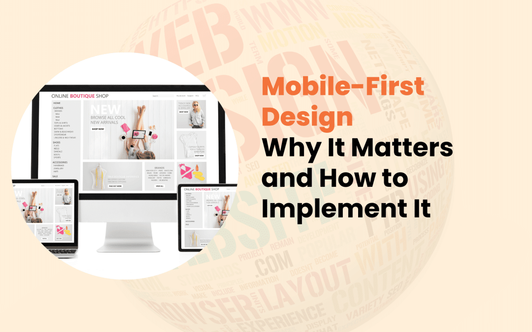
In today’s digital world, how we access information has changed dramatically. Smartphones have become an essential part of our daily lives, making it crucial for businesses and web designers to prioritize mobile experiences. This is where mobile-first design comes into play.
What is Mobile-First Design?
Mobile-first design is a web design and development approach that focuses on creating websites for smaller screens first, then gradually improving them for larger screens.
This strategy ensures that the core content and functionality are optimized for mobile devices.
The Evolution of Mobile Usage
The concept of mobile-first design has its roots in the rapid growth of mobile internet usage. Let us look at some key milestones:
- 2007: Introduction of the iPhone, beginning the smartphone era
- 2010: Mobile internet usage surpasses desktop for the first time
- 2015: Google announces mobile-friendly sites will receive a ranking boost
- 2019: Mobile devices account for over 50% of global web traffic
These milestones highlight the growing importance of catering to mobile users over time.

Why Mobile-First Design Matters
Adopting a mobile-first approach is no longer just a trend but a necessity. Here are some compelling reasons why:
- With increasing mobile usage statistics, mobile usage continues to dominate the digital landscape. Recent data shows that 92.1% of internet users access the web via mobile devices (Statista, 2023). Mobile devices account for 59% of organic search engine visits (BrightEdge, 2023). Users spend an average of 4.2 hours daily on mobile apps (App Annie, 2022). These statistics underscore the critical need for websites to prioritize mobile experiences.
- Google’s Mobile-First Indexing In 2019, Google officially switched to mobile-first indexing. This means that the search engine primarily uses the mobile version of a website for indexing and ranking. Websites that must be optimized for mobile may negatively impact their search engine rankings.
- User Experience Benefits Mobile-first design encourages designers to focus on the essential elements, resulting in cleaner, more focused layouts, faster loading times, and easier navigation on small screens. These improvements often translate to better user experiences across all devices.
- Improved Conversion Rates A well-designed mobile site can significantly improve conversions. Studies show that 51% of consumers are likelier to purchase from a mobile-optimized site (Google, 2022). Furthermore, mobile conversion rates have increased by 64% compared to desktop conversion rates (CXL Institute, 2023).
- Future-Proofing Your Website As technology evolves, new devices with varying screen sizes emerge. A mobile-first approach ensures your website remains adaptable to future devices and screen formats.
Key Principles of Mobile-First Design
To effectively implement the mobile-first design, consider these core principles:
- Content Prioritization Focus on the most critical content first. Ask yourself:
- What information do users need immediately?
- What actions are most important for users to take?
- Simplified Navigation Mobile screens have limited space, so navigation should be clear, concise, and easy to use with one hand. Consider using collapsible menus (e.g., hamburger menus) when necessary.
- Touch-Friendly Interface Design for fingers, not mouse pointers. Use larger, well-spaced buttons, implement swipe gestures where appropriate, and ensure interactive elements are at least 44×44 pixels.
- Fast Loading Times Mobile users often have slower internet connections. Optimize for speed by minimizing HTTP requests, compressing images and files, and leveraging browser caching.
- Responsive Images and Media Ensure visuals look great on all screen sizes. Use CSS to make images flexible, implement the <picture> element for art direction, and consider lazy loading for improved performance.

How to Implement Mobile-First Design
Now that we understand the principles, let us explore how to put mobile-first design into practice:
- Start with Mobile Wireframes. Begin your design process with mobile layouts. Sketch key pages for the smallest screens first, focusing on core content and functionality. Gradually expand designs for larger screens as you progress.
- Use a Responsive Grid System Implement a flexible grid that adapts to different screen sizes. Consider frameworks like Bootstrap or Foundation, or use CSS Grid or Flexbox for custom layouts. Define breakpoints based on content, not specific devices.
- Implement Progressive Enhancement Start with a basic version of your site and add features as screen size increases. Begin with essential content and functionality, then add more complex layouts for larger screens. Introduce additional visual elements when space allows.
- Optimize Images and Media for Mobile. Ensure fast loading times without sacrificing quality. Use responsive images with the srcset attribute, compress images without losing visible quality, and consider using next-gen formats like WebP.
- Utilize Mobile-Friendly Typography. Choose fonts and sizes that are legible on small screens. Use a minimum font size of 16px for body text, implement responsive font sizes using rem or em units, and ensure sufficient contrast between text and background.
- Test on Various Devices and Screen Sizes Thorough testing is crucial for a successful mobile-first design. Use browser developer tools to simulate different devices, test on actual mobile devices when possible, and consider services like BrowserStack for comprehensive testing.
Common Challenges and Solutions
While implementing mobile-first design, you may encounter some hurdles:
- Balancing Aesthetics and Functionality Challenge: Creating visually appealing designs within mobile constraints. Solution: Focus on minimalist design principles and use white space effectively.
- Handling Complex Features on Small Screens Challenge: Adapting intricate features for limited mobile real estate. Solution: Break complex elements into simpler, expandable components.
- Ensuring Consistent Experience Across Devices Challenge: Maintaining mobile and desktop design coherence. Solution: Use style guides and design systems to ensure consistency.

Conclusion
Mobile-first design is no longer optional, it is a fundamental approach to creating successful websites in today’s mobile-dominated world. By prioritizing mobile experiences, you cater to most web users and create more focused, efficient, and user-friendly websites across all devices.
As we look to the future, the principles of mobile-first design will continue to evolve alongside new technologies and user behaviours. Embracing this approach now will position your website for success in an increasingly mobile-centric digital landscape.
Remember, a great mobile experience is not just about fitting content onto a smaller screen—it is about rethinking how we present information and functionality to create truly responsive, user-centric designs.

In today’s digital landscape, cybersecurity is no longer optional but necessary, especially for small businesses.
As cyber threats evolve and become more sophisticated, small business websites are increasingly becoming targets for malicious actors.
The good news? By implementing a set of proven cybersecurity best practices, you can significantly improve your website’s security and protect your business from potential threats.
Risks: Why Small Businesses Are Prime Targets
Before discussing best practices, it’s crucial to understand why cybercriminals often target small businesses. Many small businesses need more dedicated IT staff or robust security measures, making them vulnerable to attacks.
Small businesses often hold valuable customer information, making them attractive targets. They can also serve as entry points to larger supply chains or partner networks, further increasing their appeal to cyber criminals.
Common cyber threats targeting small businesses include:
- Malware and ransomware attacks.
- Phishing scams.
- SQL injection.
- Cross-site scripting (XSS).
- Distributed Denial of Service (DDoS) attacks.
The consequences of a security breach can be devastating, ranging from financial losses and damaged reputation to legal liabilities and loss of customer trust.
Essential Cybersecurity Best Practices
1. Keep Software and Systems Up to Date
Maintaining up-to-date software is your first line of defense against cyber threats. Regular updates patch security vulnerabilities, improve overall system performance, and add new features and functionality.
To ensure your systems stay current:
- Enable auto-updates for your operating system
- Set up automatic updates for your content management system (CMS) and plugins
- Regularly check and update third-party software and applications

2. Use Strong Authentication Methods
Strong authentication is crucial in preventing unauthorized access to your systems. Creating robust passwords is essential, but it’s just the first step.
Implementing two-factor authentication (2FA) adds an extra layer of security beyond passwords.
2FA can include SMS codes, authenticator apps, or physical security keys. It’s important to implement 2FA for all user accounts, especially those with administrative access.
3. Secure Your Network
A secure network is fundamental to protecting your website and business data. Firewalls play a crucial role in network security. Install and configure both hardware and software firewalls, regularly update firewall rules to block emerging threats, and monitor firewall logs for suspicious activity.
Virtual Private Networks (VPNs) are another important tool for network security. Use VPNs for remote access to your network and to encrypt data transmission between remote workers and your systems. When choosing a VPN provider, opt for one with strong encryption protocols.
4. Encrypt Sensitive Data
Data encryption is essential for protecting sensitive information from unauthorized access. Encryption renders data unreadable to unauthorized users, protects data both in transit and at rest, and helps comply with data protection regulations. Types of data that should be encrypted include:
- Customer personal information
- Financial data
- Intellectual property
- Employee records
- Authentication credentials

5. Regular Backups
Backups are your safety net in case of data loss or a successful cyber attack. They enable quick recovery from data loss or ransomware attacks, minimize downtime and potential financial losses, and preserve business continuity. When implementing a backup strategy:
- Follow the 3-2-1 rule: 3 copies of data, on 2 different media, with 1 copy off-site
- Automate your backup process to ensure consistency
- Regularly test backups to ensure they can be successfully restored
6. Educate Employees on Cybersecurity
Your employees are often the first line of defense against cyber threats. Developing a comprehensive cybersecurity policy is crucial.
This policy should outline clear guidelines for handling sensitive data, define acceptable use of company systems and networks, and establish protocols for reporting suspicious activities.
Regular training sessions are also essential. Train employees to recognize phishing attempts and social engineering tactics, teach best practices for password management and data handling, and keep staff updated on the latest cybersecurity trends and threats.
7. Use Secure Hosting and SSL Certificates
Your hosting environment and website encryption play a crucial role in overall security. When choosing a hosting provider, look for those with strong security measures and regular backups. Ensure they offer 24/7 support and monitoring, and consider managed hosting options for enhanced security.
Implementing HTTPS with SSL/TLS certificates is also vital. This encrypts data transmitted between your website and visitors, improves search engine rankings (as Google favors HTTPS sites), and builds trust with your customers by displaying the padlock icon in browsers.

Monitoring and Incident Response
Implementing best practices is not a one-time task—it requires ongoing vigilance and preparedness. Continuous monitoring is crucial for maintaining a strong security posture. Set up intrusion detection systems (IDS) and intrusion prevention systems (IPS), regularly review server and application logs for suspicious activities, and use security information and event management (SIEM) tools for comprehensive monitoring.
Developing an incident response plan is equally important. Prepare a step-by-step plan for responding to different types of security incidents, assign roles and responsibilities to team members for incident response, and regularly update and practice your incident response plan.
Regular security audits and penetration testing should also be part of your cybersecurity strategy. Conduct periodic security assessments to identify vulnerabilities, perform penetration testing to simulate real-world attack scenarios, and address any identified weaknesses promptly.
Conclusion
Cybersecurity is an ongoing process that requires constant attention and adaptation. By implementing these best practices, small businesses can significantly improve their website security posture and protect themselves from the ever-evolving landscape of cyber threats.
Remember, the cost of implementing these measures is far less than the potential losses from a successful cyber attack. Don’t wait for a breach to occur—take action now to secure your small business website. Stay vigilant, keep learning, and prioritize cybersecurity as an essential part of your business strategy.
By following these cybersecurity best practices, you’re not just protecting your website, you’re safeguarding your business’s future, customers’ trust, and peace of mind. Start implementing these measures today, and take the first step towards a more secure online presence for your small business.

In today’s digital landscape, an online presence is crucial for businesses. E-commerce has changed how companies sell products and services, opening global markets and creating new growth opportunities. However, selecting the ideal e-commerce platform from the many available options can be challenging.
This guide will help you choose the best e-commerce platform for your specific business needs. We’ll examine various platform types and important considerations, compare popular choices, and offer a framework for making a well-informed decision.
Understanding E-commerce Platforms
Before delving into the selection process, it’s important to grasp what e-commerce platforms are and how they operate.
An e-commerce platform is a software application that enables businesses to manage their website, sales, and operations. It forms the basis for your online store’s customer-facing front-end and administrative back-end.
There are three main categories of e-commerce platforms:
- Hosted Platforms: All-in-one solutions where the provider hosts your store on their servers (e.g., Shopify, BigCommerce).
- Self-Hosted Platforms: You must host the software on your server (e.g., WooCommerce, Magento).
- Software as a Service (SaaS): Cloud-based solutions offering scalability and regular updates (e.g., Squarespace, Wix).
Modern e-commerce platforms typically include features such as product catalogue management, shopping cart functionality, payment processing, order management, customer relationship management (CRM), analytics and reporting, SEO tools, and mobile optimization.
Key Factors to Consider When Choosing an E-commerce Platform
Selecting the right e-commerce platform involves carefully weighing several factors:
Budget and Pricing Models
When considering costs, look beyond the initial price tag. Factor in ongoing expenses like monthly or annual subscription fees, transaction fees, costs for add-ons or extensions, and potential development and maintenance expenses.
Scalability and Growth Potential
Your chosen platform should grow alongside your business. Consider its ability to handle increased traffic and sales, easily add new products or categories, and support multiple currencies and languages.
Ease of Use and Technical Requirements
Evaluate your technical expertise and resources. Look for a user-friendly interface for day-to-day management, assess the coding knowledge required, and check the availability of support and documentation.

Customization Options
Your online store should reflect your brand identity. Seek platforms offering:
- Customizable themes and templates
- Design element modification capabilities
- Options to add custom features or integrations
Security Features
Protecting customer data is essential. Ensure your chosen platform provides the following:
- SSL certification
- PCI DSS compliance
- Regular security updates
Payment Gateway Integrations
Ensure the platform supports your preferred payment methods, including popular options like PayPal, Stripe, and Square. It should also support multiple payment gateways and handle international transactions.
Mobile Responsiveness
With the increasing prevalence of mobile commerce, your store must perform well on all devices. Look for responsive design, mobile-optimized checkout processes, and fast loading times on mobile networks.

Popular E-commerce Platforms: A Brief Comparison
Let’s examine some of the most widely-used e-commerce platforms:
Shopify
Shopify is known for its ease of use, excellent customer support, and wide range of apps and integrations. However, it may charge transaction fees unless you use Shopify Payments, and customization options can be limited on lower-tier plans.
WooCommerce
As a free WordPress plugin, WooCommerce offers high customizability and a large community with an extensive plugin ecosystem. It does require more technical knowledge, and you’re responsible for hosting and security.
Magento
Magento is highly scalable, feature-rich, and suitable for large enterprises with extensive customization possibilities. However, it has a steep learning curve and can be costly to develop and maintain.
BigCommerce
BigCommerce offers built-in features that reduce reliance on apps, charge no transaction fees, and provide strong SEO capabilities. Its drawbacks include annual sales limits on plans and a limited selection of free themes.

Squarespace
Squarespace is known for its beautiful, designer-quality templates and user-friendly interface. It’s an all-in-one solution with hosting included. However, compared to dedicated platforms, it offers limited payment gateway options and fewer e-commerce-specific features.
Matching Platforms to Business Types
Different platforms cater to various business needs:
- Small Businesses and Startups: Consider user-friendly options like Shopify or Squarespace with lower upfront costs and easy setup.
- Medium-sized Businesses: Platforms like BigCommerce or WooCommerce offer scalability and more advanced features.
- Large Enterprises: Magento or Shopify Plus provides robust solutions for high-volume sales with enterprise-grade security and support.
- Niche or Specialized Businesses: Look for platforms offering industry-specific features and flexible customization to meet unique needs.
Steps to Choose the Right E-commerce Platform
To make an informed decision, follow these steps:
- Assess your business needs and goals
- Research and compare platforms
- Consider future growth
- Test platforms with free trials
- Evaluate customer support options

Conclusion
Choosing the right e-commerce platform is a crucial decision that can significantly impact your business’s success. By carefully evaluating your needs, budget, and growth potential, you can select a platform that meets your current requirements and supports your future goals.
Remember, there’s no universal solution that fits all businesses. Take the time to thoroughly research and test different options before making your decision. With the right e-commerce platform, you’ll be well-equipped to succeed in the competitive online marketplace.
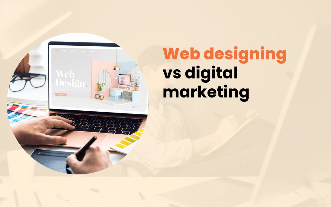
In today’s fast-paced digital landscape, businesses constantly seek ways to establish and expand their online presence.
Two critical disciplines are pivotal in this endeavor: web designing and digital marketing. At the same time, these distinct fields are profoundly interconnected and crucial for achieving online success.
This article explores the nuances of web designing and digital marketing, examining their differences, synergies, and importance in the modern business world.
Table on Web Designing vs Digital Marketing
Aspect
| Web Designing |
Digital Marketing |
Definition
| The process of creating, planning, and updating websites |
The practice of promoting products, services, or brands through digital channels |
Primary Focus
| Visual appearance and user experience of websites |
Reaching and engaging target audiences across various digital platforms |
Key Skills
| HTML, CSS, JavaScript, UI/UX design, graphic design |
SEO, content marketing, social media marketing, email marketing, PPC advertising |
Tools Used
| Adobe Creative Suite, Sketch, Figma, WordPress |
Google Analytics, SEMrush, Mailchimp, Hootsuite, Google Ads |
Main Objectives
| Create visually appealing and functional websites |
Increase brand awareness, generate leads, and drive conversions |
Timeframe
| Usually project-based with periodic updates |
Ongoing and continuously evolving |
Metrics
| Website speed, user engagement, bounce rate |
Traffic, conversions, ROI, click-through rates, engagement rates |
Target Audience
| Website visitors and users |
Potential customers across various digital channels |
Scope
| Focused on website creation and maintenance |
Covers a broad range of online marketing activities |
Integration
| Provides the foundation for digital marketing efforts |
Utilizes web design as a crucial component of overall strategy |
What is Web design?
Web designing is the art and science of creating visually appealing, functional, and user-friendly websites.
It encompasses a wide range of skills and disciplines, focusing on a website’s aesthetic and technical aspects.
Critical elements of web design include:
- Visual Design: Color schemes, typography, imagery, and overall layout
- User Interface (UI) Design: Creating intuitive and engaging user interfaces
- User Experience (UX) Design: Ensuring easy navigation and positive visitor experiences
- Responsive Design: Adapting website layouts for optimal viewing across various devices
- Information Architecture: Organizing and structuring website content for clarity and accessibility
In an era where first impressions are often made online, a well-designed website is a powerful tool for establishing brand identity and credibility, engaging and retaining visitors, facilitating easy access to information, and driving conversions to achieve business goals.
A thoughtfully designed website can significantly impact user perception, trust, and, ultimately, a business’s success in the digital realm.

What is Digital Marketing?
Digital marketing encompasses all marketing efforts that use electronic devices or the internet to connect with current and prospective customers.
It’s a multifaceted approach to promoting products, services, or brands through various digital channels.
Digital marketing employs several strategies and channels, including:
- Search Engine Optimization (SEO)
- Content Marketing
- Social Media Marketing
- Email Marketing
- Pay-Per-Click (PPC) Advertising
- Affiliate Marketing
These approaches help businesses increase brand visibility, generate leads, drive website traffic, engage with customers across multiple touchpoints, analyze and improve marketing efforts, and adapt to changing consumer behaviors and market trends.
By utilizing various digital channels, businesses can reach their target audience more effectively and drive sustainable growth in the online space.
Key Differences Between Web Designing and Digital Marketing
While both web designing and digital marketing contribute to a business’s online success, they differ in several key aspects:
Focus and Primary Goals: Web designing centers on creating functional, aesthetically pleasing websites with a positive user experience. In contrast, digital marketing aims to attract, engage, and convert target audiences through various online channels.
Skill Sets Required: Web designers typically need proficiency in HTML, CSS, and JavaScript, knowledge of design principles and tools, and an understanding of UX/UI best practices. Digital marketers, on the other hand, require analytical and strategic thinking, content creation and copywriting skills, familiarity with various marketing platforms and tools, and data analysis abilities.
Tools and Technologies Used: Web designers often use design software, code editors, and content management systems. Digital marketers utilize analytics tools, social media management platforms, email marketing software, and customer relationship management systems.
Measurable Outcomes: Web design outcomes include website load time, user engagement metrics, mobile responsiveness, and accessibility scores. Digital marketing metrics focus on website traffic, conversion rates, lead generation, return on investment for marketing campaigns, and social media engagement.

How do web Design and digital marketing complement each other?
Despite their differences, web designing and digital marketing are inherently interconnected and can significantly improve each other’s effectiveness when appropriately integrated.
A well-designed website provides a solid foundation for digital marketing efforts. When users have a positive experience navigating a site, they are more likely to stay longer, explore more content, trust the brand and its offerings, and convert into customers or leads. Conversely, even the most brilliant marketing campaign can only fall flat if it leads users to a well-designed, difficult-to-navigate website.
Web designers must consider SEO best practices to ensure technical issues do not hinder marketing efforts. This includes creating a clear, logical site structure, improving page load speeds, implementing mobile-responsive design, and using SEO-friendly URL structures.
Digital marketers often create content to attract and engage audiences. Web designers play a crucial role in effectively presenting this content by designing layouts that highlight key messages, creating visually appealing calls to action (CTAs), and ensuring content is easily readable and digestible across devices.
Both disciplines contribute to improving conversion rates. Web designers create intuitive user flows and strategically place CTAs, while digital marketers analyze user behavior and A/B test different elements to improve conversions. By working together, web designers and digital marketers can create a seamless user journey that attracts visitors and guides them effectively toward desired actions.
Choosing Between Web Designing and Digital Marketing for Your Business
When allocating resources, businesses often grapple with prioritizing web design or digital marketing efforts. Here are some factors to consider:
When to focus on web design:
- Launching a new website or rebranding
- High bounce rates due to poor user experience
- Outdated design that doesn’t reflect current brand identity
- Need for improved functionality or features
When to focus on digital marketing:
- Launching a new product or service
- Entering new markets or targeting new customer segments
- Low website traffic or poor online visibility
- Need to improve lead generation or sales
Ideally, businesses should strive for a balanced approach integrating web design and digital marketing. This integrated strategy can lead to a cohesive brand experience across all digital touch points, improved returns on marketing efforts due to a high-performing website, better insights into user behavior and preferences, and more agile responses to market changes and user needs.

Conclusion
Web design and digital marketing are distinct disciplines, but they are both integral to achieving online success in today’s digital-first world. By understanding the unique strengths and interconnections between these fields, businesses can create a powerful online presence that attracts visitors and converts them into loyal customers.
As the digital landscape continues to evolve, it’s crucial for companies to regularly evaluate and improve their web design and digital marketing strategies to stay competitive and relevant in their respective markets.

In the dynamic world of web design, user interface (UI) elements are crucial in shaping how users interact with websites. Among these elements, modals have become an essential tool for designers and developers.
But what exactly is a modal in web design, and how can it improve your website’s functionality? This comprehensive guide will explore the definition, examples, and best practices for using modals effectively.
What is Modals in Web Design?
A modal, also known as a modal window or dialog box, is a graphical control element that appears on top of the main content.
It creates a mode that disables the main content but keeps it visible.
Modals are designed to capture the user’s attention and prompt them to take a specific action or provide information before they can continue interacting with the rest of the page.
Modals have several key characteristics that set them apart from other UI elements:
- Overlay: They typically appear with a semi-transparent overlay that dims the background content.
- Focus: Modals demand immediate attention from the user, often requiring an action to be dismissed.
- Temporary nature: These elements are meant to be short-lived, disappearing once the user completes the required action or chooses to close them.
- Content variety: Modals can contain various types of content, from simple messages to complex forms or media.
Unlike regular pop-ups or new browser windows, modals are integrated into the current page’s flow.
They don’t create a new browser context, which makes them less intrusive and more user-friendly.
Modals also differ from inline expandable sections or accordions, as they temporarily take over the entire screen’s focus.
Types of Modals
Modals come in various forms, each serving a specific purpose in web design. Understanding these types can help you choose the right modal for your specific needs.
Information modals provide important information or announcements, such as system maintenance notifications or feature updates.
Confirmation modals seek user confirmation before completing an action, like asking, “Are you sure you want to delete this item?” Form modals collect user input or data, such as sign-up forms or survey questionnaires.
Image or video modals display media content in a focused view, like lightbox galleries or video players.

Real-World Examples of Modals in Web Design
To better understand how modals are used in practice, let’s explore some common implementations:
- Login/Sign-up Modals: These allow users to access their accounts or create new ones without leaving the current page.
- Cookie Consent Modals: With increasing privacy regulations, these inform users about the website’s use of cookies and seek permission.
- Newsletter Subscription Modals: Often used for lead generation, these prompt users to subscribe to newsletters or email lists.
- Product Quick View Modals: In e-commerce websites, these let users see product details without navigating away from the current page.
- Exit-Intent Modals: Triggered when a user’s mouse movement suggests they’re about to leave the site, often containing special offers or prompts.
Benefits of Using Modals
When implemented correctly, modals can significantly improve the user experience and website performance.
By dimming the background content, modals help users concentrate on the task at hand. They allow designers to present additional content without cluttering the main interface, providing quick access to information or actions without disrupting the user’s current context.
Strategically placed modals can guide users towards desired actions, potentially increasing conversions.
Best Practices for Using Modals
To make the most of modals while minimizing potential drawbacks, consider these best practices:
- Keep content concise and relevant
- Provide clear exit options
- Ensure mobile responsiveness
- Use appropriate timing and triggers
- Maintain accessibility standards
Focus on the essential information or action required, and avoid overwhelming users with too much text or options. Include obvious close buttons or click-outside-to-close functionality to ensure users don’t feel trapped.
Design modals to work well on various screen sizes, considering alternative layouts for smaller devices if necessary. Avoid interrupting users mid-task with poorly timed modals, and choose triggers that align with user intent and behavior.
Ensure modals are keyboard-navigable and use proper ARIA attributes for screen reader compatibility.

How to Implement Modals in Web Design
Implementing modals typically involves three key components: HTML structure, CSS styling, and JavaScript functionality. Create the modal container and content elements within your HTML document. Style the modal to achieve the desired look and feel, including the overlay and positioning. Add interactivity to show/hide the modal and handle user interactions.
For those looking to simplify the implementation process, several popular modal libraries and frameworks are available, such as Bootstrap Modals, jQuery Modal, React-Modal, and Vue.js Modal. These tools can significantly reduce development time and ensure consistent behavior across different browsers and devices.
Potential Drawbacks and Considerations
While modals can be powerful UI elements, they also come with potential drawbacks. Overuse of modals can lead to user fatigue, diminishing their effectiveness. Poorly implemented modals can negatively impact the user experience, especially on mobile devices.
Modals may have SEO implications, as content within them might not be easily crawlable by search engines. Excessive use of large or complex modals can affect website performance and load times.
To address these issues, always consider whether a modal is the best solution for your specific use case. Sometimes, inline content or alternative UI patterns may be more appropriate.

What Is a Modal in Web Design? Ultimate Guide
Conclusion
Modals are versatile and powerful tools in web design when used thoughtfully. They can improve user experience, simplify interactions, and increase engagement on your website. By understanding the different types of modals, following best practices, and considering potential drawbacks, you can effectively implement modals to create more intuitive and user-friendly web interfaces.
Remember, the key to successful modal usage lies in striking the right balance between functionality and user experience. As with any design element, always prioritize your users’ needs and preferences when deciding how and when to implement modals in your web projects.

In today’s digital landscape, ensuring your online safety is crucial. With cyber threats evolving rapidly, it’s essential to identify secure websites before sharing sensitive information or making online transactions. This article will guide you through 10 key indicators of website security, equipping you with the knowledge to protect yourself in the virtual world.
How Can I Tell if a Website Is Secure?
The internet has become an integral part of our daily lives, from online shopping to banking and social networking. However, this convenience comes with risks. Cybercriminals are constantly developing new ways to exploit vulnerabilities, steal personal data, and compromise financial information.
By learning to recognize secure websites, you can significantly reduce these risks and browse with confidence.
Website Security Basics
Before diving into specific indicators, let’s briefly explore what makes a website secure. Encryption is a process that scrambles data transmitted between your device and the website, making it unreadable to potential interceptors.
Authentication ensures that the website you’re visiting is genuine and not an impersonator. Integrity guarantees that the data hasn’t been tampered with during transmission.
Central to these security measures are protocols like HTTPS (Hypertext Transfer Protocol Secure) and SSL/TLS (Secure Sockets Layer/Transport Layer Security). These technologies work together to create a safe environment for online interactions
10 Key Indicators of a Secure Website
1. Check for HTTPS in the URL
The first thing to look for is “https://” at the beginning of the website address. The ‘s’ stands for ‘secure’ and indicates that the site uses encryption to protect your data. Modern browsers often hide the “https://” prefix, so look for a padlock icon instead.
2. Look for the Padlock Icon in the Address Bar
Most browsers display a padlock icon next to the URL for secure websites. This visual cue is a quick way to confirm that your connection is encrypted. However, remember that the padlock alone doesn’t guarantee the site’s legitimacy – it only indicates a secure connection.
3. Verify the SSL Certificate
Clicking on the padlock icon usually reveals information about the site’s SSL certificate. This certificate should be issued to the correct domain name, be issued by a trusted Certificate Authority (CA), and be currently valid (not expired).

4. Examine the Website’s Privacy Policy
A legitimate website should have a clear, accessible privacy policy. This document outlines how the site collects, uses, and protects your personal information. While it’s admittedly tedious, taking a few moments to skim this policy can reveal a lot about a site’s commitment to security.
5. Look for Trust Seals and Security Badges
Many reputable websites display trust seals or security badges from well-known security companies. These can include Norton Secured, McAfee Secure, TRUSTe, and BBB Accredited Business. While these badges can be faked, clicking on them should redirect you to the issuing company’s verification page.
6. Check for Secure Payment Options
When making online purchases, secure websites often offer multiple trusted payment options. Look for well-known services like PayPal, Apple Pay, or major credit card logos. These companies have strict security requirements for merchants.
7. Evaluate the Website’s Overall Professionalism
While not foolproof, a website’s overall appearance and functionality can offer clues about its security. Be wary of sites that appear hastily put together or contain numerous errors, as these may indicate a lack of attention to detail – including security measures.
Key aspects of a professional website:
- Clear, well-written content
- Functional links and navigation
- Professional design
- Absence of glaring spelling or grammatical error

8. Be Cautious of Excessive Pop-ups or Redirects
Legitimate websites rarely bombard visitors with pop-up windows or unexpected redirects. These tactics are often employed by less reputable sites and can be indicators of potential security risks. If you encounter excessive pop-ups or are frequently redirected, it’s best to err on the side of caution and leave the site.
9. Check for Updated Content and Maintenance
Regularly updated content and maintenance are good signs that a website is actively managed. An abandoned or poorly maintained website may have unpatched security vulnerabilities, making it a risky place to share personal information.
Look for these signs of an actively managed website:
- Recent blog posts or news articles
- Current copyright dates in the footer
- Working links and images
10. Research the Website’s Reputation
Before trusting a new website with sensitive data, take a moment to research its reputation. Search for reviews or complaints about the site, check if it’s listed on scam-warning websites, and look for mentions in reputable news sources or industry publications. Remember, a lack of information isn’t necessarily a red flag for new or niche websites, but it does warrant extra caution.
Additional Tools and Techniques
Beyond these indicators, you can employ additional tools to improve your online security. Most modern browsers have built-in security features. Familiarize yourself with these tools and keep your browser updated. Consider installing reputable security extensions like HTTPS Everywhere or Web of Trust.
Online website safety checkers, such as Google Safe Browsing or Norton Safe Web, can provide additional information about a website’s security status. Another useful tool is WHOIS lookup, which reveals information about a domain’s ownership and registration. While not a direct security indicator, it can help you verify the legitimacy of a website.

What to Do If a Website Appears Insecure
If you suspect a website is not secure, follow these steps:
- Don’t enter any personal or financial information.
- Leave the site immediately.
- Clear your browser cache and cookies.
- Run a malware scan on your device.
- If you’ve already shared sensitive information, monitor your accounts closely and consider changing passwords.
Reporting suspicious websites is crucial in protecting other internet users. Use your browser’s built-in reporting feature, report phishing attempts to organizations like the Anti-Phishing Working Group (APWG), and notify the legitimate company if the site appears to be impersonating a known brand.
Protecting your personal information is an ongoing process. Use strong, unique passwords for each online account, enable two-factor authentication whenever possible, and be cautious about the information you share online, even on secure websites.
Conclusion
In an era where our lives are increasingly intertwined with the digital world, the ability to identify secure websites is a vital skill. By looking for HTTPS, verifying SSL certificates, and staying alert to other security indicators, you can significantly reduce your risk of falling victim to online threats. Remember, staying safe online is an ongoing process, remain vigilant, keep your knowledge up-to-date, and don’t hesitate to err on the side of caution when in doubt. Your online security is worth the extra effort.

In today’s digital landscape, your website’s homepage serves as the virtual front door to your business. It’s often the first point of contact between your company and potential customers, making it a critical component of your online presence.
Need to Improve Your Homepage? 7 Elements You Can’t Miss
A well-crafted homepage can captivate visitors, encourage them to explore further, and ultimately convert them into loyal customers.
But what exactly should you include on this crucial page? Let’s explore the seven essential elements that every effective homepage should feature.
1. Clear and Compelling Value Proposition
Your value proposition is the foundation of your homepage. It’s a concise statement that communicates what you offer, how it benefits your customers, and what distinguishes you from your competitors.
A strong value proposition should be immediately visible and easily understood by visitors.
To create an effective value proposition:
- Keep it brief and to the point
- Emphasize the benefits for your customers
- Use language that resonates with your target audience
2. Intuitive Navigation
User-friendly navigation is essential for keeping visitors on your site and helping them find the information they need quickly and easily.
A well-designed menu structure can significantly improve user experience and reduce bounce rates.
When designing your navigation, consider these best practices:
- Use clear, descriptive labels for menu items
- Limit top-level categories to 7 or fewer to avoid overwhelming users
- Include a search function, especially for larger sites with extensive content
Don’t forget about mobile users when designing your navigation. Ensure that your menu is responsive and functions well on smaller screens.
Many sites opt for a hamburger menu or other mobile-friendly navigation patterns to provide a seamless experience across all devices.
3. Engaging Hero Section
The hero section is the large, prominent area at the top of your homepage. As it’s often the first element visitors see, it’s crucial to make a strong impression here.
An effective hero section should quickly communicate your main message and encourage visitors to take action.
Key components of a compelling hero section include:
- A clear, attention-grabbing headline
- A sub headline that provides additional context or highlights key benefits
- A prominent call-to-action (CTA) button
Consider incorporating high-quality images, videos, or animations that represent your brand and offerings to make your hero section more visually appealing.
However, be mindful of page load times – ensure that any visual elements you add don’t significantly slow down your site.
4. Trust-Building Elements
Establishing trust with your visitors is crucial for converting them into customers. Including elements that showcase your credibility and reliability can help build this trust quickly.
Effective trust-building elements often include customer testimonials, client logos, awards and certifications, and social proof indicators such as the number of customers or users you serve. For example, you might feature a rotating carousel of customer quotes, display a grid of logos from well-known clients, or showcase badges of industry awards you’ve received.
5. Concise Product or Service Overview
While your homepage shouldn’t overwhelm visitors with excessive detail, it should provide a clear overview of what you offer.
This section helps visitors quickly understand your products or services and decide if they want to learn more.
When creating your product or service overview:
- Use clear, benefit-focused headings
- Include brief descriptions that highlight key features
- Incorporate high-quality images or icons to represent each offering
- Provide links to more detailed pages for those who want additional information
A grid or card layout can be an effective way to showcase multiple products or services in an organized, visually appealing manner.
6. Prominent Call-to-Action (CTA) Buttons
Your CTAs guide visitors to take the next step, whether that’s making a purchase, signing up for a newsletter, or requesting more information. Well-designed and strategically placed CTAs can significantly impact your conversion rates.
To create effective CTAs:
- Use contrasting colors to make them stand out
- Place primary CTAs above the fold (visible without scrolling)
- Use action-oriented text (e.g., “Get Started,” “Try it Free,” “Learn More”)
- Ensure buttons are large enough to be easily clickable, especially on mobile devices
Don’t hesitate to use multiple CTAs throughout your homepage, but prioritize them appropriately. Your primary CTA should be the most prominent, while secondary CTAs can be less conspicuous.
7. Contact Information and Social Media Links
Make it easy for visitors to get in touch with you or connect on social media. This information helps build trust and provides multiple ways for potential customers to engage with your brand.
Essential contact details to include are:
- Phone number
- Email address
- Physical address (if applicable)
- Links to social media profiles
Consider integrating a contact form directly on your homepage for quick inquiries. This can be a simple “Get in Touch” form or a more specific “Request a Quote” form, depending on your business needs.
For social media, use recognizable icons that link to your profiles. These are typically placed in the footer or header where visitors expect to find them.

Bringing It All Together
Creating an effective homepage involves more than just including these seven elements – it’s about how you combine them to create a cohesive, engaging experience for your visitors.
As you design or refine your homepage, keep these final tips in mind:
- Maintain consistent branding throughout your homepage
- Ensure your page loads quickly to prevent visitors from leaving
- Use white space effectively to avoid a cluttered appearance
- Regularly test and improve your homepage based on user behavior and feedback
Remember, your homepage is often the first step in your customer’s journey with your brand. By incorporating these seven essential elements, you’ll create a homepage that not only informs and engages visitors but also encourages them to take the next step in their relationship with your business.
Take a critical look at your current homepage. Does it include all these elements? Is it effectively communicating your value proposition and guiding visitors to take action? If not, consider refreshing your homepage. Your future customers will appreciate a well-designed, informative, and user-friendly introduction to your business.

Digital marketing is essential for small businesses in today’s competitive business landscape. With the right strategies, small businesses can level the playing field with larger competitors.
Digital marketing encompasses all marketing efforts that use electronic devices or the Internet. Businesses leverage digital channels like search engines, social media, email, and websites to connect with current and prospective customers. It is crucial for targeting customers who are most likely to want your products or services.
Key Digital Marketing Strategies for Small Businesses
Search Engine Optimization (SEO)
SEO involves optimizing your website to rank higher in search engine results, increasing visibility and organic traffic. For example, using relevant keywords in your website content, optimizing meta tags, and building quality backlinks can lead to:
- Increased website traffic
- Higher brand credibility
- Cost-effective marketing
At Designs By Dave O., we have successfully implemented SEO strategies for many of our clients, which have increased website traffic and increased brand credibility.
Pay-Per-Click Advertising (PPC)
PPC is an advertising model where you pay a fee each time someone clicks on your ad. Running Google Ads campaigns to promote a seasonal sale, for instance, offers:
- Immediate visibility in search results
- Targeted advertising
- Controlled budgeting
Content Marketing
Content marketing focuses on creating valuable, relevant content to attract and engage a target audience. Regularly publishing informative blog posts, videos, or infographics related to your industry can:
- Build trust with your audience
- Support SEO efforts
- Encourage customer engagement
Social Media Marketing
Utilizing social media platforms to promote products and services and engage with your audience can be highly effective. Sharing behind-the-scenes photos on Instagram or hosting Q&A sessions on Facebook can lead to:
- Increased brand awareness
- Direct communication with customers
- Enhanced customer loyalty
Email Marketing
Email marketing involves sending targeted and personalized messages to your audience to promote products, events, or offers. For example, sending a monthly newsletter with exclusive discounts or updates on new products can result in:
- High return on investment (ROI)
- Direct communication channel
- Building customer relationships
Conclusion
Digital marketing strategies are essential for small businesses growing and competing in today’s market. By understanding and implementing these strategies, small businesses can connect with their audience, build brand awareness, and drive sales.
Contact us today for your free digital assessment.

Shopify vs Etsy: Overview
Shopify and Etsy are two leading eCommerce platforms with distinct offerings. This overview highlights their beginnings, approach, and some stats.
Shopify: At A Glance
Shopify is often recognized as one of the leading eCommerce platforms. It is specifically designed for online sales and provides all the necessary tools to display products, manage your store and inventory, and grow your business. With Shopify, digital expansion feels seamless.
You can choose from over 150 e-commerce themes and use its point-of-sale app and devices. Additionally, its extensive app store offers various functionalities to enhance your store. According to BuiltWith.com, Shopify supports around 4.7 million online shops globally.
Shopify earns high marks for its simple setup, intuitive interface, and robust security features. Its users appreciate its mobile-friendly design, extensive app marketplace, versatile payment methods, scalability, and powerful SEO and marketing tools on review aggregators such as G2 and Capterra.
Etsy: At A Glance
Etsy is an online marketplace for handmade and vintage items. It provides a platform for artisans and crafters to sell their unique products directly to consumers. On Etsy, shoppers can find various goods, from jewelry and clothing to home décor and art made by artisans and independents.
Statista said over 1.9 billion dollars worth of goods were sold on Etsy just last year. This opens up a tremendous opportunity for anyone looking to sell their crafts, as millions can see their products online. Additionally, Etsy offers a community for sellers to connect and share advice.
Shopify vs Etsy: Features
When comparing eCommerce platforms like Shopify vs Etsy, they thrive on their ability to offer robust features that empower businesses. This section explores the comprehensive feature sets of Shopify and Etsy, shedding light on their distinct capabilities.
Shopify Features
Website Builder
Shopify is a website builder with a user-friendly drag-and-drop interface that lets you easily achieve your desired design. We’ll delve into the functionalities of this editor soon. To kick things off, Shopify offers nine complimentary themes. Pick the one that resonates with your brand and tweak it to match your brand’s vibe. These adaptive themes ensure your shop looks great across all platforms – desktop, tablet, or mobile devices.
In addition to the free options, Shopify offers many premium themes. Alternatively, you can start from scratch with a blank template or upload a custom theme acquired from another vendor. Shopify’s built-in editor lets you view your store’s appearance in real-time as you make changes.
Marketing Features
Shopify offers essential SEO tools, allowing you to manage titles and meta descriptions and preview how your pages look in search results. While suitable for beginners, it may lack the control advanced users desire. For more features, explore the apps in the Shopify App Store; however, premium versions can be costly.
If you prefer not to use Shopify’s built-in tools, you can integrate your Shopify store with services like ActiveCampaign, MailChimp, or Omnisend.
Etsy Features
Website Builder
Etsy also offers a website builder called Pattern for an additional monthly cost. It is designed for existing Etsy sellers to create and customize their standalone e-commerce websites on custom domains. It is nowhere near Shopify in terms of its features. However, it is still an excellent option for anyone planning to take advantage of all Etsy features while staying professional. By default, the domain is yourstorename.patternbyetsy.com, but you can use your domain. If you don’t already have a domain name, you can purchase it in a few clicks using NameCheap.
Marketing Features
Etsy is an online marketplace that attracts millions of visitors. Although your account doesn’t have many marketing tools, your items will still be visible to Etsy’s large user base, reducing the need for extensive marketing efforts.
You’ll have to compete with other sellers within your niche. It would be best to optimize your store to rank higher in Etsy’s search results. To help with this, Etsy provides tools to improve SEO and marketing. Shop Stats and Etsy’s search bar show popular keywords for your shop. Etsy Ads and Etsy Offsite Ads promote your products on different platforms.
Use relevant keywords in your shop’s titles, descriptions, and tags to boost visibility in search results. You can do this using SEO research tools. Etsy also provides a feature in your Shop Manager that allows you to create and share social posts. You can choose from six types of social posts and easily share them on Facebook, Instagram, Twitter, or Pinterest.
Ease of Use
Ease of use is essential when choosing an eCommerce platform, as it directly impacts the user experience for merchants and customers. This section evaluates the user-friendliness of Shopify and Etsy, examining factors such as setup processes, dashboard navigation, and overall intuitiveness.
Shopify’s Ease of Use
Shopify is easy to use, but mastering its features, creating a nice store, handling inventory, marketing, and analyzing data take time and effort. It may be challenging initially, but it gets easier with perseverance and resources like guides and tutorials.
Etsy’s Ease of Use
Selling on Etsy has a generally gentle learning curve compared to Shopify. Although its platform is more restricted in terms of customization and advanced features, it provides a user-friendly interface and a hand-held approach for setting up and managing a rudimentary online store.
Which Is Better?
Choosing the right eCommerce platform is crucial for your business’s success. This section provides a brief analysis to help you determine which best meets your needs and long-term goals.
Shopify Is For Business Owners Who…
…are seeking a fully customizable, scalable eCommerce platform and have a formidable budget. Shopify provides extensive tools for inventory management, secure payments, marketing integrations, and unlimited product listings. With its user-friendly interface and comprehensive analytics, Shopify empowers business owners to build a professional online presence and streamline operations as they grow. However, its price point might be a barrier to entry for independent artists and small businesses.
Etsy Is For Business Owners Who…
…are artisans, crafters, and small businesses selling handmade, vintage, or unique items. Its marketplace structure provides built-in exposure to a dedicated customer base seeking one-of-a-kind products. Etsy’s user-friendly platform simplifies the listing and selling process, making it an attractive option for those prioritizing a community-driven, niche market experience. For all of its fees and limitations, it does provide a large, readily available audience to sell.
There is no universally correct answer when choosing between Shopify and Etsy. Shopify offers unparalleled flexibility and scalability for online merchants, while Etsy’s niche marketplace appeals to artisans and crafters with a vast audience.
Consider your business goals, product line, and desired level of control over your online presence. The platform that aligns best with your unique needs will likely be the most rewarding long-term choice.

Ranking high on search engines requires a well-planned SEO strategy.
Our search engine marketing specialists have put together a beginner’s guide for you. Every business aims to rank at the top of Google’s search results. Since half of all clicks go to the first three listings, it’s definitely a goal worth pursuing. Getting onto the first page of Google doesn’t happen by chance; it requires a carefully crafted plan. Here at Informatics, we call this an SEO strategy.
If you’re new to search engine optimization, here’s how to get started:
Identify relevant keywords.
Keywords are specific words or phrases that people use when searching for information online. They are crucial for helping search engines understand the content of a webpage and matching it to relevant user queries.
By incorporating relevant keywords into your website content, you can increase your chances of appearing in search engine results for those specific terms without having to pay for sponsored ads.
But how do you determine which keywords to use?
Identify terms worth targeting.
Once you have a large collection of terms you rank for and terms you’ve discovered, seek assistance for a deeper analysis. We can create your complete keyword list and even provide estimated monthly search volumes and keyword difficulty scores for each.
It’s important to note that the keywords you should target are not always the ones with high volumes. Striking a balance between search volume and difficulty is crucial. Highlight, underline, or bold those with significant traffic potential but lower competition scores (usually anything under 50).
Optimize and create content.
After identifying the keywords you want to target, create a plan to:
- optimize your website’s current content and
- create new, keyword-rich content.
To ensure success, we develop a content calendar to help us monitor and stay on top of both tasks. Remember that your keywords should not only be included in your body copy. You should also naturally incorporate them in key spots such as metadata, header tags, and URLs.
Advanced SEO
It’s important to understand that search engine optimization is a long-term effort requiring varying commitment levels. In highly competitive search landscapes, businesses need to do more—such as building backlinks, breaking keywords into clusters, writing pillar pages, and deploying other high-level SEO tactics.
Whether you need help getting started, want to implement aggressive SEO initiatives, or are unsure, Informatics is your go-to digital marketing agency for search engine marketing services.

Optimizing Your Law Firm’s Online Presence: SEO Best Practices
Search engine optimization (SEO) is essential for ensuring that your website is visible to potential clients when they search for legal services online. Here are a few key SEO strategies specifically for law firms:
- Keyword Research: Identify keywords that potential clients might use to find legal services like yours. These might include terms like “personal injury attorney” or “corporate law firm.” Use these keywords strategically in your content, including titles, headings, and throughout the text, but avoid overstuffing.
- Local SEO: For many law firms, local clientele is crucial. Optimize your website for local search by including location-based keywords, registering with Google My Business, and creating listings in local directories.
- Quality Content: Google values quality content that provides real value to users. For law firms, this could mean detailed blog posts about common legal issues, guides, and explanations of legal processes relevant to your practice areas. Updating content regularly can also help improve your site’s SEO.
- Backlinking: Establishing backlinks from reputable sites not only boosts your website’s authority but also its ranking in search results. Consider guest blogging for respected legal publications or local news sites.
- Technical SEO: Ensure your website has a clean codebase, utilizes structured data, and loads quickly. This helps search engines crawl and index your site more effectively.
Mobile Optimization With more than half of all web traffic coming from mobile devices, having a mobile-optimized website is no longer optional. Here’s how to ensure your law firm’s website is mobile-friendly:
- Responsive Design: Your website should look good and function well on any device, from desktops to smartphones. Responsive design automatically adjusts the layout based on the device’s screen size.
- Mobile-Friendly Navigation: Menus and navigation should be easy to use on mobile devices. Large buttons, accessible dropdowns, and a sticky navigation bar can enhance the user experience on mobile.
- Speed Optimization: Mobile users often have less patience for slow-loading websites. Optimize images, leverage browser caching, and minimize code to speed up loading times.
- Touchscreen Ready: Make sure that all interactive elements like buttons and form fields are large enough to be easily tapped on a touchscreen.
- Testing: Regularly test your website on various devices and browsers to ensure that it remains compatible and user-friendly.
By combining effective SEO strategies with a robust mobile optimization plan, law firms can significantly improve their online visibility and user engagement. These enhancements not only help in attracting more potential clients but also provide them with a superior browsing experience, reflecting the professionalism and modernity of your legal practice.

Have you ever seen the term bounce rate and not thought about what it does to your online rankings?
In this article, we will discuss the top ten reasons visitors bounce from your website, but first, let’s review what a bounce is and what it is telling you. Here’s a good explanation of the phenomena:
The bounce rate shows how often visitors leave the site after viewing just one page instead of engaging with the site, such as:
- Clicking on any links.
- Filling out forms.
- Navigating to other pages within the site.
- Making any purchases.
- Contacting the company for quotes or information.
No matter how great of a job you did in attracting visitors to your website, you can get a high bounce rate if your visitors aren’t satisfied immediately upon landing.
Typically, they’ll bounce when they aren’t finding what they’re looking for once they land on the site:
- The content was not engaging or relevant to their search.
- They may have experienced issues with user experience such as slow loading times or poor design.
Here is a more detailed look at these points with this list of the top ten reasons why visitors bounce from your website. With each point, we also give an example of how to fix it. Implementing any or all of these can mean better conversions, which leads to more revenue for your company.
1. Slow Loading Times
Patience is a rare commodity online. If your website takes too long to load, visitors are likely to bounce. Aim for a loading time of under three seconds to keep users engaged. Two things you can do right away are to check the hosting platform and ensure that you’re being hosted by a company that provides plenty of bandwidth and can support your site with fast loading times. Another is to make sure your images are all optimized for fast loading.
2. Poor Mobile Experience
With more people browsing on their phones than ever before, a website that isn’t mobile-friendly can drive visitors away. Ensure your site is responsive and looks good on all devices.
3. Unattractive Design
First impressions matter. A cluttered or outdated design can make your site seem unprofessional. Invest in a clean, modern design that aligns with your brand. [url to contact page]
4. Complicated Navigation
If visitors can’t find what they’re looking for quickly, they’ll leave. Make sure your navigation is intuitive and that key information is easily accessible.
5. Intrusive Pop-Ups
While pop-ups can be effective for capturing leads, they can also be incredibly annoying if overused. Make sure they’re not too intrusive and that they can be easily closed. Consider other optin options as well such as announcement bars, or links in blog posts.
6. Irrelevant Content
Visitors come to your site with specific needs. If your content doesn’t match their expectations or interests, they won’t stick around. Ensure your content is relevant and valuable to your target audience.
7. Lack of Trust Signals
Visitors need to trust your site to engage with it. Include trust signals such as SSL certificates, customer testimonials, and clear privacy policies to build credibility.
8. Auto-Playing Media
Unexpected sounds or videos can be jarring and off-putting. Avoid auto-playing media that can startle visitors and disrupt their browsing experience.
9. No Clear Call to Action
Visitors need to know what to do next. Without clear calls to action (CTAs), they might leave without taking any meaningful steps. Make sure your CTAs are prominent and direct.
10. Technical Issues
Broken links, error pages, and other technical problems can frustrate visitors and cause them to leave. Regularly check your site for technical issues and resolve them promptly.
Conclusion
Understanding why visitors bounce from your website is crucial for improving your user experience and increasing engagement. By addressing these common issues, you will find that attracting visitors to your website and converting them becomes much easier.

Creating a Better User Experience for Your Website
Businesses can increase efficiency online, but not if their site provides a bad user experience. In our latest article, we tell you how to improve your UX.
Have you ever visited a website looking for one simple thing and felt lost and confused? Clicking through page after page to find a “book online” button or contact form is frustrating, isn’t it?
Here in the industry, we call that a bad user experience—or UX to get technical. This nightmare scenario might even be occurring on your site right now, and it could be driving away potential clients or customers.
Signs your site offers clients/customers a bad user experience
- People call or email instead of completing an action that could be done on your website.
- In GA4, your conversion rates are low.
- Your customer service team often answers questions your website could answer.
- You’ve been told, “I couldn’t find it on your website.”
If any of these indicators are true for your business, you probably need an overhaul. Fair warning: This process takes a bit of time, but it will be completely worth it when you see your conversion rates (and, as a result, sales) jump.
Steps to Bettering Your Site’s UX
Evaluate your information architecture.
- An information architecture is a visual representation of how content is organized on your website. Mapping it out will help you evaluate the relationships between pages and determine if content needs to be moved, removed, or replaced.
- Start with the main sections on your navigation bar and map out all the pages under it. Then, think about a first-time user coming to your website. Where would they look to find the information? And once they’ve found it, is there a clear call-to-action (CTA)?
- If you’re beginning a new site or are committed to a complete content refresh, you could also use the card sorting method. Often favored by web designers, this method involves writing down bits of information or ideas on individual cards and then asking someone outside your organization to sort and group them.
Check your Core Web Vitals.
- Aside from content, factors like website load time can influence your users’ experience. Google recommends that your pages load in 5 seconds or less to keep your audience engaged instead of frustrated.
- Luckily, Google introduced Core Web Vitals to identify usability issues, such as a slow-to-load site. You can also view your site’s interactivity and visual stability through your Google Search Console account. If you’re unfamiliar with these metrics or need help tracking them, we recommend contacting us for more information.
Write for an online audience.
- We’ve seen client websites with 10-sentence paragraphs and over a thousand words for an “About Us” section. And while it’s hard to tell them to take a hatchet to the hours of work they poured in, we have to do it—web content has to be concise.
- The simple truth is that website users are usually just looking for answers. If they cannot find them quickly, they’ll either go somewhere else and/or resent you for making them sift around.
- Our content writers recommend keeping paragraphs short, breaking up sections with imagery, and utilizing subheadings for different topics. If you need an example, just look at this blog 🙂
Here’s the big takeaway:
Creating a good experience for your site users requires extensive testing, research, and more testing. But in today’s digitally driven world, you must do it.
If you have questions about refining your web design or content, reach out today we look forward to start you off with an audit!

Harnessing the Power of Google Business Manager for Your Business
In today’s digital age, having a robust online presence is crucial for business success. Google Business Manager is essential for businesses looking to optimize their online operations. Understanding and utilizing Google Business Manager can significantly enhance customer visibility and interaction, whether a small local shop or a large corporation. Let’s dive into what Google Business Manager is, its key features, and how it can benefit your business.
Google Business Manager is a free tool provided by Google that helps business owners manage their online presence across Google’s various services like Search and Maps. By allowing businesses to update their information, manage interactions, and optimize their profiles, Google Business Manager serves as a central platform for enhancing visibility and customer engagement.
Key Features of Google Business Manager
- Business Profile Management: This feature allows you to manage your business listing information, such as address, hours, contact details, and more. Keeping this information up-to-date is crucial as it helps customers find and contact you easily.
- Insights and Analytics: Google Business Manager provides valuable insights into how customers interact with your business online. You can see data on how many people viewed your business profile, clicked on directions, called your business, or visited your website. This data is vital for understanding customer behavior and optimizing your marketing strategies.
- Customer Reviews and Interactions: This platform enables you to engage directly with customers by responding to reviews and messages. Engaging with customer feedback improves your relationship with customers and boosts your business’s credibility and attractiveness to potential new customers.
- Post Updates and Offers: You can post updates, events, offers, and more directly to your Google Business Profile through the manager. This feature is particularly useful for promotions, announcing new products or services, and keeping your customers informed about what’s happening in your business.
Benefits of Using Google Business Manager
- Increased Visibility: Optimizing your business profile increases your likelihood of appearing in local search results, which can significantly increase your visibility and draw more foot traffic to your location.
- Enhanced Customer Trust: Regular updates and active engagement build trust and credibility among your customers. Responding to reviews shows that you value customer feedback and are attentive to their needs.
- Streamlined Communications: Google Business Manager makes it easier than ever to maintain effective communication with your customers, with tools that allow you to manage messages and interactions in one place.
- Data-Driven Decisions: The analytics provided by Google Business Manager help you make informed decisions based on how customers interact with your business online. This can guide your marketing and operational strategies to be more effective.
Getting Started with Google Business Manager
To start using GBM, you must claim your business on Google My Business. After verification, you can access all the features and optimize your profile. Here’s a quick guide on getting started:
- Claim Your Business: Verify ownership of your business to manage your profile.
- Complete Your Profile: Fill out all relevant details such as location, hours, and services.
- Engage with Customers: Respond to reviews and messages to build relationships and trust.
- Monitor Insights: Monitor how customers interact with your profile and adjust your tactics accordingly.
Conclusion: A Tool for Every Business
Google Business Manager is an indispensable tool for any business to strengthen its online presence. Its comprehensive features and benefits facilitate better customer engagement, enhanced visibility, and smarter business operations. Whether you’re just starting out or looking to refine your existing online strategy, Google Business Manager provides the resources and insights needed to succeed in the digital marketplace.
By leveraging Google Business Manager’s power, businesses can maintain a strong digital footprint, drive growth, and foster meaningful connections with their audience.

Crafting effective brand messaging is crucial for connecting you with your target audience. Learn how to resonate with users and enhance brand communication.
Understanding your target audience
Crafting effective brand messaging starts with a deep understanding of your target audience. By identifying their needs, preferences, and pain points, you can tailor your messaging to resonate with them. Once you clearly understand your target audience, you can create messaging that speaks directly to their needs and desires. Use language and tone that resonates with them, addressing their challenges and offering solutions. By showing that you understand their problems and can provide valuable solutions, you build trust and establish a connection with your audience.
Crafting a compelling brand story
A compelling brand story is the foundation of effective messaging. It helps you differentiate your brand and create an emotional connection with your audience. Define your brand’s values, mission, and unique selling proposition. Consider what sets your brand apart from competitors and why your audience should choose you. Use storytelling techniques to convey your brand’s essence and evoke emotions. Share your brand’s journey, highlighting milestones, challenges, and successes. By sharing your story, you humanize your brand and make it relatable to your audience.
Consistent tone and voice across platforms
It is important to maintain a consistent tone and voice across all platforms and channels. This helps reinforce your brand identity and ensures that your messaging is recognizable and cohesive.
Start by defining your brand’s tone and voice. Consider the personality and values you want to convey. Are you formal or informal? Serious or playful? Authoritative or friendly? Once you have established your brand’s tone and voice, consistently apply it in all your communications, including website content, social media posts, emails, and advertisements. This consistency will help your audience develop a clear understanding of your brand and what it stands for.
Utilizing visual elements to enhance messaging
Visuals can grab attention, evoke emotions, and convey complex ideas more effectively than words alone. Incorporating compelling visuals into your messaging can help create a memorable and impactful brand experience for your audience. Consider using high-quality images, videos, infographics, and illustrations that align with your brand’s identity and message.


